One number for chaos.
A governance dashboard for Microsoft Teams admins: it scores six indicators of a sprawling tenant, explains every point, and turns the weak ones into a plan they can buy and act on.
Nobody knows if their Teams tenant is healthy.
Teams multiply faster than any admin can review them. Ownerless teams, dead archives, no naming convention, sensitivity labels nobody applied. All the data sits in the Microsoft admin center, spread across reports that answer questions one at a time and never say what to fix first.
Before the UI, the arithmetic.
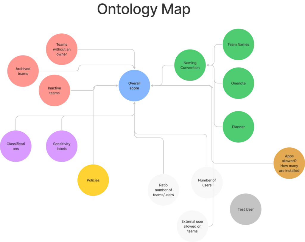
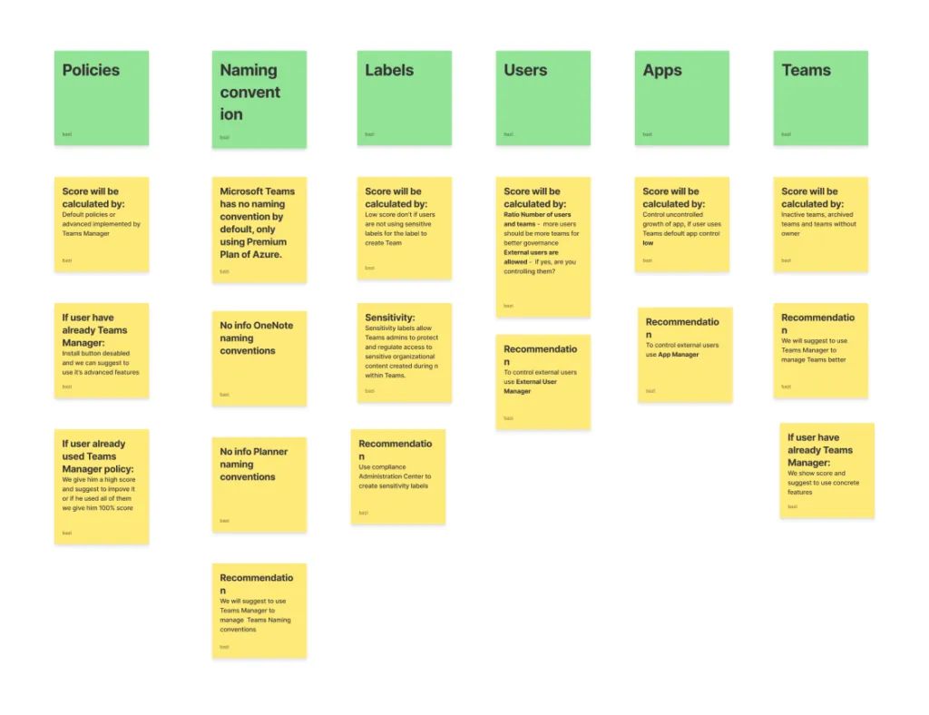
I mapped every signal Microsoft Graph exposes against what an admin can actually change, then worked out which ones deserve to move a score. That ontology decided the whole information architecture.
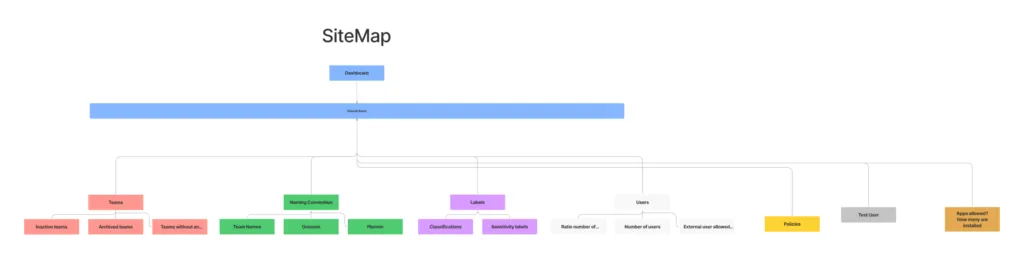
Six indicators, one headline number.
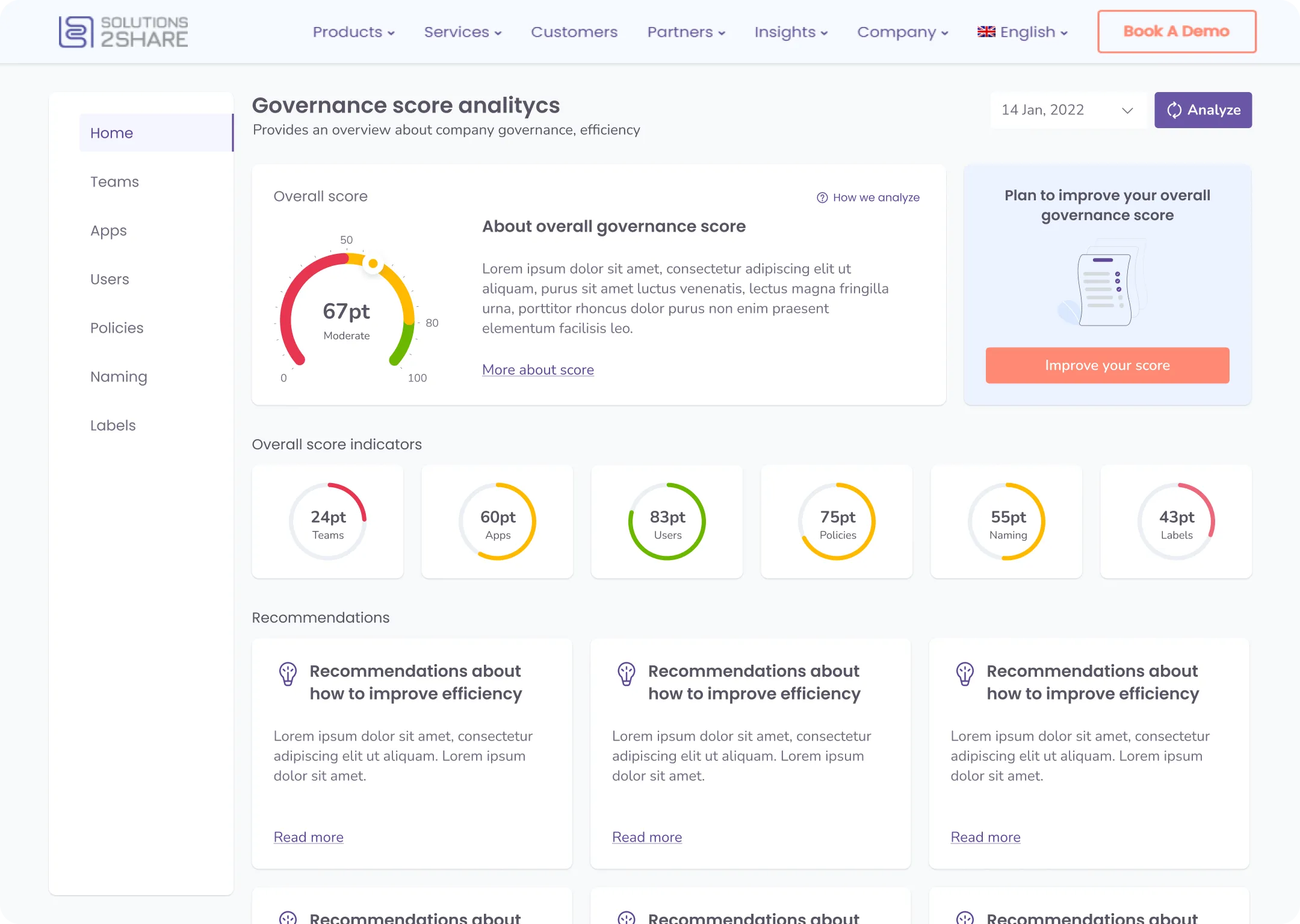
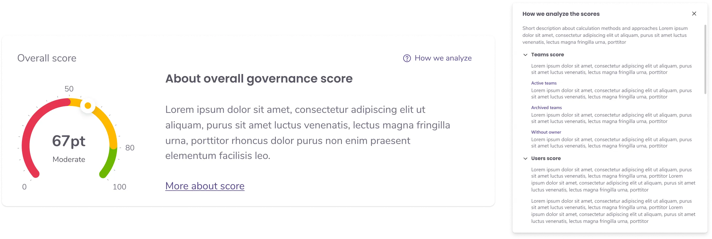
The overall score is a weighted roll-up, never a black box: the gauge sits next to a plain-language explanation and a panel that opens the full calculation per indicator.
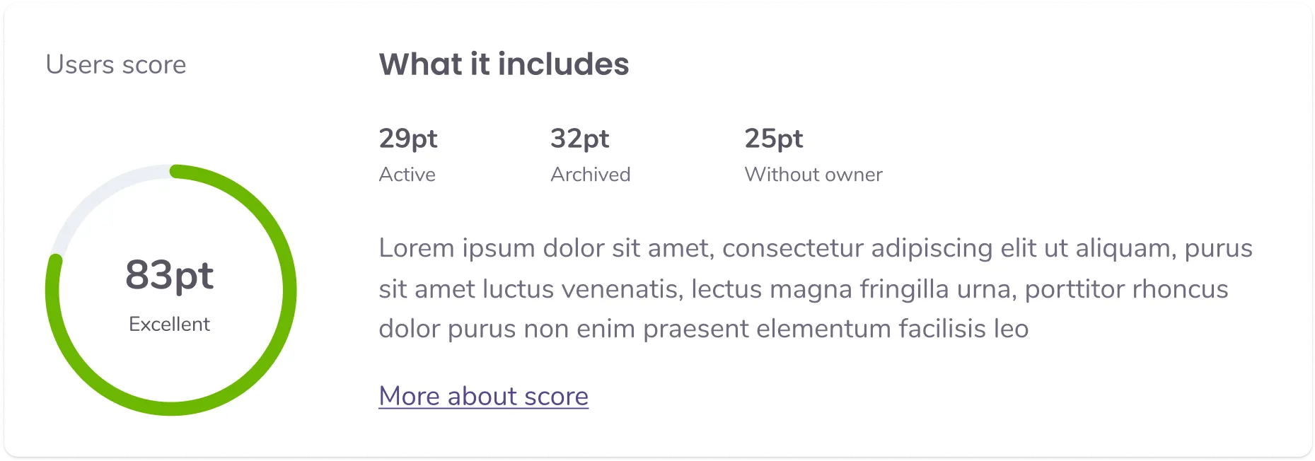
A number that tells you what to do next.
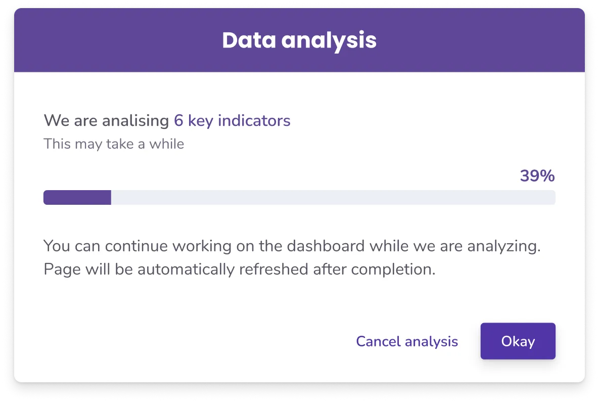
Every low indicator produces a recommendation, and every recommendation names the product that fixes it. Analysis runs in the background, history keeps the score honest over time.

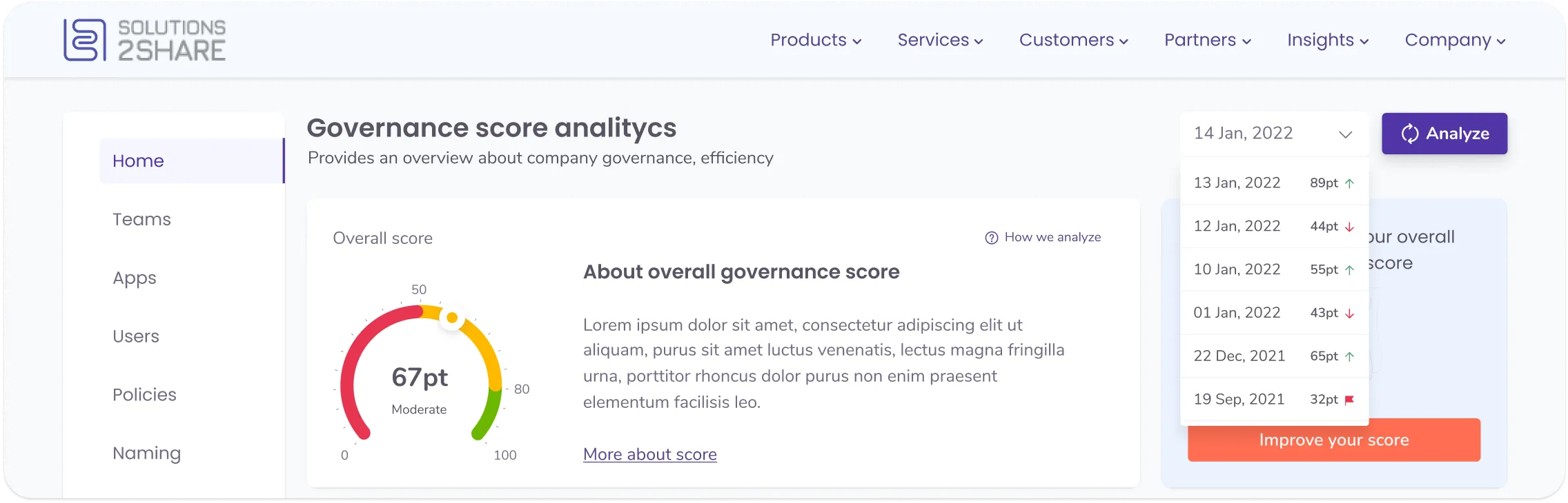
The free score sells the paid plan.
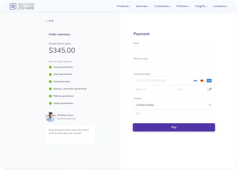
The dashboard ends in a governance report: an expert-written plan per indicator, and a checkout that lists exactly which six areas the plan covers. Diagnosis is free, the cure is the product.