See the clutter first.
A Microsoft 365 storage analytics app that shows where a tenant's space actually goes, how much of it is reclaimable, and which teams to look at on Monday morning.
Storage fills up quietly, then all at once.
Teams, SharePoint, Exchange and OneDrive each report their own numbers. An admin at 86% capacity has no single view of what is dead weight, so the answer is always to buy more space.
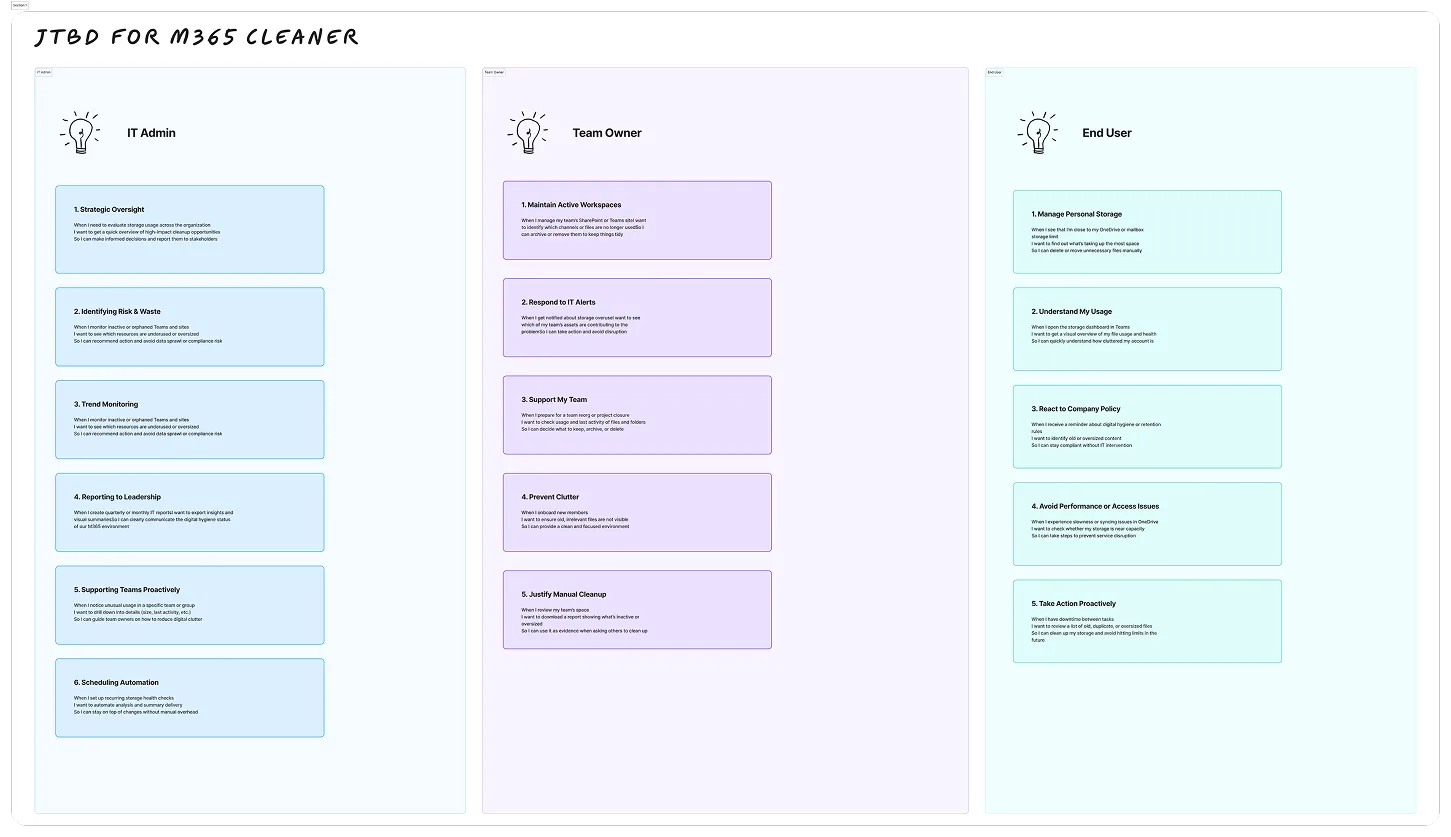
Three roles, sixteen jobs to be done.
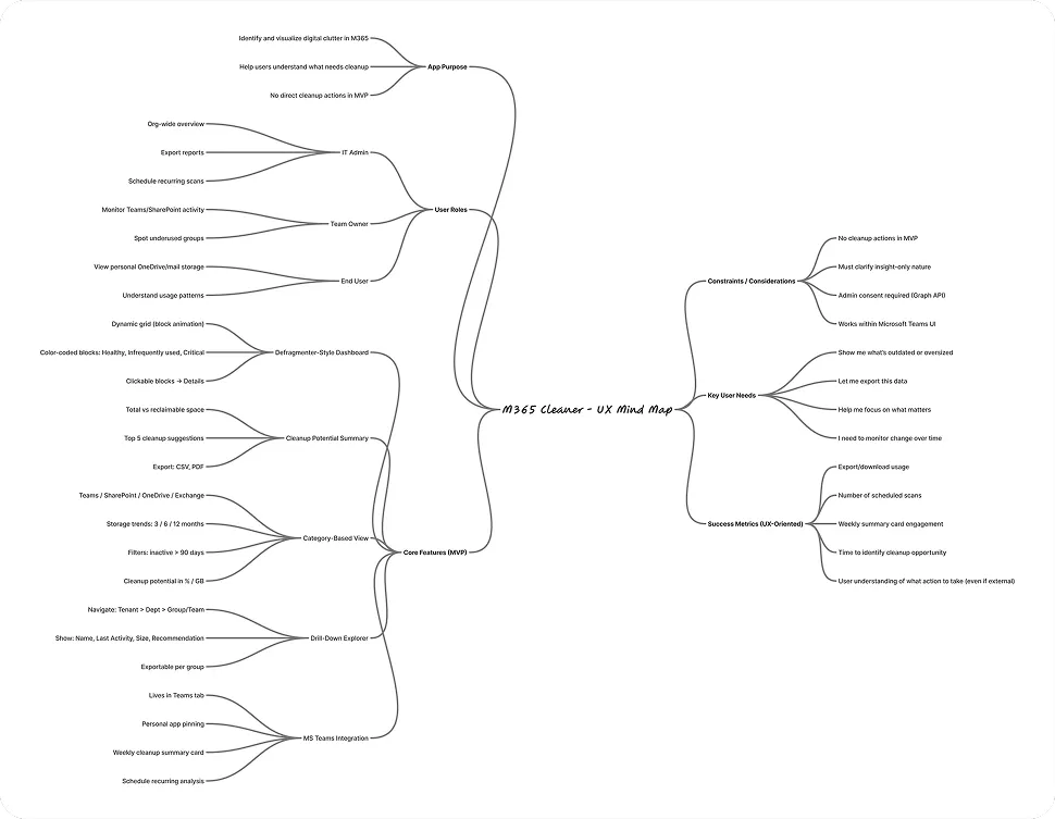
I framed the product as jobs rather than features: an IT admin reporting to leadership, a team owner keeping a workspace tidy, an end user watching a mailbox fill. The MVP scope fell out of that map, including what to leave out.
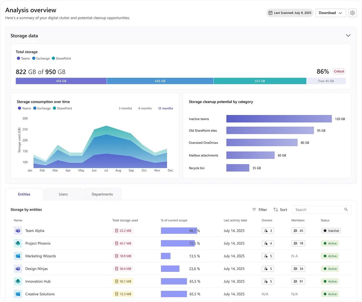
Capacity, trend, and where to cut.
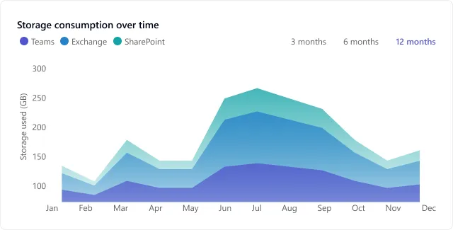
The landing screen answers three questions in one scroll: how full are we, how did we get here, and what would free the most space. Everything below it is a drill-down, never a new mental model.

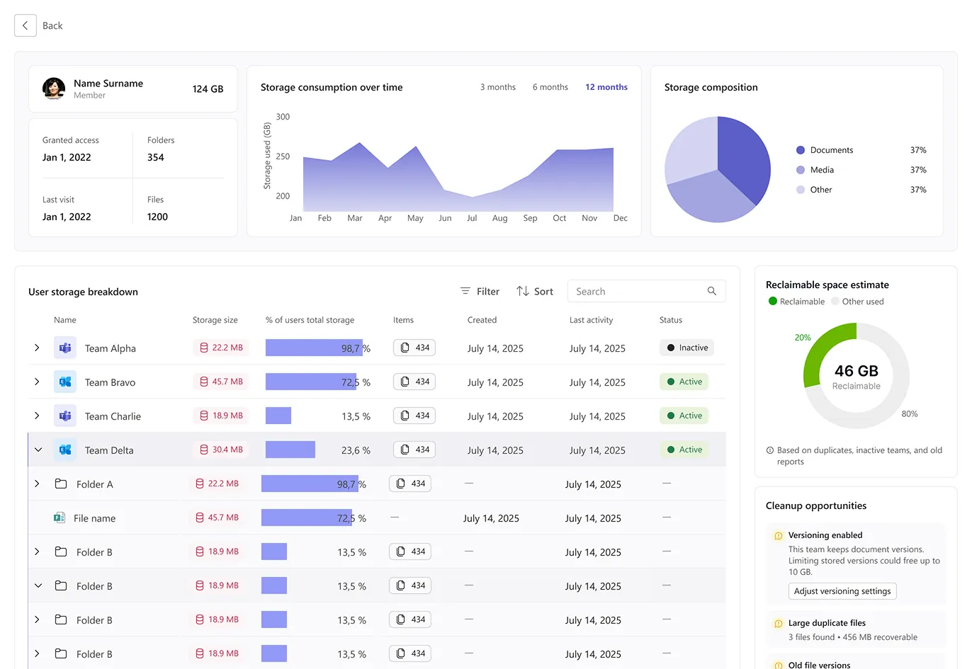
Tenant, team, person, folder.
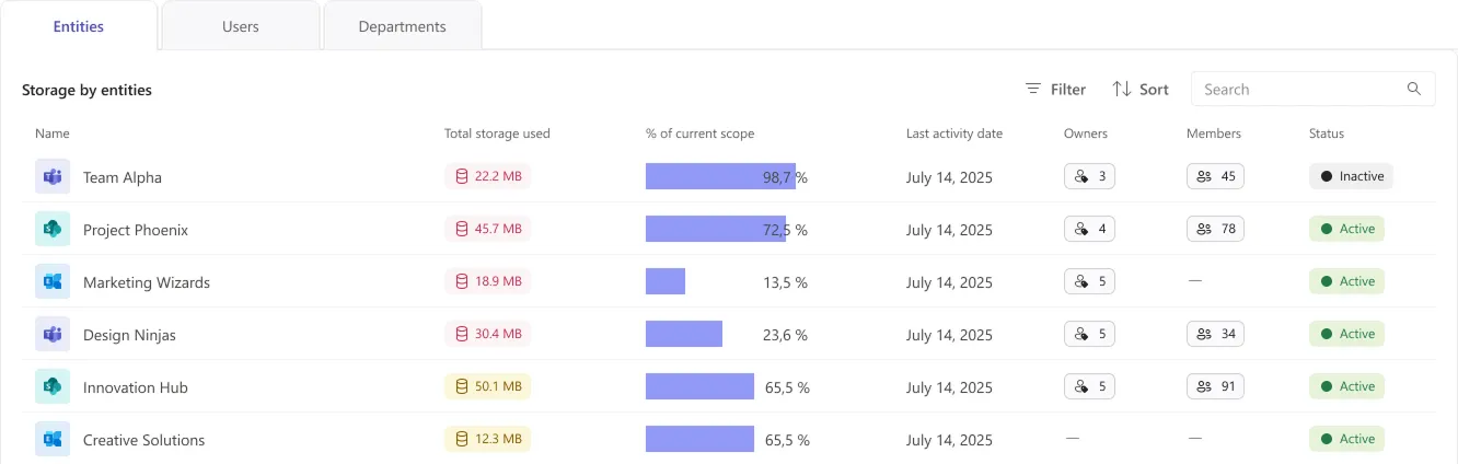
One layout repeats at every level: identity card, trend, composition, then an expandable table. The right rail always answers the only question that matters, how much of this can I actually get back, and names the specific opportunity behind the number.