See the clutter first.
A Microsoft 365 storage analytics app that shows where a tenant's space actually goes, how much of it is reclaimable, and which teams to look at on Monday morning.
Context & Problems
Context
A Microsoft 365 tenant buys storage once and spends it in four places.
Teams, SharePoint, OneDrive and Exchange each keep their own books, in their own admin
centre, on their own refresh cycle.
The quota is a single tenant-level number. The evidence for it is not. An admin sitting at 86% capacity can name the number but cannot name the cause.
As tenants grew, admins told us the same story:
- • Four admin centres, four numbers, no shared denominator
- • Growth only became visible after the quota alert
- • No way to separate live content from dead weight
- • Every review ended the same way — buy more storage
The Core Problem
Admins could see how full the tenant was. They could not see what was safe to remove. The signals that would answer that — last activity, duplication, version history, retention — were either:
- Held in a different admin centre
- Reported per workload, never per tenant
- Available only as a raw export
- Missing a reason, so nobody could defend the deletion
Capacity planning was procurement, not hygiene.
My Role & Constraints
 Me
Me I owned the design of:
- • The analysis overview (tenant layer)
- • The entity page (team, site, mailbox and member layer)
- • The reclaimable-space model and its wording
- • Filtering, sorting and the empty states around them
- • The settings concept that governs the scan itself
Responsibilities:
- • Stakeholder interviews across IT, team owners and end users
- • Jobs-to-be-done synthesis
- • Information architecture and MVP scoping
- • Interaction and visual design inside the Teams shell
- • Writing every number's explanation
Scope & Constraints
- Insight-only MVP — the app must not delete anything
- Lives inside the Microsoft Teams shell and its theming
- Admin consent required through the Microsoft Graph API
- Large tenants: thousands of entities, users and departments
- Every view has to leave the app as a report
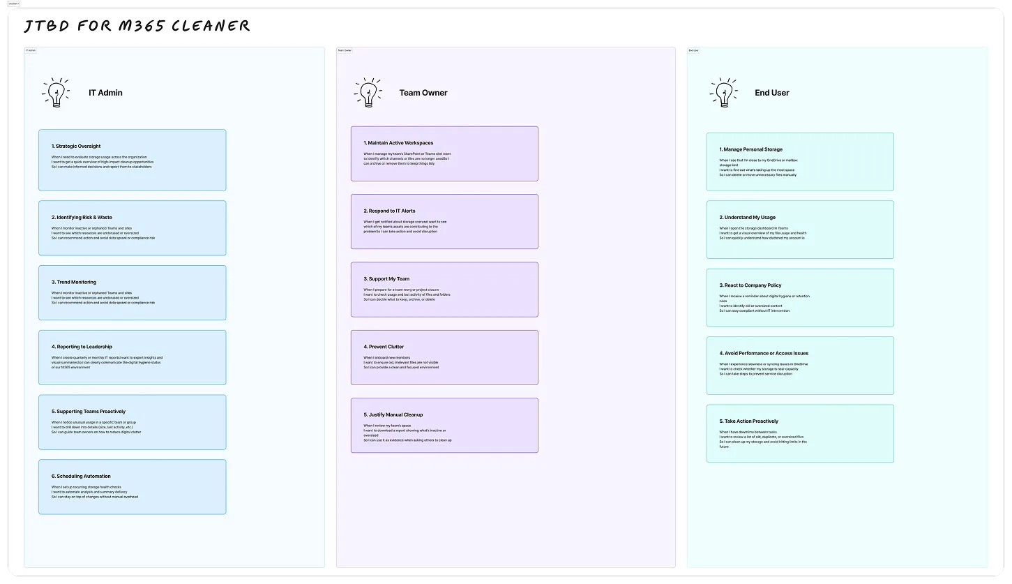
Three Roles, Sixteen Jobs
I framed the product as jobs before it was framed as features.
The same tenant is read by three people with three horizons. An IT admin answers to leadership. A team owner keeps one workspace tidy. An end user watches a mailbox fill up and cannot explain why.
Writing sixteen jobs across those roles did two things: it produced the MVP scope, and it produced the list of things to deliberately leave out.
Reframing the Problem
The gap was not data. It was permission to act on it.
Every admin we spoke to could already produce a storage number. What none of them could produce was a defensible sentence: this team, this much, and here is why removing it is safe.
That reframing moved the product away from "show more data" and toward "make one recommendation you would be willing to forward to your CIO."
Finding 1
Admins did not lack numbers. They lacked a reason they could defend to a team owner.
Finding 2
The three roles ask the same question at different scales — tenant, workspace, person.
Finding 3
“Reclaimable” is meaningless unless the product also names what makes it reclaimable.
Finding 4
The real deliverable is the report to leadership. The screen is only the draft of it.
Finding 5
A product that can delete needs a consent conversation an MVP was not going to win.
From Insights to Product Direction
From buying capacity to reclaiming it.
Strategic DecisionsShip insight, not action
No destructive operations in v1, so trust is never the thing being tested.
One denominator
Every number on every screen resolves back to the same tenant quota.
Name the opportunity, not the size
Each category carries the rule that made it a candidate, in plain language.
One page, three lenses
Entities, users and departments share a layout so the scan only has to be learned once.
Export is a feature, not a footer
Every table leaves the app as a report, because that is what leadership actually reads.
Visual design
Final designs
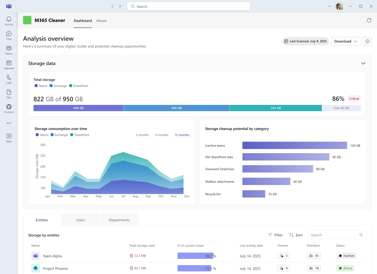
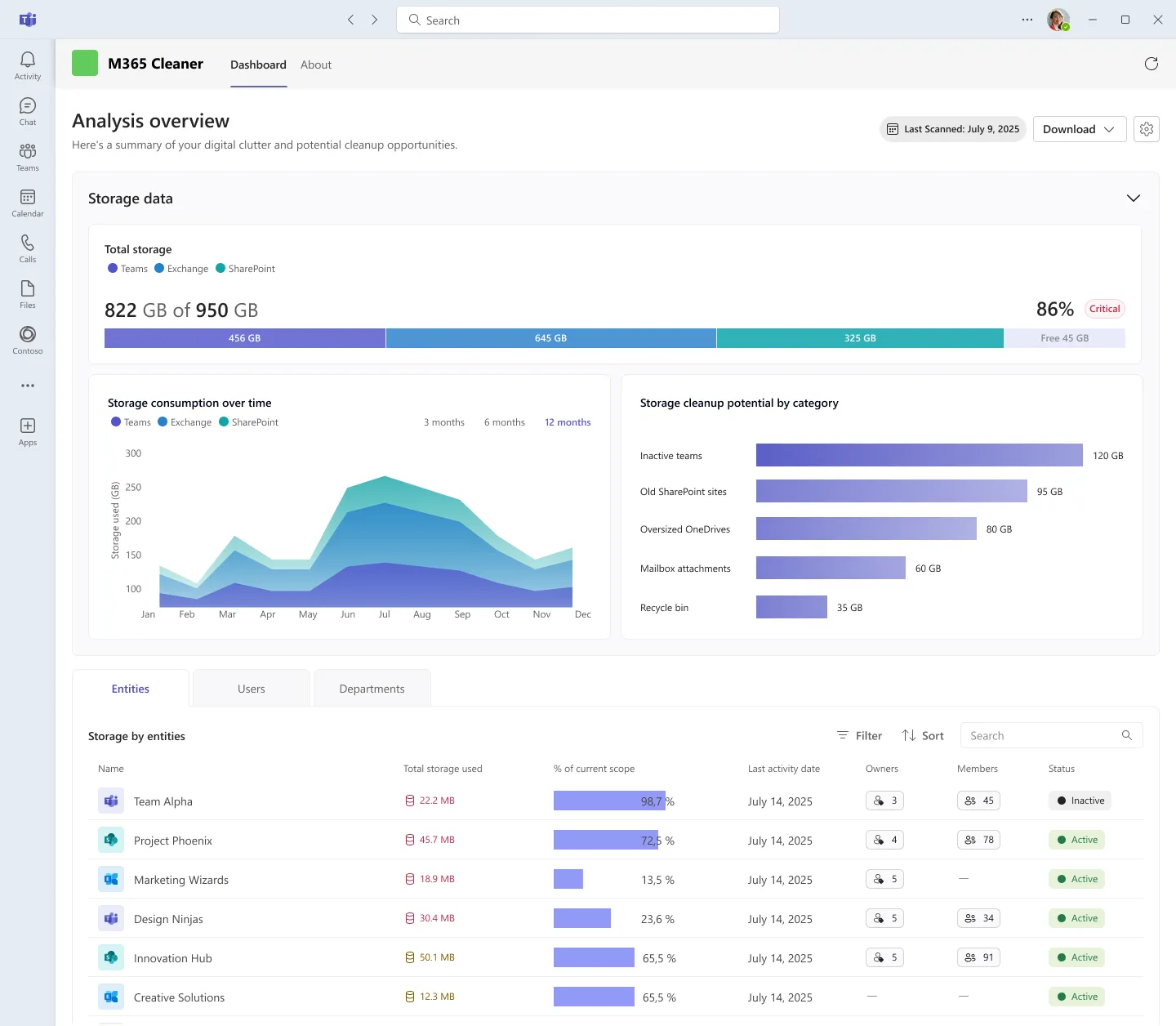
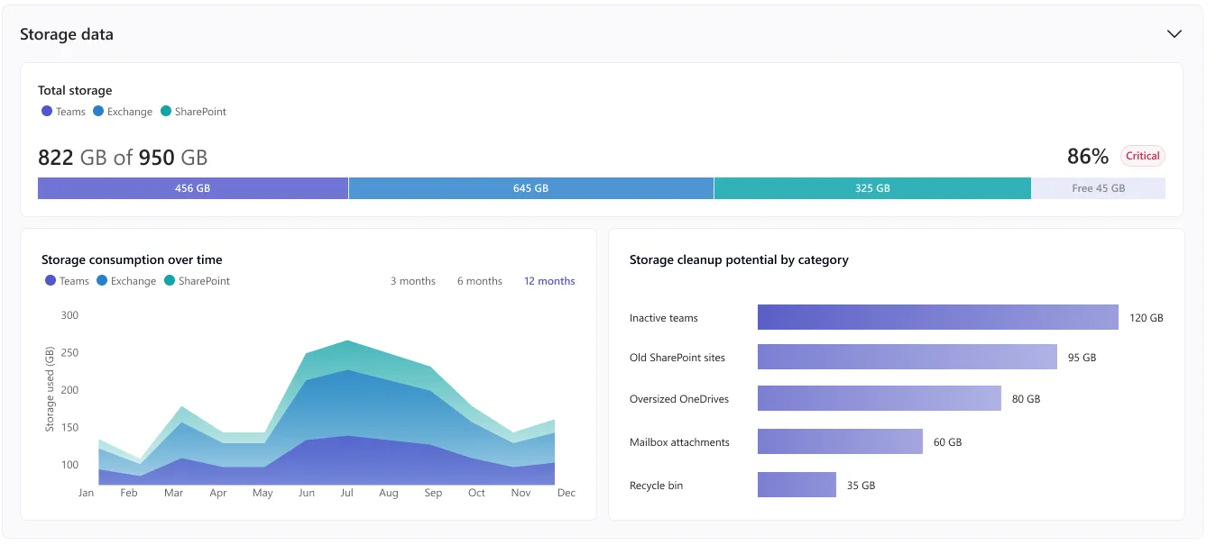
The analysis overview answers three questions in one scroll: how full are we, how did we get here, and what would free the most space. Everything below it is a drill-down, never a new mental model.
The first cut was a metaphor
What we cut, and why the chart survived instead.
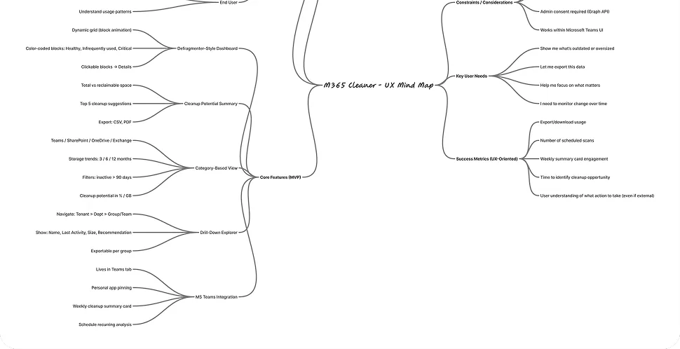
The jobs board turned into a feature map before it turned into a screen. Five branches came out of it — a defragmenter-style dashboard, a cleanup summary, a category view, a drill-down explorer and the Teams integration. Four of them shipped almost unchanged. The one at the top did not.
V1 — the defragmenter idea
- A grid of coloured blocks looks busy, not urgent
- Block size answers “how much”, never “how much is safe”
- Nothing in it could be pasted into a report
V2 — what shipped, and why
- One bar carries the quota, so the denominator is never in doubt
- Categories are ranked by reclaimable space, so the first row is the first job
- Every band exports as-is
The first concept borrowed the disk-defragmenter metaphor: a grid of colour-coded blocks
that animate as the tenant is scanned. It demoed beautifully. In review it fell apart for a
plain reason — an admin could see that the tenant was messy, but could not read a single
number out loud, and could not put the grid in front of anyone else.
We kept the ranking idea and dropped the metaphor. A quota bar, a trend, and five ranked
categories say the same thing in a form that survives being pasted into a slide.
Information Hierarchy That Scales
From one number to the row you act on.
The overview is stacked in the order an admin actually asks the questions: state first, then change, then the list. Each band is legible on its own, so a screenshot of any one of them still means something.
-
The quota bar is the only place the tenant total is stated, and every other number on the page is a share of it.
Splitting it by workload turns an abstract 86% into four segments an admin can argue about.
-
The trend answers whether the situation is getting worse, and how fast, over three, six or twelve months.
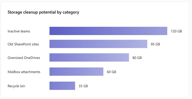
Beside it, cleanup potential ranks the five categories by how much space each would return.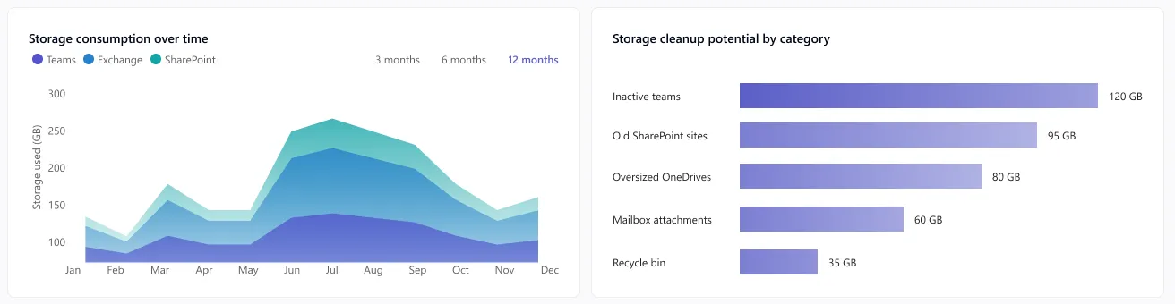
-
The table turns the ranking into named rows: what it is, how much it holds, when it was last touched, who owns it.
This is where the scan stops being a report and becomes a shortlist.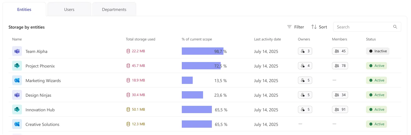
Surfacing the Right Signals
Four signals, and the words that make them defensible.
One bar, one denominator
The quota bar is the anchor of the whole product. It states the tenant total once — 822 GB of 950 GB — and splits it across the three workloads that own it. Every percentage further down the page, and every percentage on the entity pages, is a share of this bar. Fixing the denominator was the single change that stopped admins comparing numbers that came from different admin centres.
A threshold, not just a number
86% on its own is a fact. “86% · Critical” is a decision. The badge reads the tenant against the critical size and inactivity thresholds set in Settings, so the same figure can be routine in one tenant and urgent in another without the admin doing the arithmetic.
Change, not only state
Capacity problems are noticed too late because most tools only report the current figure. Stacking twelve months by workload shows which service is driving the growth, and the three / six / twelve month switch matches the reporting cycles admins already run on.
Ranked by what it returns
Cleanup potential is deliberately ordered by reclaimable space rather than by workload or alphabetically. The top bar is the first job of the week. Five categories was the ceiling: enough to cover the tenant, few enough that the whole list is read.
Every category had to carry its rule
A bar labelled “Inactive teams · 120 GB” invites the obvious question, and an admin who cannot answer it will not act on it. Each category states the rule that put it on the list, in the same words the settings page uses to define it.
Inactive teams
Teams with no activity in the last 90 days — candidates for archiving or deletion.
Old SharePoint sites
SharePoint sites without recent access — often legacy or abandoned workspaces.
Oversized OneDrives
User OneDrives containing redundant or oversized files — high reclaimable space.
Mailbox attachments
Exchange mailboxes with attachments above the defined size threshold.
Recycle bin
Deleted items still retained in recycle bins across M365 services — safe to clear.
And so did every segment of the bar
“Teams” does not mean what a Teams admin assumes it means — channel files live in SharePoint. Spelling out each segment prevented the most common misreading of the whole dashboard.
Teams
Includes Teams chat files, channel documents, and shared content stored in SharePoint.
Exchange
Covers all mailbox data: emails, calendar items, and attachments.
SharePoint
Storage used by SharePoint sites, document libraries, and site collections.
Free
Available capacity not yet consumed by M365 services.
From Overview to Shortlist
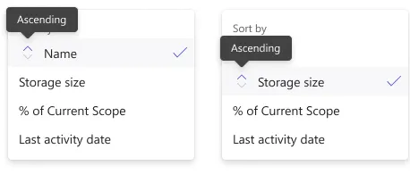
One table, three lenses, and the controls that survive a thousand rows.
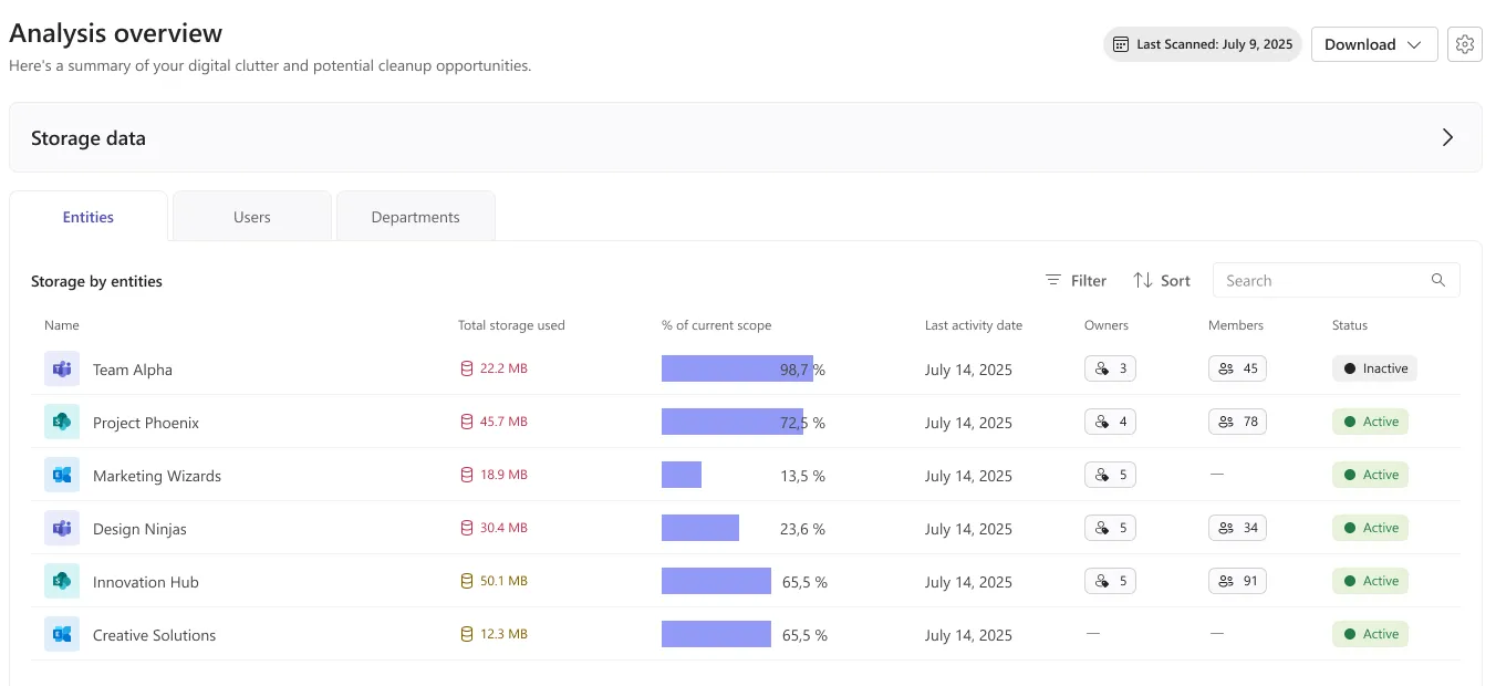
The same scan is read three ways. Entities is the workspace view an IT admin triages from, Users is the view a helpdesk needs, and Departments is the view leadership asks for by name. Swapping the lens never changes the layout — only the noun in the first column.
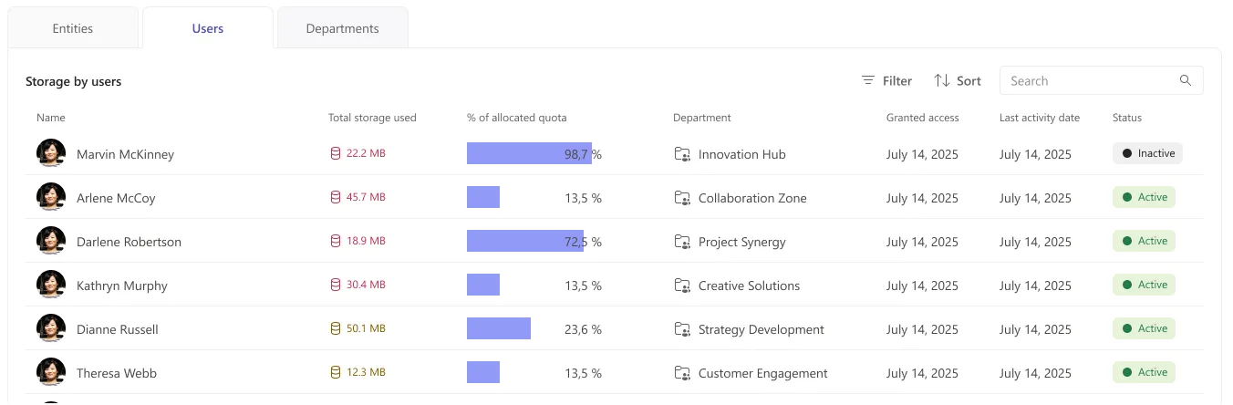
Users: the same question, asked of people
The user lens keeps the identical column rhythm and swaps share of scope for share of allocated quota, because a person has a quota and a workspace does not. Department is added so a single row can be escalated to the right manager without a second lookup.
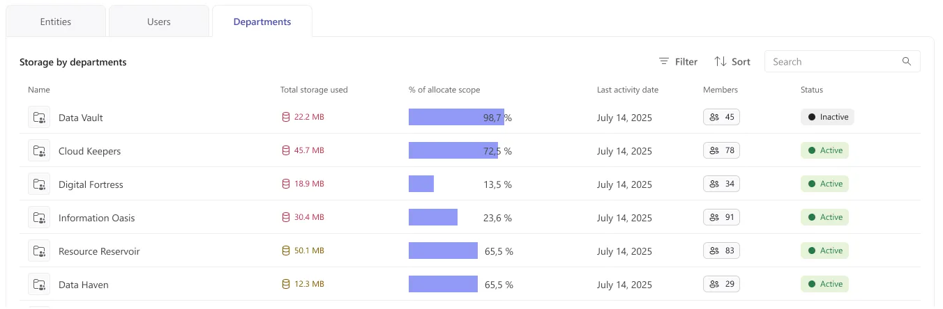
Departments: the view leadership asks for
Departments aggregate the other two lenses into the unit that owns a budget. This is the lens that gets exported: it is the only one where a storage figure maps onto someone who can approve a decision about it.
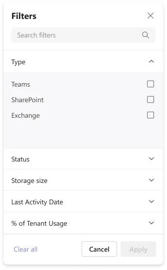
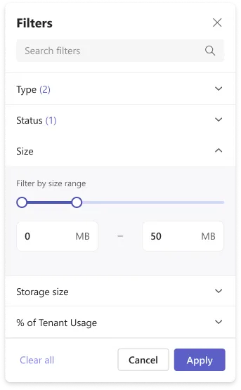
Filters that stay visible
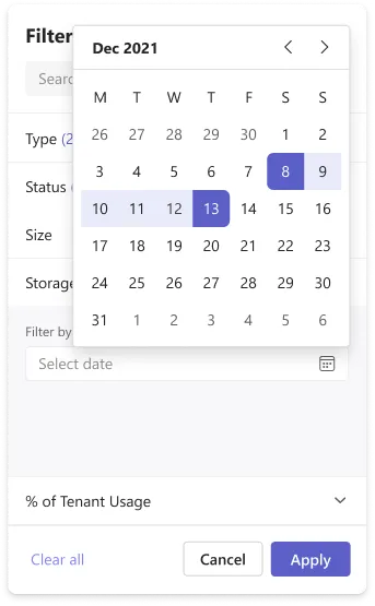
Six facets can be active at once. Rather than hide them behind a count, every applied filter becomes a removable chip on the table header, so the scope of the number on screen is always readable — and always reversible one chip at a time.

Collapse the signals once you know what you are hunting
An admin who already knows the answer does not need the charts again. Collapsing the storage data panel hands the whole viewport to the table and keeps the header, the scan date and the export where they were. It is the difference between a monthly review and a Monday morning.
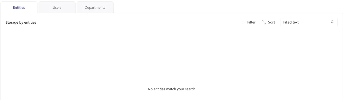
An empty result is still an answer
With six facets stacked, an empty table is common and it is not a failure. The controls stay in place and the message names the cause — the search, not the scan — so the way out is one chip away rather than a page reload.
One Template, Four Contexts
Identity, trend, composition — then the evidence.
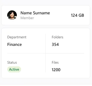
Clicking any row opens the same page: who or what this is, how its storage moved, what it is made of, and a right rail that answers the only question worth clicking through for — how much of this can I actually get back.
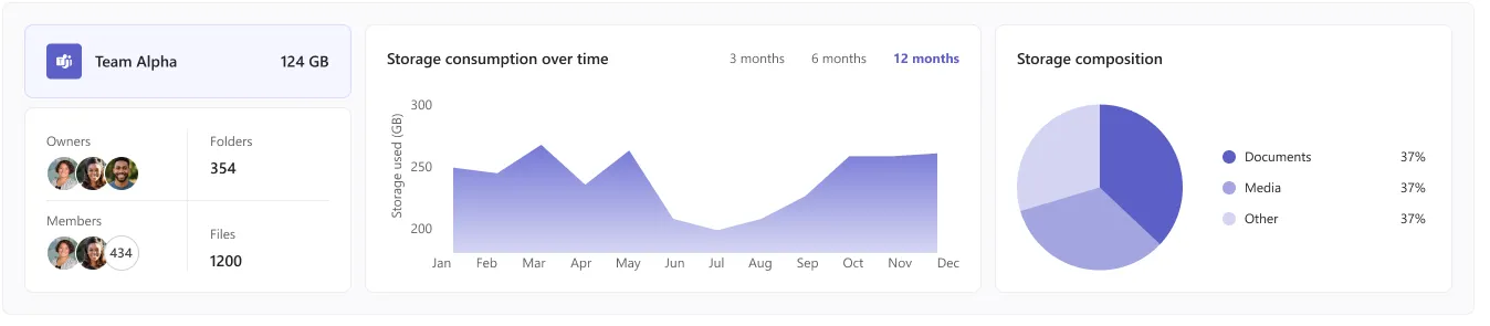
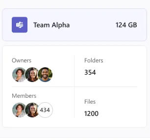
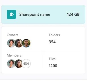
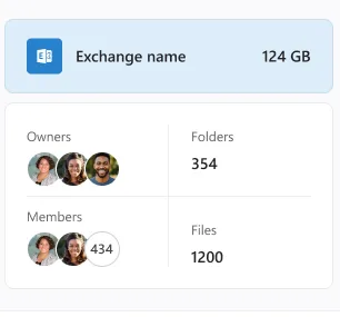
The card changes, the page does not
A team has owners and members. A mailbox has neither. A person has a department and a status. Only the identity card is rewritten per type — everything to the right of it stays where the admin left it.
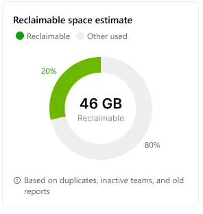
Reclaimable space estimate
The number the whole product exists to produce. A donut rather than a bar, because this is a share of one entity rather than a share of the tenant, and the footnote names its three inputs — duplicates, inactive teams, old reports — so the figure can be challenged rather than merely believed.

Cleanup opportunities
The estimate broken back into its causes, each with the evidence attached: three duplicate files, twelve files with five or more versions, two folders untouched for ninety days. The first item carries the only action in the MVP that is not a report — a link out to the versioning settings, which changes a policy rather than deleting content.
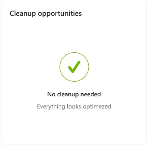
Nothing to do is a result worth showing
A tenant-wide audit is only credible if it can also clear a team. The healthy state gets the same card, the same position and a plain sentence, so an admin can screenshot it as evidence that a workspace was reviewed and passed.
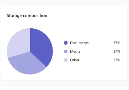
Composition, in three buckets
Documents, media and other. Three buckets rather than a file-type breakdown, because the decision this chart supports is coarse — is this a document library that grew, or a video dump — and a longer legend would push the entity table below the fold.
Governing the Scan Itself
Where “inactive” gets its definition.
Every flag on the dashboard comes from a threshold, and a threshold nobody can see is a number nobody can defend. Settings is where the vocabulary of the product is set — and where an admin can prove to a sceptical team owner that the rule, not the tool, put their workspace on the list.
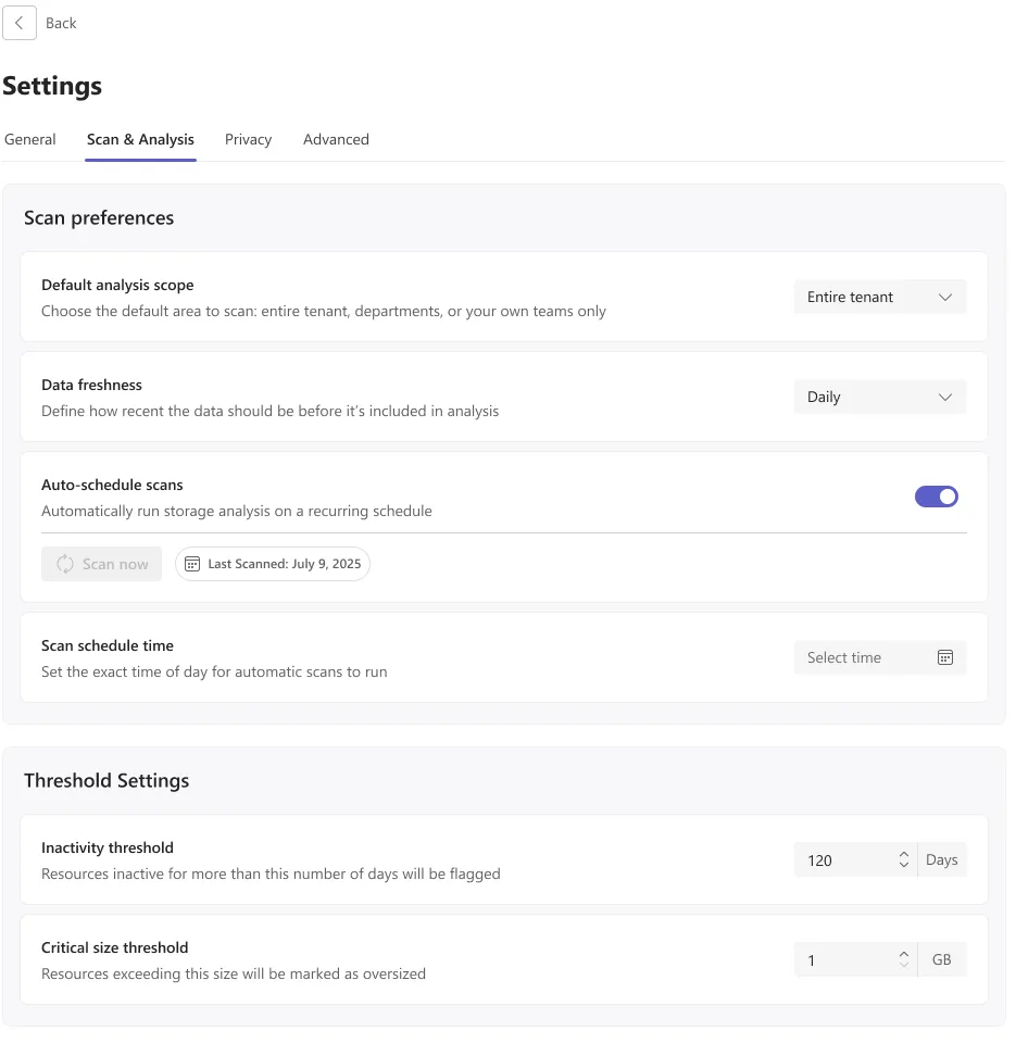
Scan & analysis
Scope, freshness and schedule sit above the two thresholds that define the whole product's vocabulary: inactivity in days and critical size in gigabytes. Placing them on the same page as the schedule makes the causal chain visible — change 120 days to 90 and the next scan flags a different set of teams.
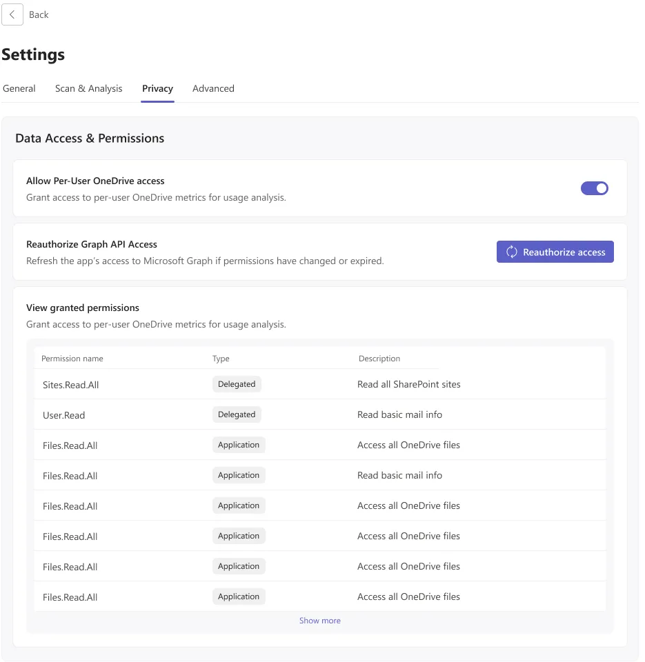
Privacy & permissions
An app that reads every mailbox and OneDrive in a tenant has to show its hand. Per-user OneDrive access is a switch rather than an assumption, and the granted Graph permissions are listed in full with their type, so the person who signed the consent can audit it later without leaving the app.
Conclusion
Achievements / insights
The hardest decision on this project was subtractive. Shipping an MVP that deliberately cannot delete anything sounds like a weaker product, and it turned out to be the reason admins were willing to install it — the app can be wrong about a team without costing anyone their files. Fixing a single denominator, ranking categories by what they return, and writing the rule behind every flag did more for confidence than any additional metric would have.
What the design review showed
In the tenant used for the design review, the five cleanup categories accounted for 390 GB against a 950 GB quota — 41% of everything the organisation had paid for, sitting in content nobody had opened in ninety days. That single sentence, not the dashboard, is what moved the conversation from procurement to hygiene.
What I would design next
The obvious v2 is the one the MVP refused: acting on the shortlist from inside the app. That needs an approval trail, a per-entity undo window and a delegation model that lets a team owner confirm their own workspace — three problems that are governance design, not storage design, and each one deserves the same treatment this scan got.