Licensed on day one.
A standalone portal where a Microsoft 365 administrator turns a marketplace subscription into working seats: grant consent once, assign licenses in bulk, or hand the job to a rule that runs every morning.
Context & Problems
Context
Solutions2Share sells its apps through the Microsoft commercial marketplace. A purchase
creates a subscription.
It does not create a working product.
Somebody still has to sign in, grant tenant-wide admin consent, choose a plan and hand out seats before a single colleague can open anything. That handover happens exactly once, usually on the day the invoice lands, and often by a person who has never seen the product and did not choose to buy it.
Which is where it kept going wrong:
- • The buyer and the administrator are frequently not the same person
- • Admin consent is a frightening dialog, and there is no second chance to explain it
- • Assigning hundreds of seats is a manual job nobody finishes
- • Nothing told anyone that 438 paid seats were sitting unassigned
The Core Problem
Between the purchase and the first working seat there are four steps, and every one of them can fail quietly:
- Signed in with the wrong account
- Consent refused, or attempted by someone without the rights
- The subscription not yet visible to the portal
- Licenses bought, and never handed out
All four failures reach support as the same sentence: it doesn’t work.
My Role & Constraints
 Me
Me I owned the design of:
- • The entry sequence: sign-in, consent, plan selection
- • The assignment screen and its counters
- • Bulk selection and the actions that depend on it
- • The license automation rule builder
- • Every empty and error state, and the sentence inside it
Responsibilities:
- • Reading the support backlog as research
- • Mapping the purchase-to-first-seat journey
- • Interaction design and visual design
- • Writing the microcopy, including the consent explanation
- • Specifying every state the portal can be in
Scope & Constraints
- A standalone web portal, outside Teams, so none of the Teams shell’s affordances apply
- Tenant-wide admin consent is required before anything at all can be read
- Subscription state comes from the Microsoft marketplace and is not ours to fix
- Multilingual from the first release
- The audience is an IT administrator doing this once, under time pressure
Reframing the Problem
The product is not the table. It is the four steps in front of it.
The brief was “a screen where admins assign licenses”, and that screen is genuinely simple — a list, a toggle, a button. Reading the support backlog reframed it. Almost nothing was about the table. It was about arriving at the table and finding the wrong thing there.
So the design problem became the sequence, and the states inside it: what the portal says when it cannot yet show you anything, and whether that sentence gets you unstuck without a support ticket.
Finding 1
Almost every first-week ticket was about a state, not a feature.
Finding 2
The person granting tenant-wide consent needs a reason first, not a permissions list.
Finding 3
Assigning 567 seats one toggle at a time is not a task anyone completes.
Finding 4
An unassigned license is invisible money, and nobody in the room was counting it.
Finding 5
The portal cannot fix a marketplace problem, but it can name it and offer the next step.
From Insights to Product Direction
Design the handover, not just the destination.
Strategic DecisionsExplain consent before asking for it
One screen, one sentence and a video, then one button that only has to be pressed once.
Make the unassigned seats visible
Assigned and unassigned get equal weight in the header, because only one of them is a problem.
Bulk is the default path
Select many, act once. The per-row toggle stays for the exception, not the routine.
Turn the recurring case into a rule
A daily automation with conditions, so onboarding a new hire stops being a monthly chore.
Every dead end names its cause
Three failure screens, three plain sentences, one button each. No blank pages.
Visual design
Final designs
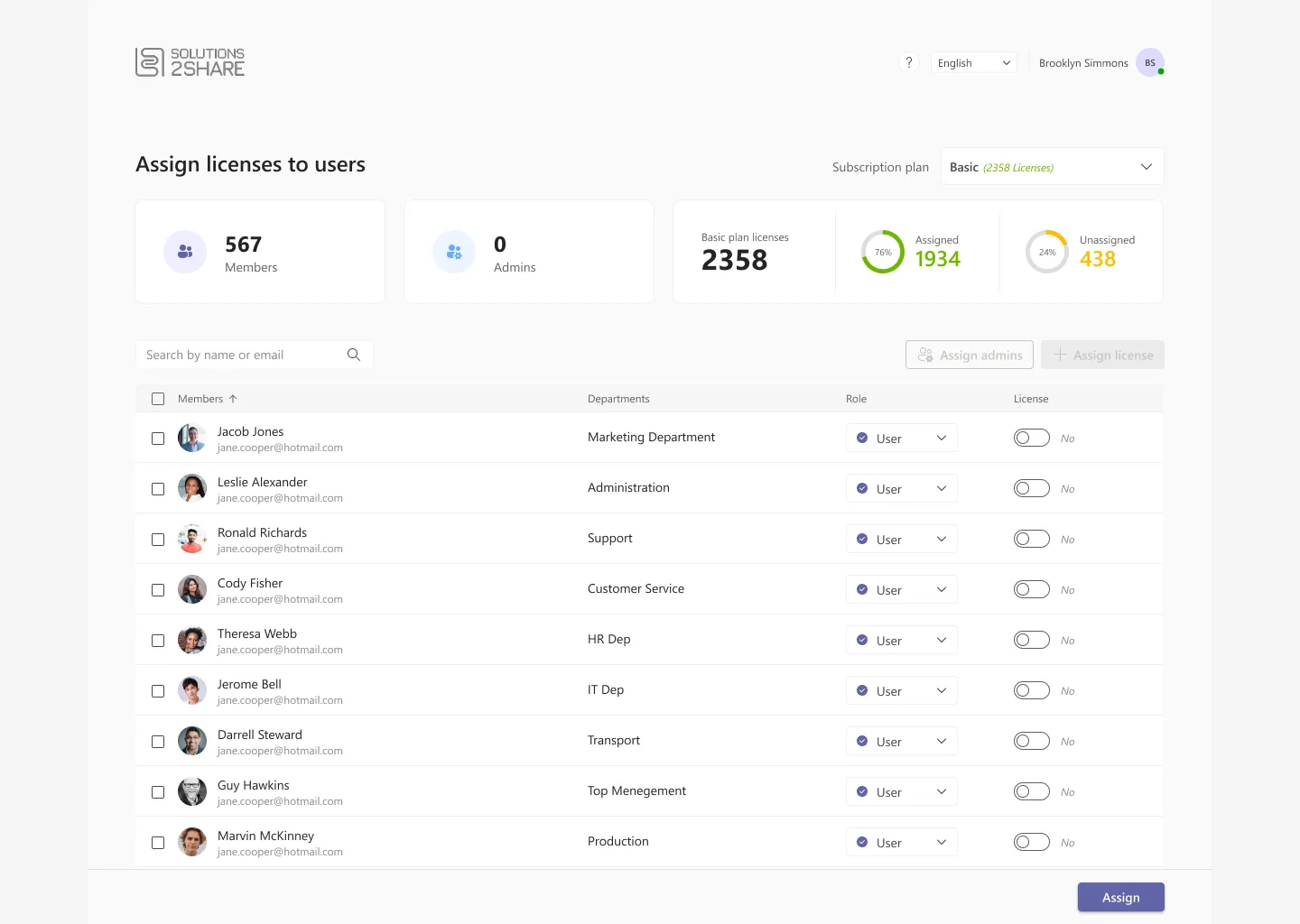
One screen carries the whole job: what you own, what you have spent, who is waiting, and the two actions that change any of it. Everything above the table is a number you can act on; everything below it is the acting.
The First Five Minutes
Three screens stand between a purchase and a working seat.
Each one is a single decision on an otherwise empty page. That emptiness is deliberate: these screens are read once, by somebody who is not yet a user of anything, and a second option on any of them is a second way to get it wrong.
-
Sign-in is a single card with a single button, because the only failure worth preventing here is signing in with a personal account.
Naming Microsoft on the button does more for that than any instruction underneath it would.
-
The welcome screen states what the portal is for and what has to happen next, in two short paragraphs.
The video sits beside it rather than behind a link, because the person about to grant tenant-wide consent is usually the person least able to judge whether they should.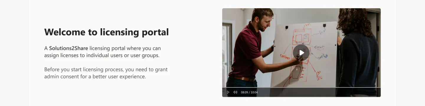
-
Consent is then its own card with nothing else on it, and one line of reassurance: you only need to grant permissions once.
Separating the explanation from the action means the scary click is never the first thing on the page.
Surfacing the Right Signals
Four numbers, and only one of them is a problem.

The plan comes first
A tenant can hold several subscriptions, and every number below this control belongs to exactly one of them. Putting the picker on the same line as the page title — with the license count repeated inside it — means the question “which plan am I looking at” is answered before the counters are read rather than after a confusing conversation with support.
Members
Everyone in the tenant the portal can see. It is the denominator for everything else on the page, and the first sanity check that consent actually worked: a number here means the directory was read.
Admins, usually zero
The honest default. Whoever bought the subscription is the only administrator until they name another, and showing a zero is a quiet prompt to fix a single point of failure before it becomes one. It is the reason “Assign admins” sits beside “Assign license” rather than in a settings page.
What was paid for
The plan total, stated once, in the largest type in the band. Every other figure on this page is a share of it, which is what stops the assigned and unassigned counts being read as unrelated statistics.
The number that pays for the page
438 licenses out of 2,358 — nineteen per cent of what the organisation bought — sitting with nobody attached to them. Assigned is green and settled; unassigned is amber and open. Giving the two an equal-sized ring rather than a single progress bar is what makes the second one impossible to read as leftover space.
Nobody asked for the unassigned counter. It came out of the observation that a licensing screen is the only place in the company where somebody can see paid capacity going unused, and that the person looking at it is precisely the person who can fix it in two clicks.
Selection Is a State
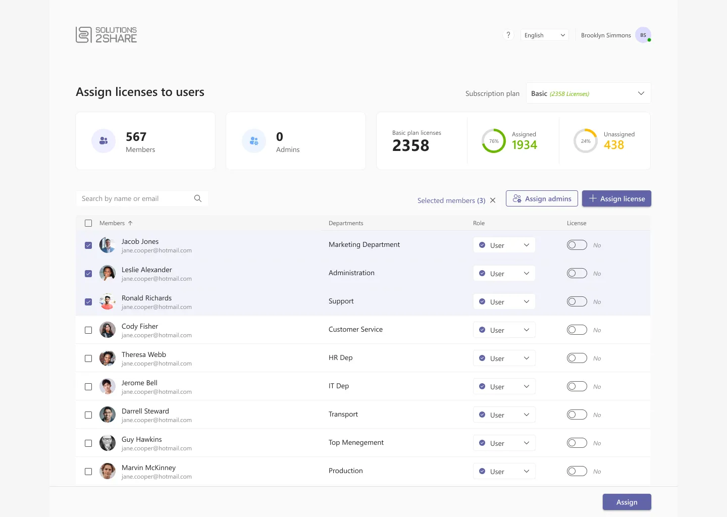
The toolbar is disabled until it has something to do.
Assigning licenses one row at a time is possible and it is not the point. The path the product wants you on is: filter, tick, act once. Which means selection has to be legible from anywhere on the page, and the two actions that depend on it have to be visibly unavailable until it exists.


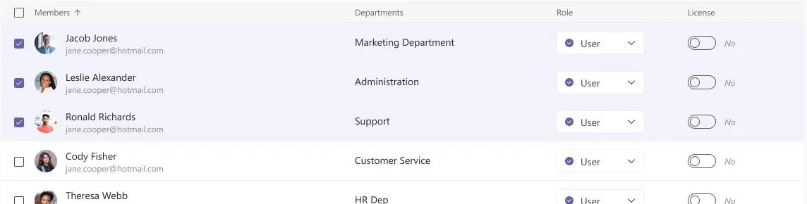
Four columns, and only two of them move
Name and department are who the person is; role and license are what you are here to change. Selected rows take a tint rather than a border so the eye can follow a block of three down the page, and the per-row license toggle stays live throughout — bulk is the default path, not the only one.
Assign is pinned, not appended
With 567 members the page scrolls a long way, and a commit button that scrolls with it is a button that gets lost. Pinning it to a bar at the bottom keeps the end of the task in view for the whole of the task — and separates the one irreversible action from the two toolbar actions above the list.
From a List to a Rule
Bulk assignment solves today. It does not solve next Monday.
Every new hire arrives unlicensed, so the manual job comes back every month. License automation turns it into a standing instruction: a set of conditions, evaluated daily, that assigns a license the moment somebody matches.
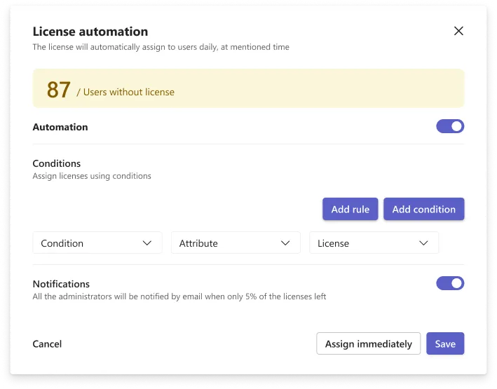
It opens as one sentence
Eighty-seven users without a license, stated in amber at the top, because that number is the reason anyone opened this dialog. Below it, one condition made of three dropdowns. A rule builder that starts empty is intimidating; one that starts with a single row you can read left to right is a form.
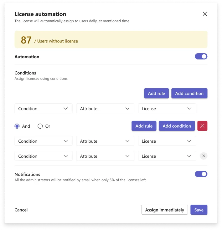
And it grows only when you ask
Add rule creates a group with its own And / Or switch and its own delete control, in a colour that says this whole block goes together. Nesting is the part of every rule builder that gets confusing, so the boundary is drawn once, at the group, and never deeper than one level.
Two commits, not one
Save schedules the rule for tomorrow morning. Assign immediately runs it against the 87 people who already match. Separating them means an admin can try the rule on today’s backlog without waiting a day to find out whether they wrote it correctly.
A warning at five per cent
Automation quietly consumes licenses, so it ships with a notification switch that emails every administrator when only 5% of the plan is left. An automation that can run out of what it spends has to say so before it stops working.
The Screens Nobody Designs
Three of the nine screens are the ones where things have gone wrong.
A portal that is used once has no habit to fall back on. If the first visit lands on a blank page, the next step is a support ticket, so each dead end names its cause in one sentence and offers exactly one button.
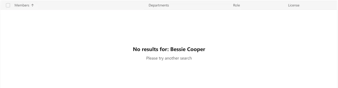
No results, with the search echoed back
Repeating the query inside the message — “No results for: Bessie Cooper” — turns a dead end into a spell-check. The column headers stay in place so the table has not visibly disappeared, and the sentence underneath names the fix rather than the failure.
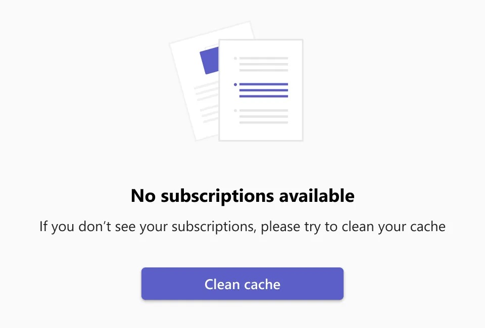
No subscriptions available
This one is almost always a stale token rather than a missing purchase, and it was the single most common ticket. Naming the likely cause and putting the remedy on the page as a button — clean cache — moved it from a conversation with support to one click. The illustration exists so the screen does not read as a crash.
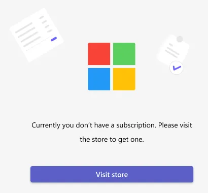
Genuinely not subscribed
The one failure the portal truly cannot fix. So it does not pretend to: it states the situation in one sentence and hands over to the Microsoft store, where the problem actually lives. Keeping this distinct from the screen above matters — the two look identical to a user and need completely different actions.
Conclusion
Achievements / insights
This was the smallest product I have worked on and the one where state design mattered most. There is no daily habit to lean on: an administrator opens the portal once, and whatever happens in those five minutes is the entire relationship. Treating sign-in, consent and the three failure screens as first-class design work — rather than as the things you draw after the table — is what the project was actually about.
What the design review showed
The figure that changed the conversation was 438 of 2,358 — nineteen per cent of the licenses the organisation had paid for, assigned to nobody. It had always been derivable and had never been shown. Putting it in the header beside the assigned count, in amber, gave the page a reason to be opened by somebody other than the person handing out seats.
What I would design next
Reclamation. The portal is good at handing licenses out and has nothing to say about taking them back, so the unassigned count only ever moves in one direction. A last-used column, and a rule that releases a seat after a period of inactivity, would close the loop the automation dialog currently only opens.
