Eating without Guesswork.
A mobile app that turns the low-FODMAP diet into a simple traffic light: scan a product, log how you feel, and finally see which foods set off your gut.
Every meal is a bet you can lose for two days.
The low-FODMAP diet is the most effective way to manage IBS, and one of the hardest to follow. Safe portions differ per food, labels never mention FODMAPs, and the link between what you ate on Tuesday and how you felt on Thursday lives in someone's notes app.
Three people, three versions of the same fear.
 Anna, 29 “I just want to know quickly if I can eat something without worrying.” Suffers from bloating after eating outNeeds fast, reliable food checks on the goRelies on mobile apps but finds them confusing
  Sophie, 35 “I try to track my food, but connecting meals with symptoms is too complicated.” Uses a notes app as a food diaryStruggles to see patterns between diet and symptomsNeeds effortless symptom tracking
  David, 42 “There's too much information online, I don't know what to trust.” Recently diagnosed with IBSFeels overwhelmed by conflicting sourcesWants clear and simple guidance
 The data existed. The experience didn't.



Each app owned one piece of it: credibility, tracking, or scanning. None of them made a decision easy in the aisle of a supermarket. That gap became the product.
One rule the whole app obeys.
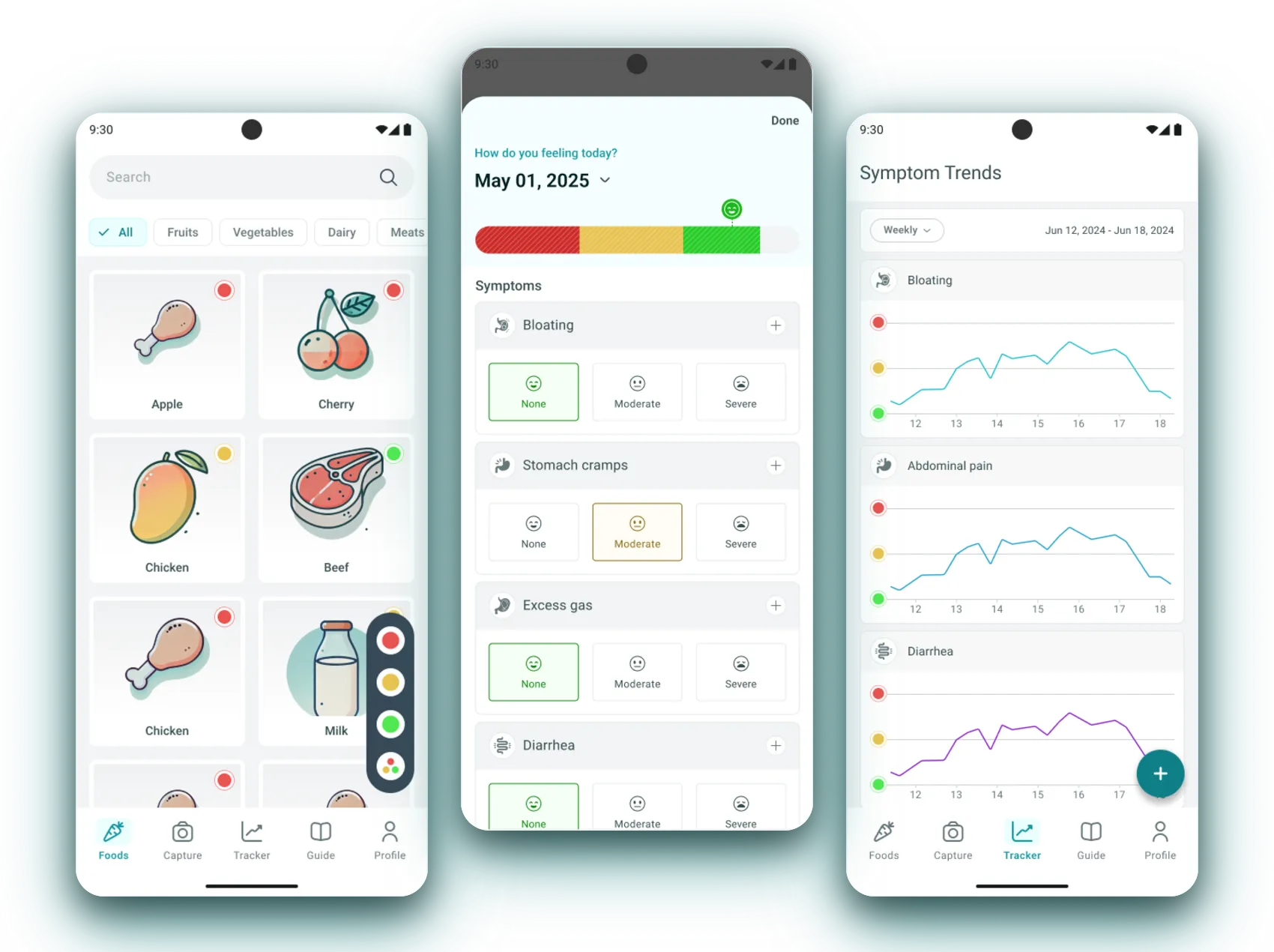
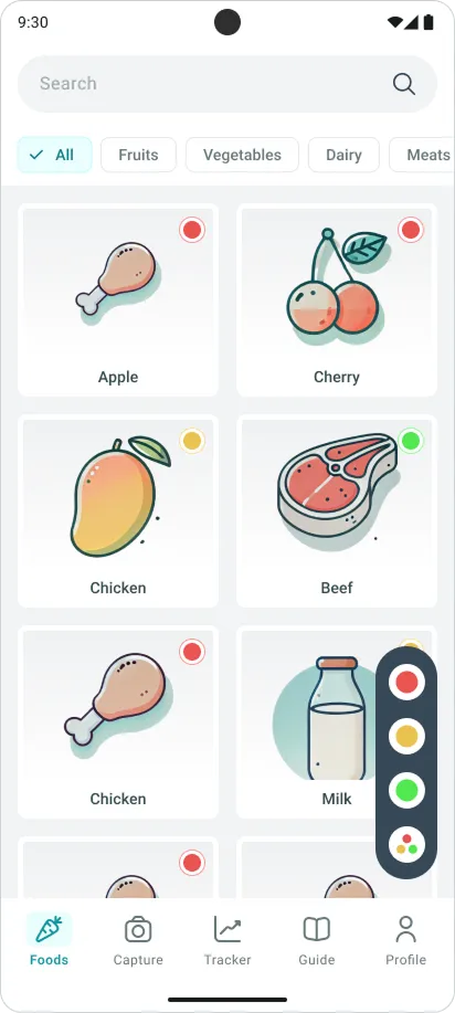
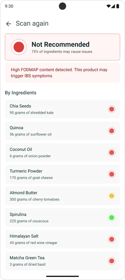
The same three colors label a food, a scanned product, an ingredient, and a symptom day, so reading the app never has to be learned twice.
A library you read with your eyes, not your reading glasses.
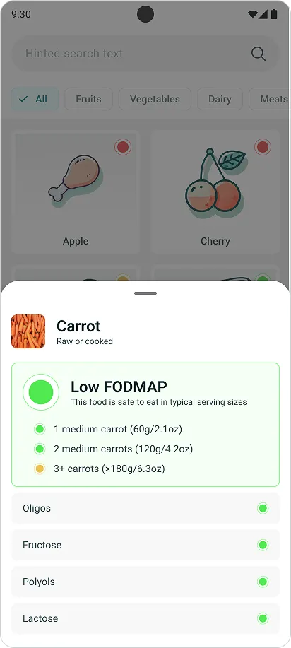
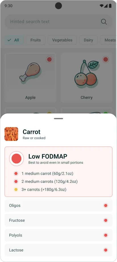
Every food carries its verdict as a dot. Tap one and a sheet breaks the food down by portion and by sugar group (oligos, fructose, polyols, lactose), so a “no” always explains itself.
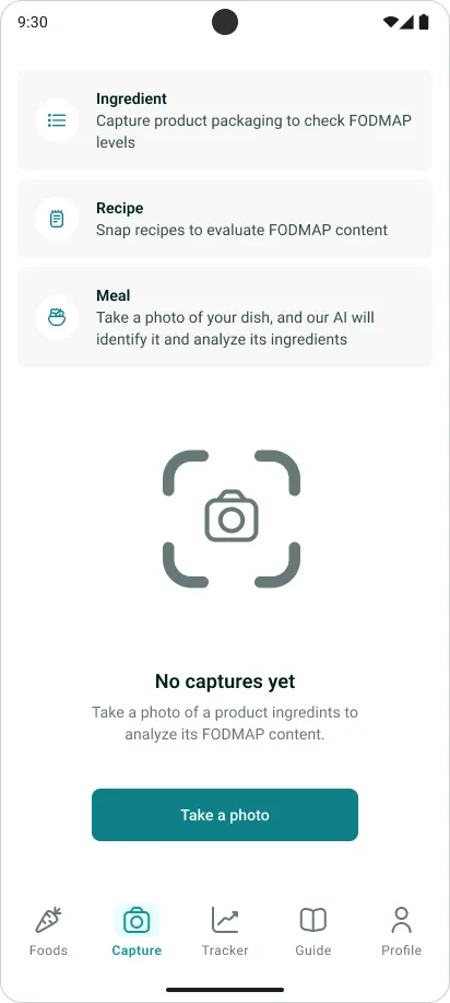
Point the camera at dinner, get a verdict.
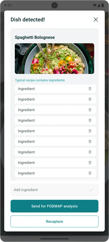
Three capture modes: packaging, recipe, or a plate of food. The AI proposes the ingredient list, the person corrects it, and only then does the analysis run. Editing before the verdict is what makes the result trustworthy.
Logging in taps. Patterns for free.
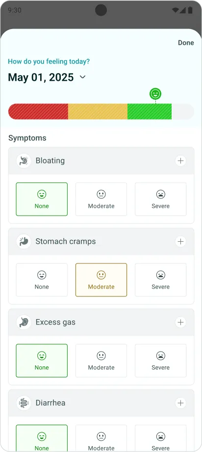
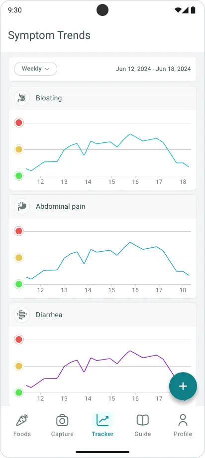
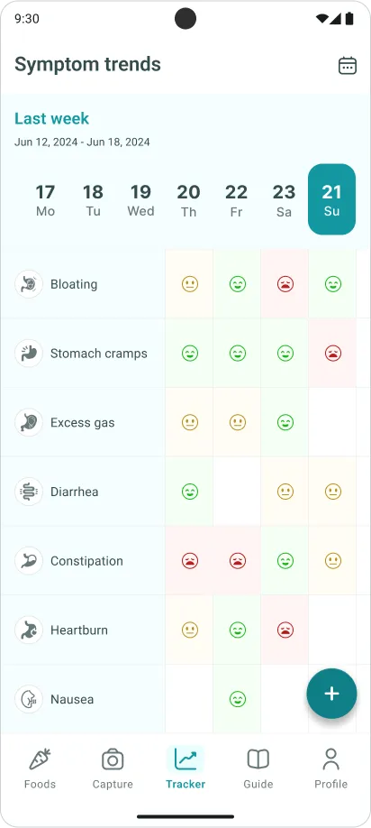
A day is one screen: how you feel overall, then each symptom rated none / moderate / severe. No typing, no scales to interpret. Those taps roll up into weekly trend lines and a colour grid where a bad week is visible before it is described.