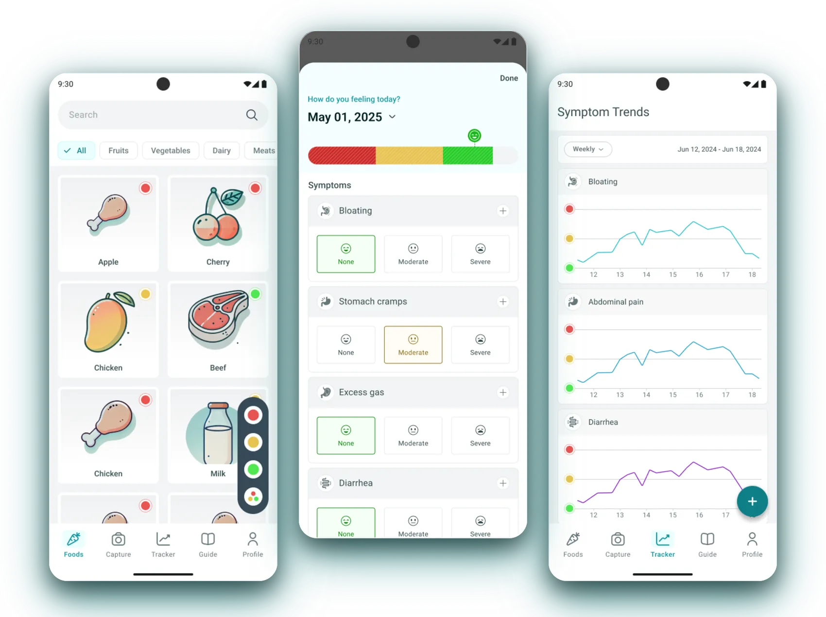
Eating without Guesswork.
A mobile app that turns the low-FODMAP diet into a simple traffic light: scan a product, log how you feel, and finally see which foods set off your gut.
Context & Problems
Context
The low-FODMAP diet is the most effective way to manage irritable bowel syndrome, and one
of the hardest to actually follow.
It is not a list of banned foods. It is a list of thresholds.
One carrot is safe. Three carrots are not. Nothing on a label mentions FODMAPs, the safe portion differs per food, and the link between what you ate on Tuesday and how you felt on Thursday lives in somebody’s notes app, if it exists at all.
Which turns every meal into the same three failures:
- • A verdict is needed in the supermarket aisle, in about a second
- • Portion is the whole answer, and no product surfaces it first
- • Symptom logging is homework, so it stops after a week
- • The advice online contradicts itself, so nothing feels trustworthy
The Core Problem
People with IBS were not short of information. They were short of a decision they could make in the moment it mattered:
- The science exists, in a database nobody reads standing up
- Every meal is a bet that can be lost for two days
- A food diary and a symptom diary that never meet
- No way to tell a safe portion from an unsafe one
They could look it up. They could not decide.
My Role & Constraints
 Me
Me I owned the design of:
- • The traffic-light system the whole product is built on
- • The food library and its portion-aware detail sheet
- • The capture flow, including where the person corrects the AI
- • The symptom tracker and its weekly and trend views
- • The visual language shared across all four surfaces
Responsibilities:
- • Interviews with people living with IBS
- • Persona synthesis and competitive teardown
- • Information architecture and MVP scoping
- • Interaction and visual design for Android and iOS
- • Writing every verdict, so a “no” always explains itself
Scope & Constraints
- A health product, so nothing may read as a medical claim
- The FODMAP data is licensed, not ours to reinterpret
- Decisions happen one-handed, standing up, in poor light
- Colour carries meaning, so it can never be the only carrier
- Android and iOS from the first release
Three Versions of the Same Fear
Different people, different symptom, identical question.
Everyone I spoke to was asking “can I eat this”, and each of them was blocked at a different point in answering it. Anna cannot get an answer fast enough. Sophie can get answers but cannot connect them to how she felt. David cannot decide which answer to believe.
 Anna, 29 “I just want to know quickly if I can eat something without worrying.” Suffers from bloating after eating outNeeds fast, reliable food checks on the goRelies on mobile apps but finds them confusing
  Sophie, 35 “I try to track my food, but connecting meals with symptoms is too complicated.” Uses a notes app as a food diaryStruggles to see patterns between diet and symptomsNeeds effortless symptom tracking
  David, 42 “There's too much information online, I don't know what to trust.” Recently diagnosed with IBSFeels overwhelmed by conflicting sourcesWants clear and simple guidance
 The Data Existed. The Experience Did Not.
Three apps, three-thirds of a product.
The teardown was unusually clean: each competitor owned exactly one of the three things a person needs, and none of them owned the other two.



Credibility, tracking, or scanning — pick one. Not one of them made a decision easy in the aisle of a supermarket, which is the only place the decision is actually made. That gap was the product.
Reframing the Problem
The answer is not a food. It is a portion.
Every existing app answers “is this food low FODMAP”, and that question is close enough to the truth to be dangerous. Carrots are safe at sixty grams and a problem at a hundred and eighty. A yes/no product either forbids food people can eat, or permits food that will hurt them.
Once portion is the unit, the rest of the product follows: the verdict has to be a scale rather than a label, and the same scale has to survive being applied to a scanned dinner and to a symptom day.
Finding 1
A yes/no verdict is wrong often enough to lose trust the first time it is caught out.
Finding 2
Nobody reads a database standing up. The answer has to survive being glanced at.
Finding 3
A food diary and a symptom diary that do not meet are two chores, not one insight.
Finding 4
A “no” without a reason gets ignored the second time somebody wants the food anyway.
Finding 5
Trust is a design problem here, not a data one. The source has to be visible.
From Insights to Product Direction
One vocabulary, learned once, used everywhere.
Strategic DecisionsVerdict first, chemistry second
The colour and the sentence come before the FODMAP groups that produced them.
Portion is the unit
Every food carries a ladder of serving sizes, not a single label.
One palette, four surfaces
Foods, scans, ingredients and symptom days all read red, amber, green.
Let the person correct the machine
The AI proposes ingredients; the analysis only runs after a human has agreed.
Logging in taps
None / moderate / severe, tapped in seconds, because a diary that takes typing dies.
One rule the whole app obeys.
The same three colours label a food, a scanned product, a single ingredient and a symptom day, so reading the app never has to be learned twice. Colour is never alone: every dot is paired with a word, because a third of the audience for a health app cannot rely on hue.
A Library You Read With Your Eyes
List, verdict, and the reason behind the verdict.
The library is the fast path: search or filter, read the dot, move on. Tapping a food opens a sheet that turns the dot into a sentence, a portion ladder, and the four sugar groups that produced it — in that order, because each layer is for a different person.
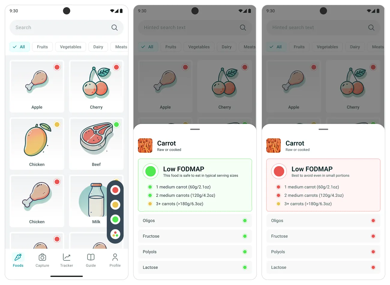
The dot does the work
Every card in the library carries its verdict in the corner, so the list is scannable without opening anything. Cards are illustrated rather than photographed: a drawing of a carrot is recognisable at a glance and, unlike a photo, never implies a particular brand or preparation.
The verdict is a sentence
A coloured dot beside a plain line — “This food is safe to eat in typical serving sizes”. The word carries the meaning and the colour carries the speed, which is what keeps the screen readable for anyone who cannot rely on hue and for everyone else in a badly lit aisle.
A ladder, not a label
One medium carrot is green. Two are amber. Three or more are red, with the gram and ounce weight beside each step. This ladder is the whole argument of the product: it is the difference between a food being banned and a food being budgeted, and it is what every competitor flattened into a single yes or no.
The chemistry, last
Oligos, fructose, polyols and lactose, each with its own dot. Almost nobody needs this layer, and the few who do need it badly — someone eliminating one group at a time cannot use a product that only reports the total. Putting it at the bottom of the sheet serves them without taxing anyone else.
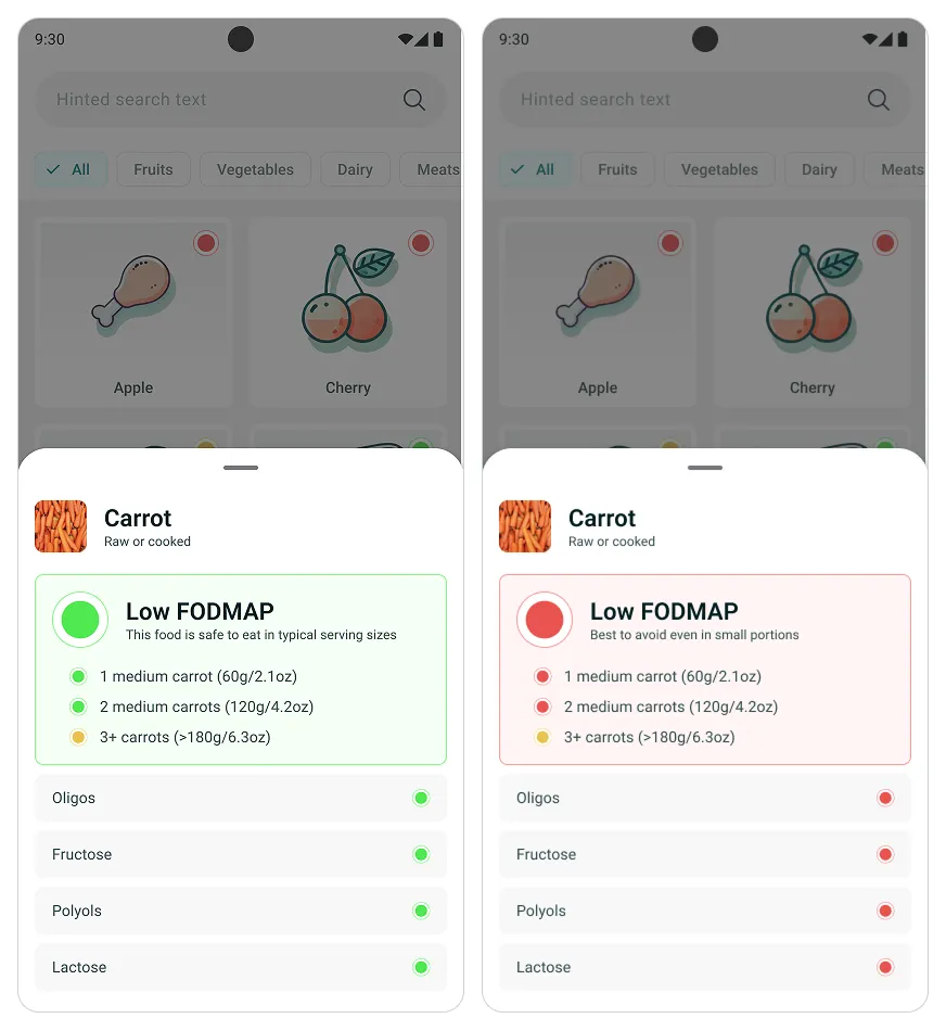
The same sheet, inverted
A red verdict uses the identical layout: same position, same order, same ladder. Nothing moves and nothing new appears, so the difference between a yes and a no is a colour and a sentence rather than a different screen to parse.
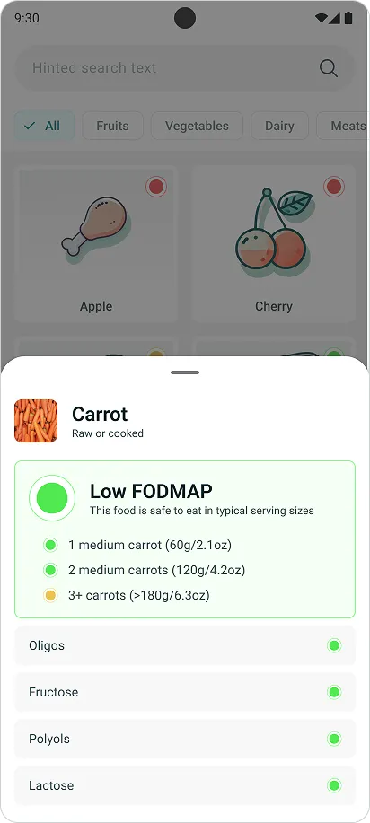
Three layers, one sheet
Verdict, portion, chemistry — stacked so that reading stops naturally at whichever depth answers your question. The sheet slides over the library rather than replacing it, which keeps the list underneath and makes closing it cheaper than going back.
Point the Camera at Dinner
The library covers ingredients. Capture covers meals.
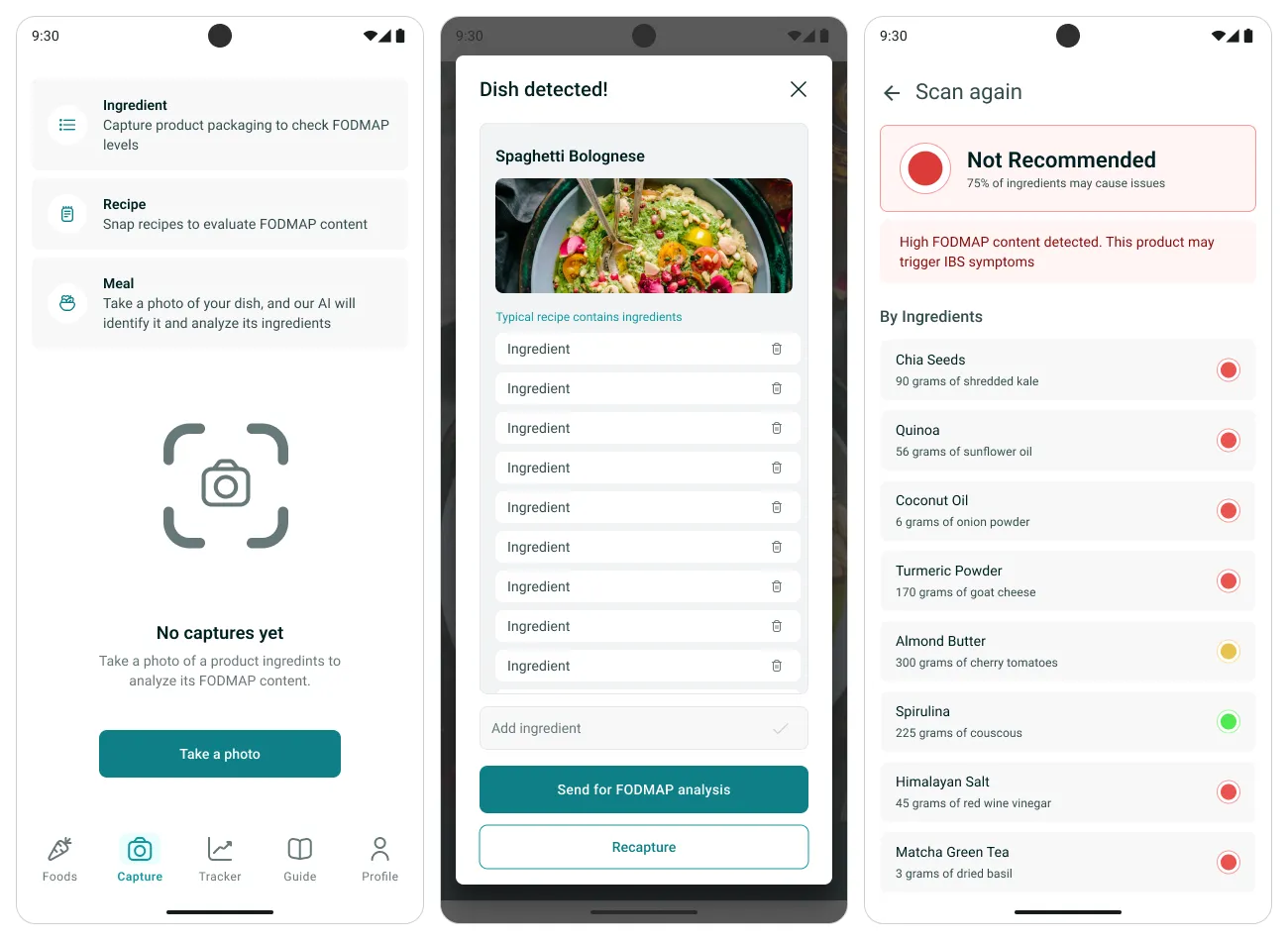
A food library answers questions about carrots. It cannot answer a question about the spaghetti bolognese in front of you. Capture takes three kinds of photograph — packaging, a recipe, or the plate itself — and turns each into an ingredient list that can be analysed.
The person corrects the machine
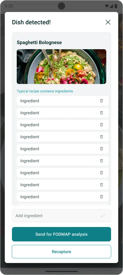
The model proposes the dish and its ingredients; every row can be deleted and a missing one typed in. Analysis only runs after that, on a list a human has agreed to. It costs one extra tap and it is the reason the verdict on the next screen can be trusted — the app is never wrong about what you were eating, only about what it means.
A headline, then the receipts
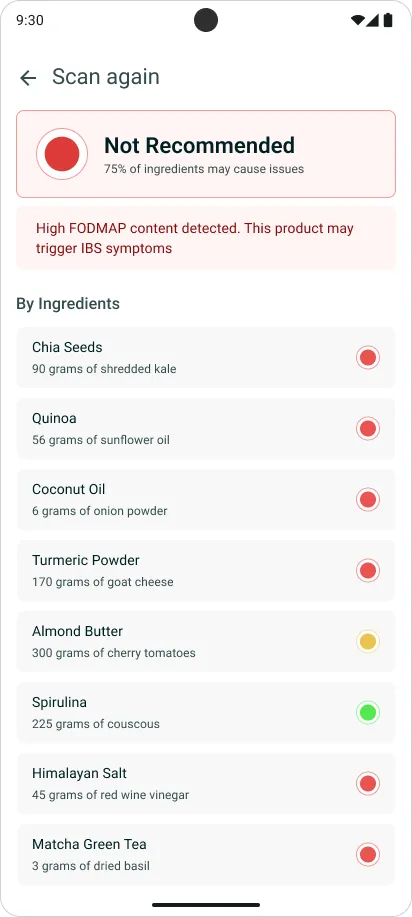
“Not Recommended — 75% of ingredients may cause issues” arrives before any chemistry, followed by the ingredient list with a dot on each row. That ordering means the screen works both for someone deciding in four seconds and for someone who wants to know which two ingredients to swap out.
Logging in Taps, Patterns for Free
The half of the product that only pays off in week three.
Sophie was already keeping a food diary in a notes app and getting nothing out of it. The tracker exists to make the logging cheap enough to survive, and then to do the connecting she could not do by hand.
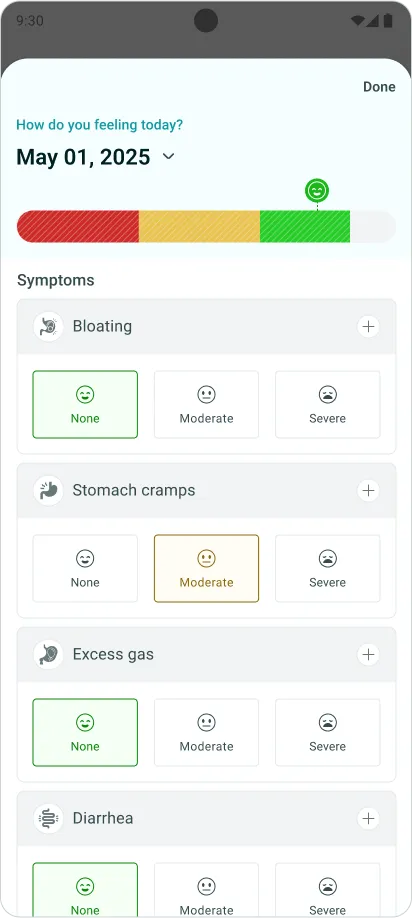
A day is seven taps
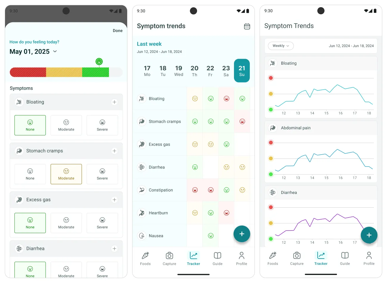
One slider for the day overall, then none / moderate / severe for each symptom. No free text and no ten-point scale, because both are things people stop doing. Three levels is the coarsest split that still produces a usable trend line, and coarse is what gets logged every day.
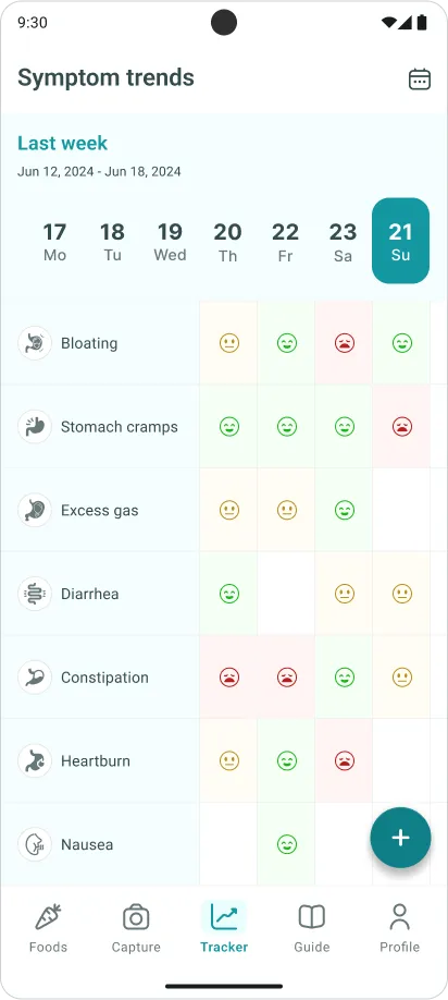
A week you can hand to a doctor
Seven days across, symptoms down, one coloured face per cell. This grid was designed for a fifteen-minute appointment: a clinician can read a month of it without a word of explanation, which is more than a notes app full of sentences ever achieved.
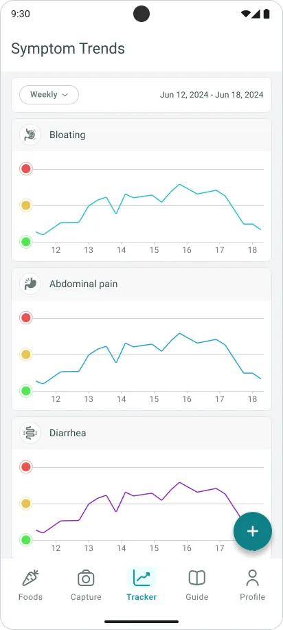
One line per symptom, not one line for you
Bloating and abdominal pain do not move together, and averaging them into a wellbeing score hides the only thing worth knowing. Separate charts with a shared date range let a pattern belong to one symptom, which is the level at which somebody can actually change what they eat.
Conclusion
Achievements / insights
The decision that shaped everything was refusing the binary. Every competitor answers “is this low FODMAP”, and the honest answer is “it depends how much”. Building the portion ladder first, and then making the same three colours describe a food, a scanned dinner and a symptom day, meant the product only has one thing to learn — and that one thing is correct rather than merely convenient.
What the design review showed
The traffic light stopped being a visual device and became the information architecture. Once red, amber and green meant the same thing on four different surfaces, the food library, the scanner and the tracker read as one product rather than three tools sharing a tab bar — which is precisely the failure the competitor teardown had found in Cara Care.
What I would design next
The loop is still open. The tracker records symptoms and the capture flow records meals, but nothing yet puts them on the same timeline and says “the two worst days both followed onion”. Closing that — carefully, with the correlation shown as a suggestion rather than a diagnosis — is the feature that would make the third week worth reaching.