Redesigning Governance for Microsoft Teams at Scale
Enterprise admins were managing thousands of Teams through list-heavy, fragmented views. I led the redesign of the decision architecture to make governance visible, comparable, and actionable.
Context & Problems
Context
Microsoft Teams environments at enterprise scale often contain hundreds or thousands of
Teams.
Admins are responsible for governance, lifecycle policies, ownership gaps, inactive
spaces, and compliance risks.
However, the default management views were optimized for browsing and collaboration — not for governance decision-making at scale.
As environments grew, admins faced:
- • Fragmented signals across tabs
- • Manual health checks
- • Delayed identification of high-risk Teams
- • Cognitive overload when scanning long lists
The Core Problem
Enterprise admins could see activity — but not governance health. Key risk indicators (lifecycle state, ownership gaps, inactivity, storage growth, access exposure) were either:
- Fragmented signals across tabs
- Manual health checks
- Delayed identification of high-risk Teams
- Cognitive overload when scanning long lists
Decision-making was reactive instead of proactive.
My Role & Constraints
 Me
Me I led the redesign of:
- • The governance dashboard (overview layer)
- • The Teams profile (context layer)
- • Lifecycle visualization and decision signals
- • View architecture and information hierarchy
Responsibilities:
- • Stakeholder interviews
- • UX research synthesis
- • Interaction & information architecture
- • Visual system alignment
- • Prioritization of governance signals
Scope & Constraints
- Enterprise B2B environment
- Existing Microsoft design ecosystem
- Large datasets (hundreds / thousands of Teams)
- Admin-focused workflows
- Backward compatibility with existing governance logic
Reframing the Problem
Research revealed a structural governance gap
As Teams adoption scaled across enterprises, governance complexity grew — but admin tooling did not evolve at the same pace.
Through interviews with enterprise admins and internal stakeholders, we identified a consistent pattern:
Governance decisions were being made reactively, based on manual checks, scattered signals, and experience — not system guidance.
Finding 1
Admins lacked a single source of truth for Teams health.
Finding 2
Lifecycle, access, and risk signals were fragmented across multiple views.
Finding 3
Admins mentally separated “overview” from “team-level investigation,” but the product did not reflect this cognitive model.
Finding 4
Existing dashboards supported reporting — not daily decision-making.
Finding 5
High-risk Teams were often identified only after users reported issues.
From Insights to Product Direction
Shifting from reactive management to proactive governance
Strategic DecisionsIntroduce a clear overview layer
A high-level health surface that reduces cognitive load.
Replace manual verification with system signals
Governance score, lifecycle progress, ownership visibility.
Surface risk signals before they become urgent
Visual lifecycle indicators and governance scoring.
Design for scale
Decision surfaces optimized for hundreds or thousands of Teams.
Separate overview from team-level context
Clear navigation from environment view to structured Team profile.
Visual design
Final designs
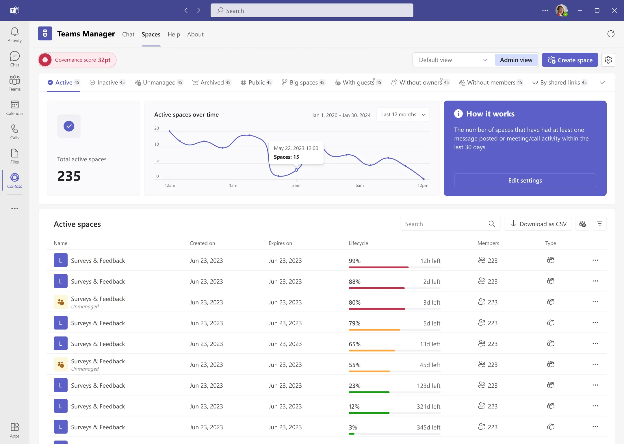
The dashboard acts as a high-level control center, helping admins quickly assess Teams health and identify where attention is needed.
The first version didn’t scale
Here’s what broke — and how we fixed it
V1 — what went wrong
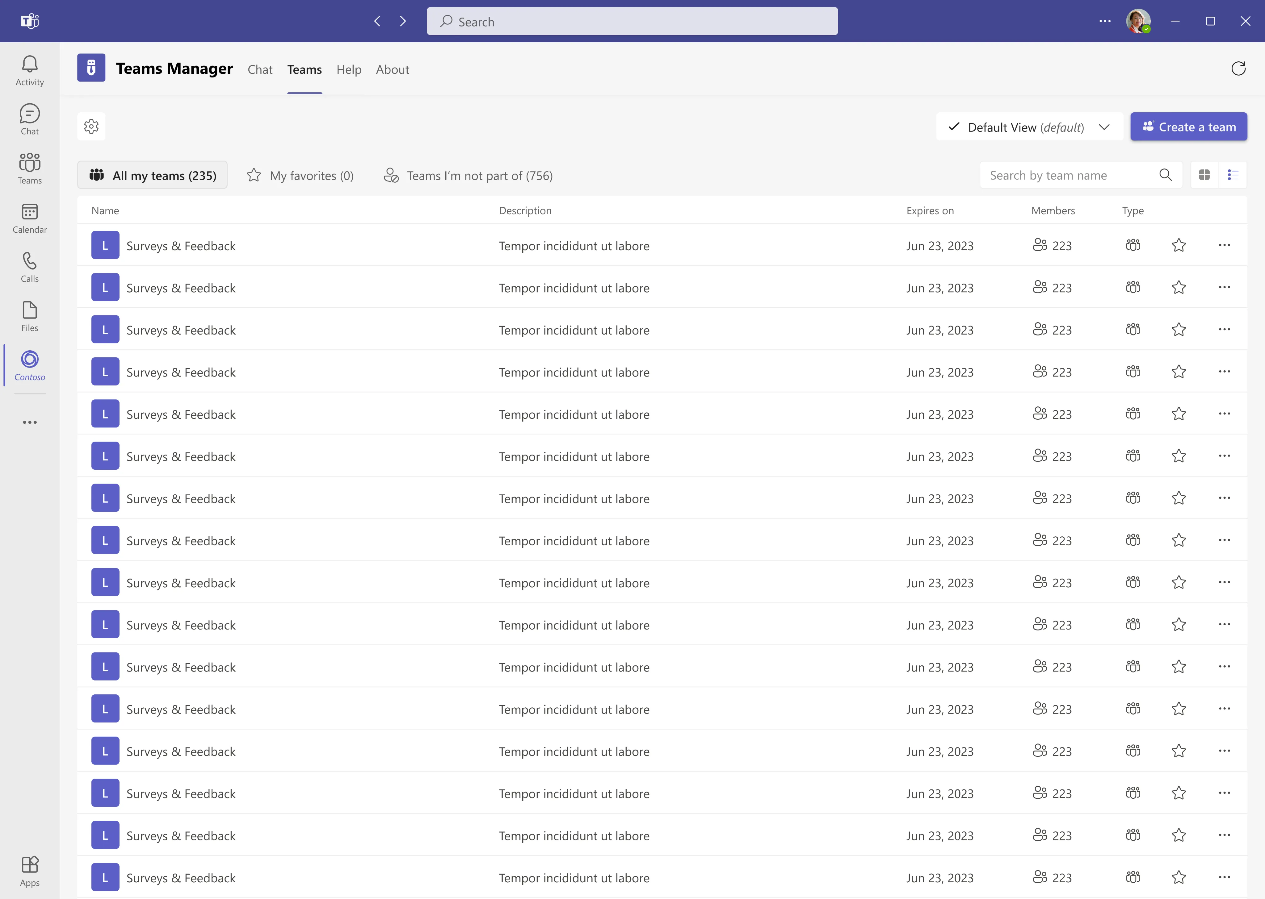
- Too many rows, no signal
- Manual scanning = slow decisions
- High-risk teams surfaced too late
V2 — what changed + why
- Signals first: governance score + risk indicators
- Hierarchy: overview → trends → list
- Action-ready: faster triage, less manual work
In the first iteration, we relied on a detailed list view. It looked complete, but at scale
it forced admins to scan, compare, and guess. As environments grew, this approach slowed
decision-making and surfaced risks too late.
We redesigned around clear signals and a hierarchy that matches how admins think: overview
first, details second.
Information Hierarchy That Scales
From high-level signals to actionable team-level insights.
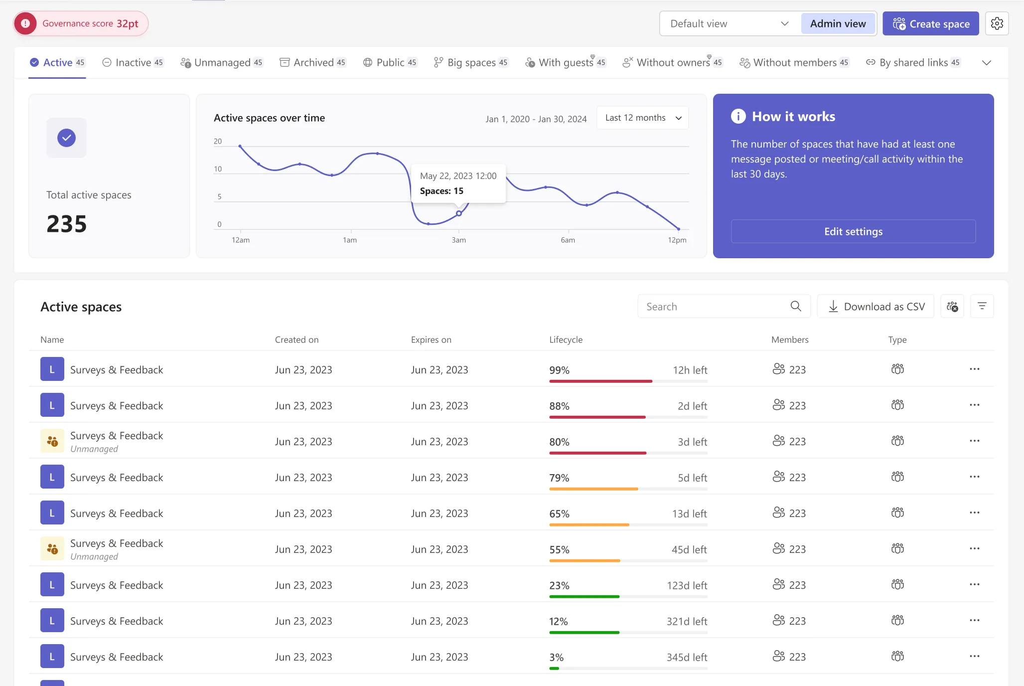
The dashboard information hierarchy was designed to match how admins naturally scan and interpret system health — moving from a high-level overview to actionable detail.
-
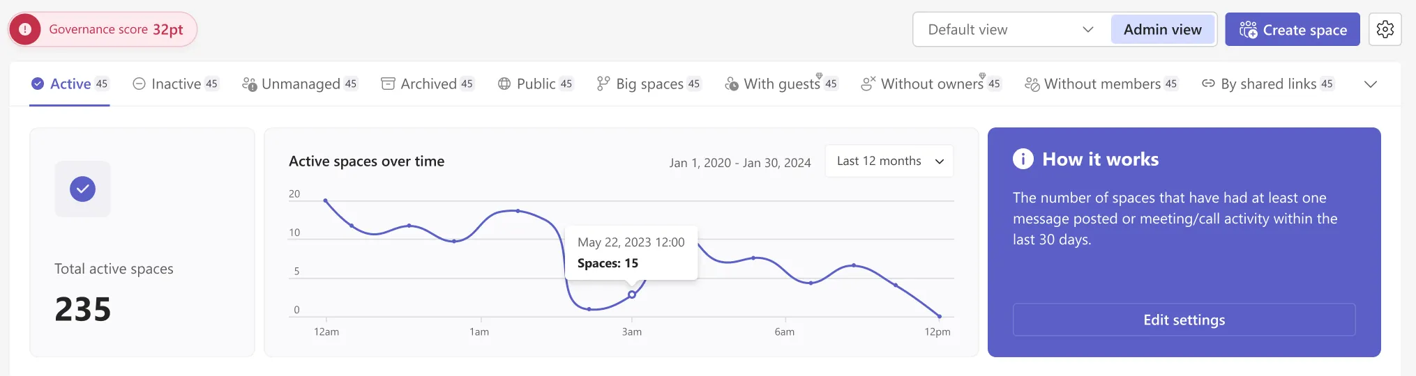
At the top of the dashboard, summary indicators provide an immediate snapshot of the Teams environment.
This layer helps admins quickly understand overall health and spot areas that require attention.
-
Below the overview, activity trends add time-based context to the current state.
This allows admins to understand whether situations are improving, stable, or deteriorating.
-
The main table presents Teams in a prioritized, scannable format.
Visual lifecycle indicators and key attributes help admins decide where to act next without manual investigation.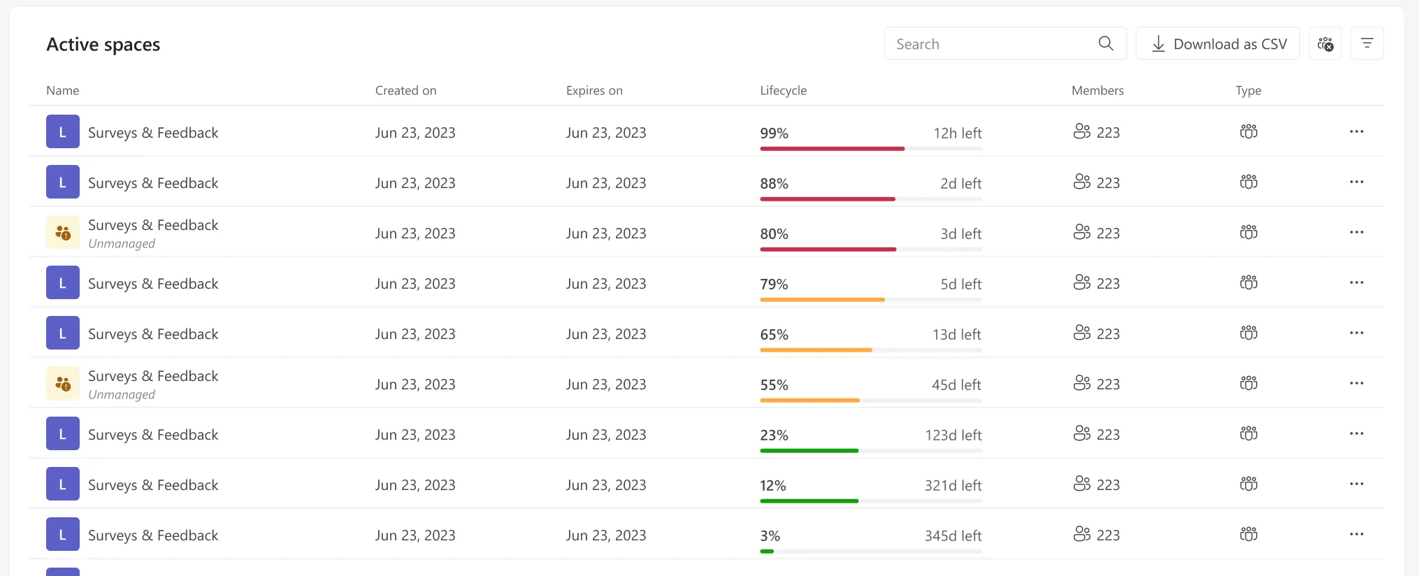
Surfacing the Right Signals
Reducing noise and elevating the metrics that drive action.
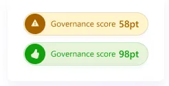
Governance score
The Governance Score provides a single, high-level signal that summarizes the overall health of the Teams environment. Instead of forcing admins to interpret multiple metrics in parallel, it surfaces governance risk at a glance—helping them quickly identify problem areas, prioritize actions, and move from reactive checks to proactive management.
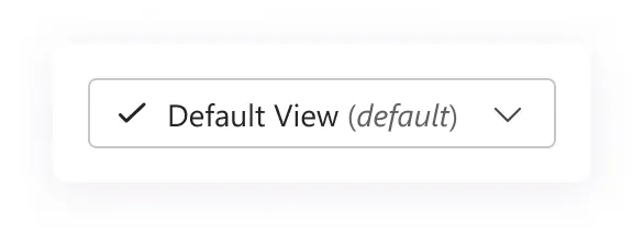
View switcher redesign
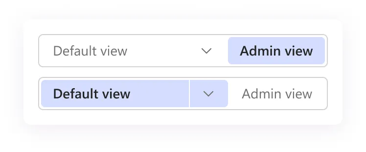
Previously, all views were grouped into a single dropdown, which became cluttered as admins created multiple custom views. By separating Admin view from user-defined views and turning the primary choice into a switcher, we reduced visual noise, improved scanability, and made the most important context instantly accessible—without overwhelming the user.
Total active spaces
This metric answers a fundamental question immediately: How many Teams are currently active?
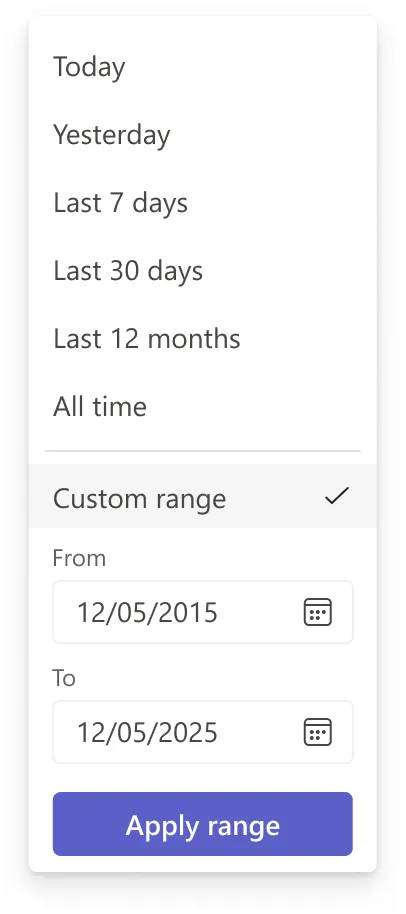
Activity over time chart
Admins often need to detect change, not just status. Trends help identify emerging issues before they become urgent.
From Insight to Action
Turning governance signals into controlled, auditable operations.
The Active spaces table is the primary decision-making surface of the dashboard. It translates high-level signals into concrete, actionable items.
Lifecycle as a visual signal
Instead of raw dates, lifecycle progress bars provide a single, clear signal by combining time passed and time remaining. This makes risk instantly visible and reduces the effort required to compare Teams.
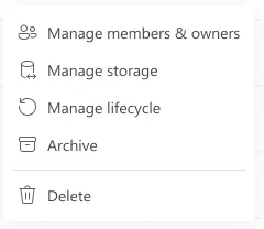
Row actions
Every row carries the same set of governance actions, so an admin can act the moment a signal is spotted instead of leaving the table.
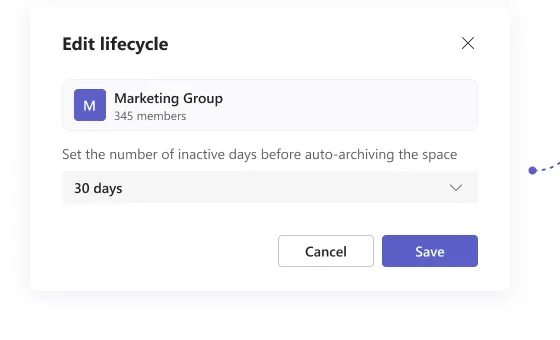
Edit lifecycle
The lifecycle edit modal allows admins to define when a space should be automatically archived based on inactivity, helping enforce governance rules without manual follow-up.
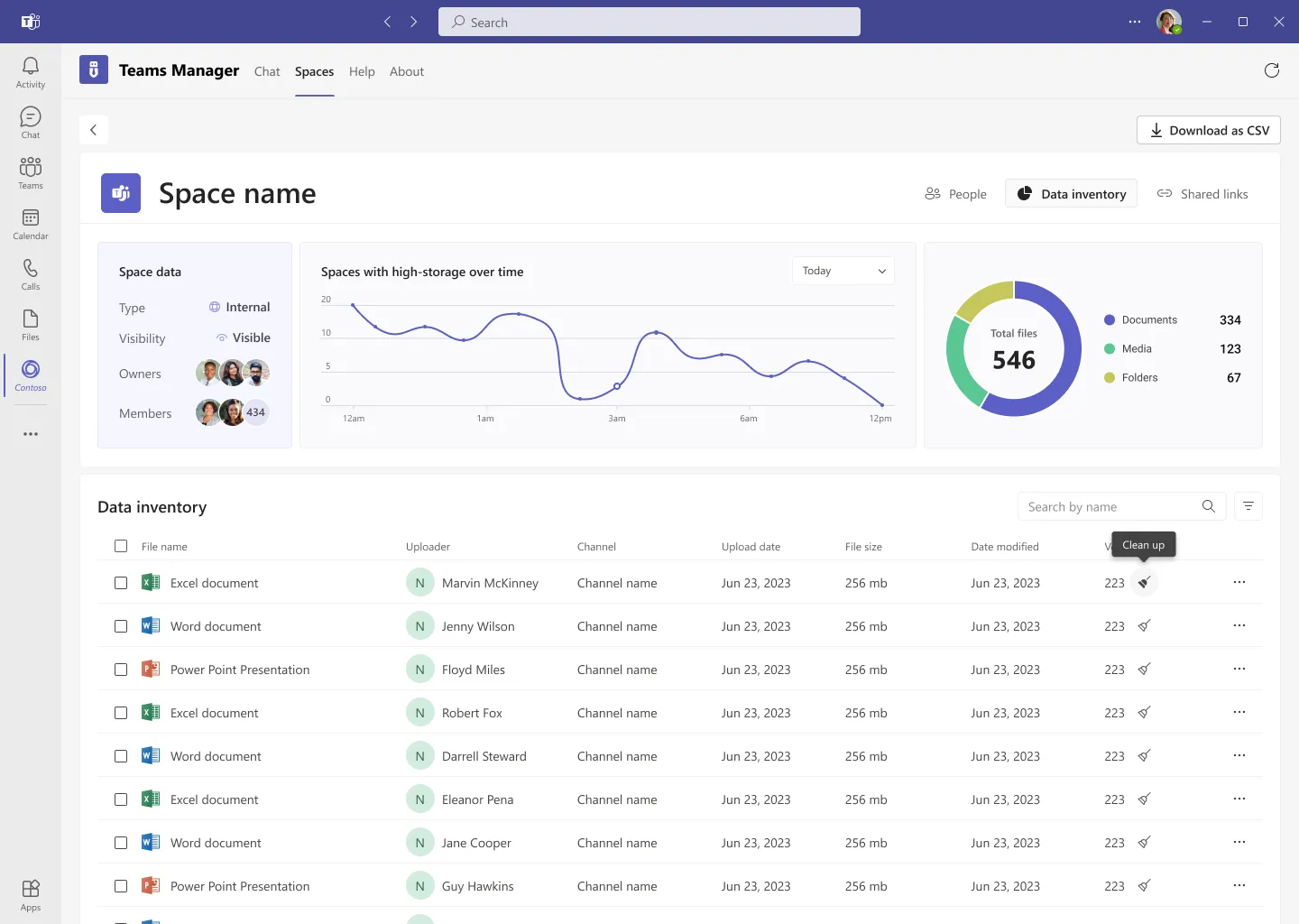
Manage storage
Storage management requires detailed, file-level information and actions that would overload the main dashboard. Moving it to a dedicated page keeps the dashboard focused on decision-making, while giving admins the space and tools needed to analyze and clean up storage efficiently.
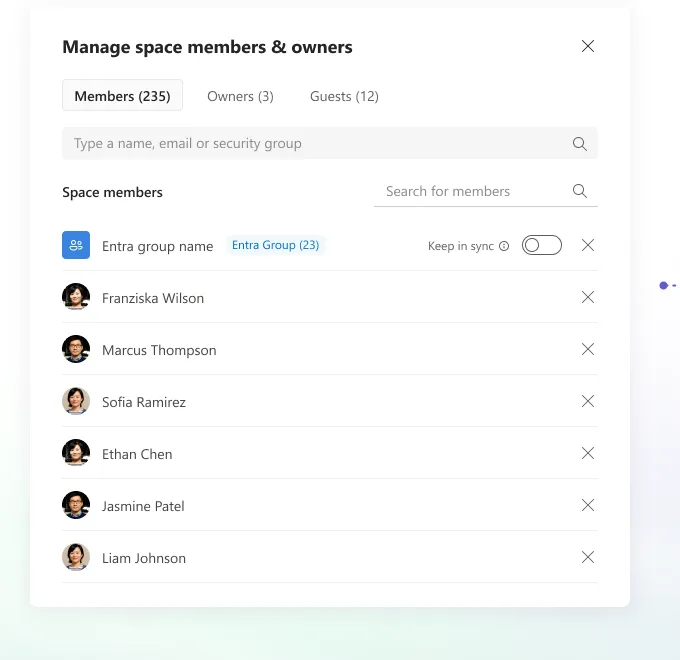
Manage space members & owners
This view allows admins to easily review and manage who has access to a space. Members, owners, and guests are separated to reduce mistakes, while search and group sync help keep access aligned with organizational structure.
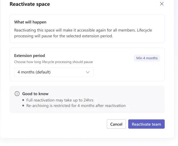
Reactivate space
This flow allows admins to safely restore an archived space and make it accessible again. By requiring an extension period and clearly explaining constraints, it prevents accidental re-archiving and ensures lifecycle actions remain intentional and controlled.
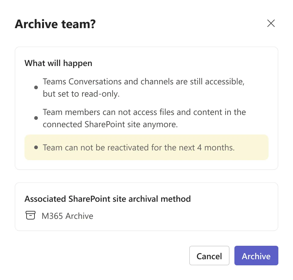
Archive team
This confirmation step clearly explains the consequences of archiving a Team before the action is taken. By making access limitations, SharePoint impact, and reactivation constraints explicit, it helps prevent accidental or uninformed archiving and ensures lifecycle actions are deliberate and compliant.
The Governance Visibility Gap
Why Microsoft Teams’ default profile isn’t built for administrative decision-making at scale.
Microsoft Teams’ default Team profile is designed primarily for collaboration. It focuses on channels, members, apps, and basic activity signals that help users work inside a Team efficiently.
For day-to-day collaboration, this structure works well. However, it offers limited support for administrative decision-making. Governance-related information—such as lifecycle state, ownership risks, access patterns, or historical changes—is either distributed across multiple tabs or not visible at all in a single view.
Before introducing our own solution, we analyzed each section of the default Team profile to understand what it provides, where it excels, and where it falls short for admins managing Teams at scale.
Channels: Content Structure, Not Governance
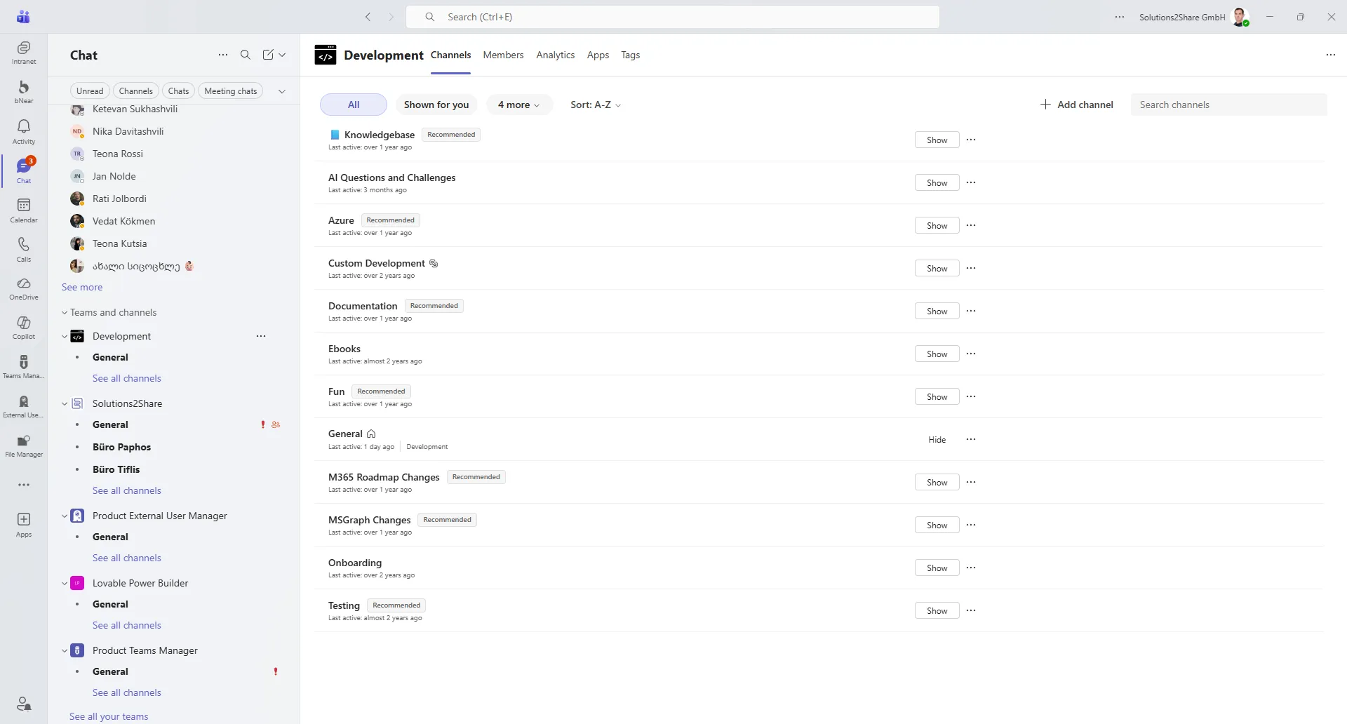
The Channels tab is designed to help users navigate conversations and content within a Team. It shows available channels, their activity status, and basic recommendations, making it easy to jump into day-to-day collaboration. While effective for content discovery, this view provides little administrative context. It does not surface ownership, lifecycle state, access risks, or historical changes—key signals admins need when assessing the health or governance status of a Team.
Members: Directory, Not Risk Awareness
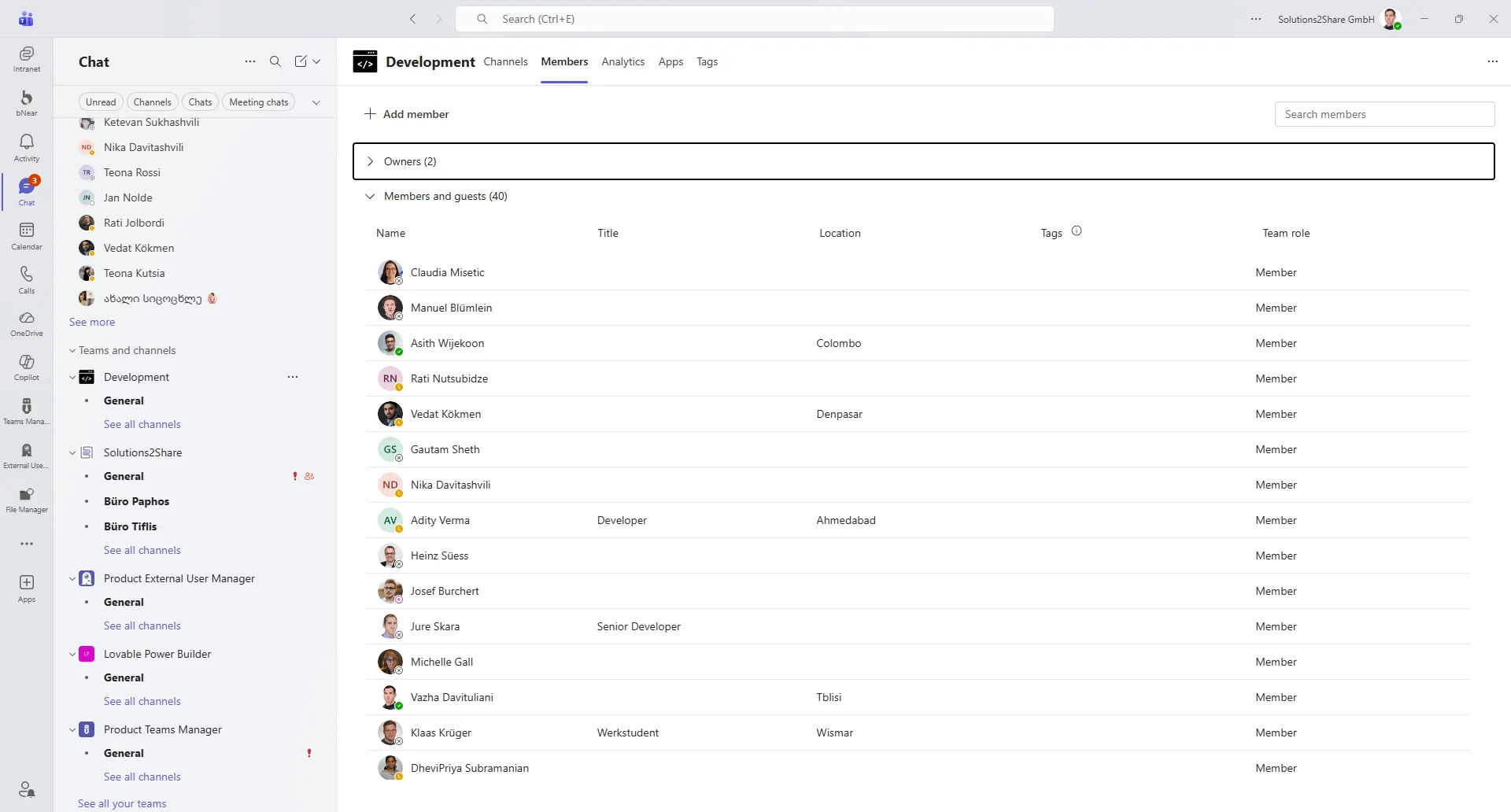
The Members tab provides a clear directory of who belongs to the Team and their assigned roles. It supports basic member management tasks such as adding users and reviewing ownership. However, this view focuses on individual users rather than access health. It does not highlight ownership gaps, guest exposure, access anomalies, or historical changes—making it difficult for admins to assess whether the current access setup is still appropriate or risky.
Analytics: Activity Metrics Without Governance Context
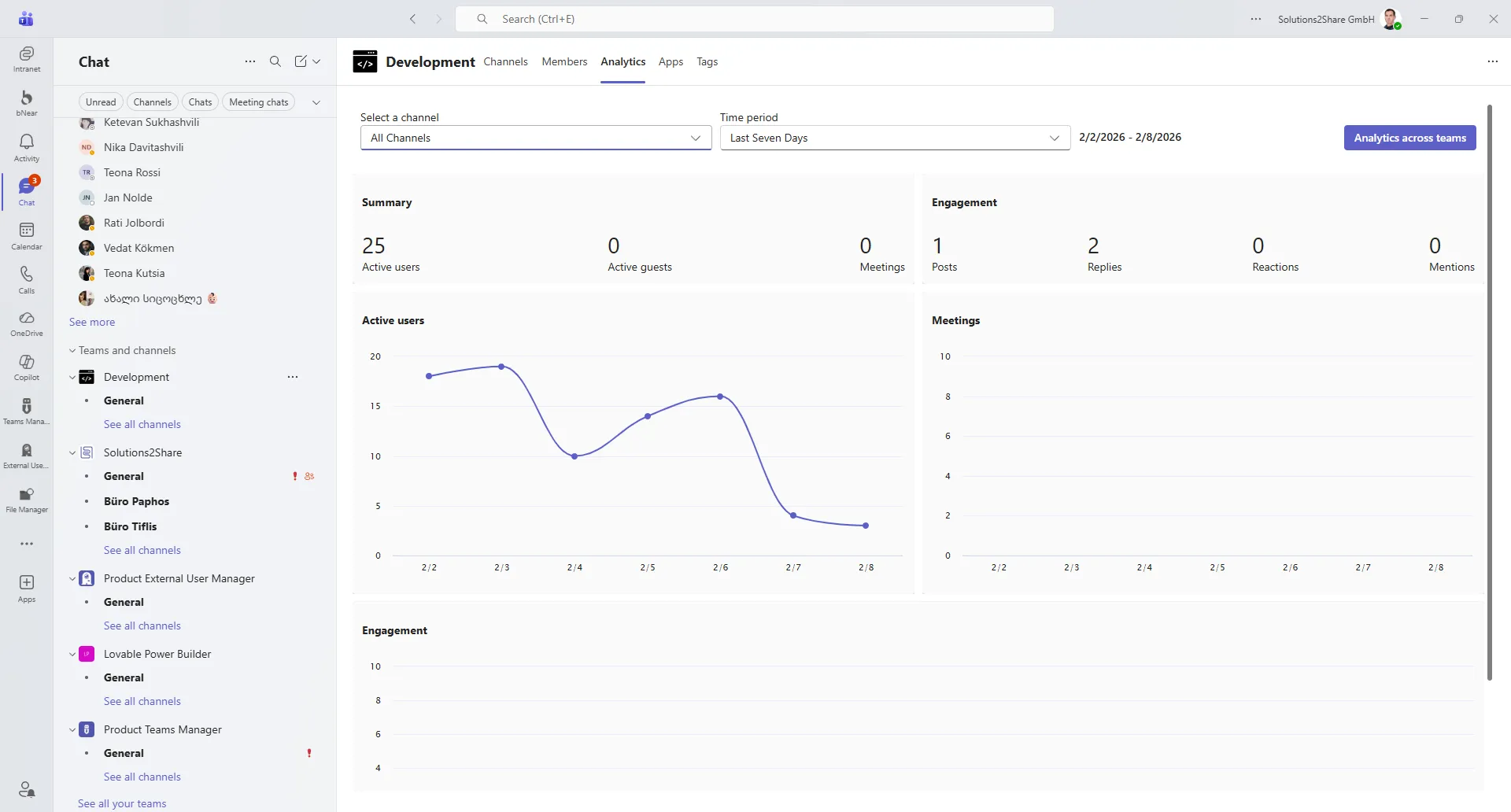
The Analytics tab provides activity and engagement metrics such as active users, posts, meetings, and trends over time. It helps teams understand how actively a Team is being used. However, these metrics are isolated from governance context. They do not explain why activity changes, how it relates to lifecycle state, ownership, access risks, or storage health. As a result, admins can see usage patterns—but not whether a Team is healthy, compliant, or requires action.
Conclusion
Achievements/insights
This project demonstrated how strong information hierarchy and visual prioritization can simplify complex enterprise governance. By shifting from list-heavy management to context-rich views, admins were able to understand lifecycle state, access risks, and storage impact at a glance. The design focused on reducing cognitive load, supporting proactive decision-making, and aligning daily admin workflows with long-term governance goals.
Quantified results
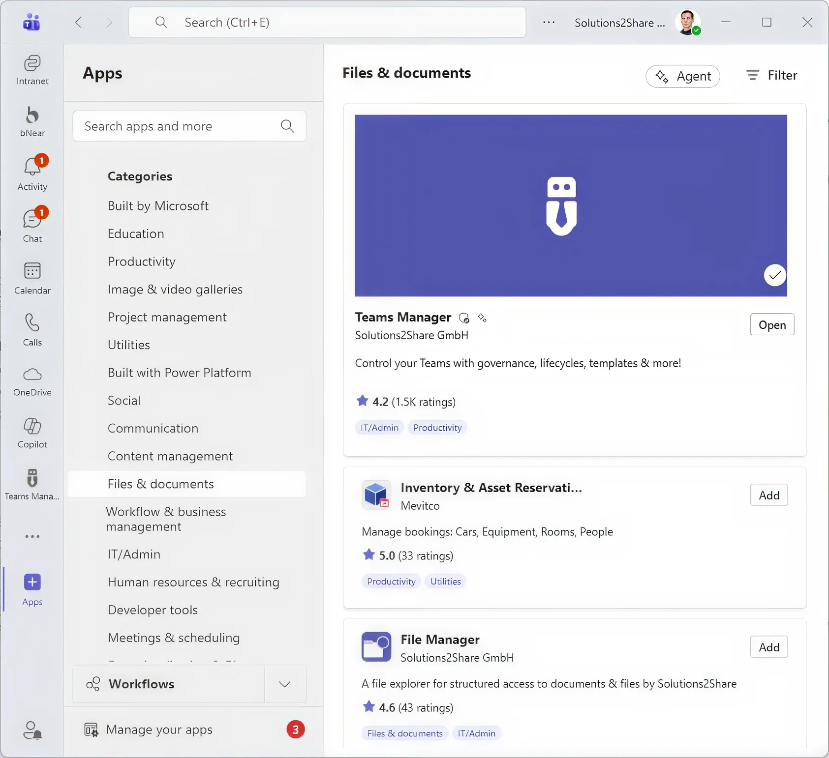
Within six months of releasing the redesigned experience, Teams Manager’s App Store rating increased from 3★ to 4.2★. The app reached #1 in the Microsoft Teams App Store, supported by positive customer feedback and public recognition. These outcomes validated that improving clarity and decision confidence directly impacts product adoption, trust, and satisfaction.