Every guest, accounted for.
An overview dashboard for external users in Microsoft Teams: who they are, which teams they can reach, who vouched for them, and when that access expires.
Context & Problems
Context
A guest is invited to a Microsoft Teams tenant one at a time, by whoever needed them that
week.
Teams lists guests per team. Nothing lists them per tenant, and an invitation carries no
expiry date of its own.
So the population grows quietly. A contractor from a project that ended two years ago is indistinguishable, in every admin surface, from the agency that started on Monday.
In interviews the same four sentences came back:
- • There is no place to see all the existing externals
- • No analytics or reporting, so a trend is invisible until it is a problem
- • Nothing survives a few hundred guests without becoming a spreadsheet
- • Nothing can be tailored to how this particular organisation governs access
The Core Problem
An invitation is a one-line decision with no end date. By the time anyone asks who has access, the facts that would answer it have scattered:
- Guest lists are held per team, never per tenant
- No last-activity signal, so dormant and active look identical
- No owner of record once the person who invited them leaves
- Nothing to hand leadership when they ask for the list
Guest access grew by accident and was audited from memory.
My Role & Constraints
 Me
Me I owned the design of:
- • The overview (tenant layer) and its four counters
- • The request queue, in both densities
- • The guest profile, its lifecycle bar and its onboarding states
- • The configuration area that governs all of the above
- • Theme parity across the light and dark Teams palettes
Responsibilities:
- • Stakeholder interviews and needs / pains synthesis
- • Building the reference set in the absence of a competitor
- • Information architecture and MVP prioritisation
- • Interaction and visual design inside the Teams shell
- • Writing the settings copy, including every consequence warning
Scope & Constraints
- Sensitive identity data, so security review shaped what could be shown
- Lives inside the Microsoft Teams shell, light and dark
- Large tenants: hundreds of guests, teams and organisations
- Limited budget and limited time, so scope had to be sequenced
- No like-for-like product to benchmark against
Needs, Pains and Limits
No direct competitor, so I built the reference set sideways.
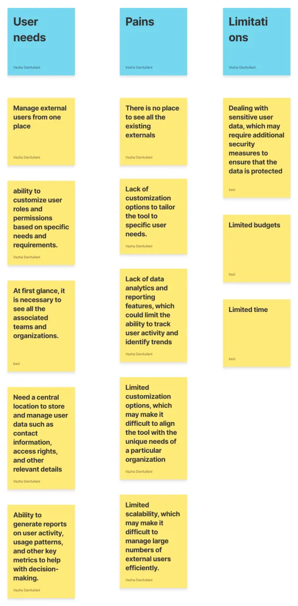
The first board was the plain one: what admins need, what hurts today, and what the project cannot change. Thirteen notes, written in their words rather than mine, and the three limitations at the right are the ones that shaped scope more than any feature request did.
External User Manager had no like-for-like product on the market. Instead of benchmarking a competitor, I assembled the reference set from enterprise identity and user-management platforms, research papers and industry reports, plus consultations with experts in UX and Microsoft Teams administration. Each one answered a different question: what admins expect to monitor, how such tools stay usable at scale, and how access is normally governed.
Needs, pains, limitations
Five needs, five pains, three limitations. The pains column is the one that set the direction — every note in it is about absence rather than friction, which is what told us this was a missing surface rather than a badly designed one. The limitations column is the reason the first release was an inventory: sensitive identity data, a fixed budget and a fixed date.
Reframing the Problem
Admins did not want a list of guests. They wanted a list of decisions.
The brief arrived as “show all the externals in one place”, and an inventory is what the first version delivered. Watching admins use it made the gap obvious: they could find any guest in seconds and still could not tell me what to do about one.
Every question they asked turned out to be a question about time or about accountability — when was this granted, when does it lapse, and who signed for it.
Finding 1
A list of guests is a report. A list of pending decisions is a product.
Finding 2
“Who invited them” is the single fact that makes a removal defensible to the team that loses access.
Finding 3
Every guest question is really a date question: granted when, renewed when, deleted when.
Finding 4
No two tenants govern access the same way, so the rules have to be configuration rather than code.
Finding 5
The audit report is the deliverable. The screen is only where it gets assembled.
From Insights to Product Direction
From an inventory of guests to a queue of decisions.
Strategic DecisionsPut the queue inside the product
Approving is the job. It stops being a number on a dashboard and becomes a tab with a live count.
Make time visible
One bar per guest carrying granted access, next renewal and the delete window.
One record per guest
Identity, activity, every team they touch and the full history, on a single page.
Governance is configuration
Expose the thresholds and the automations instead of hard-coding one organisation’s policy.
Native in both themes
Every surface specified twice against the Teams palette, with status colour holding its meaning.
Visual design
Final designs
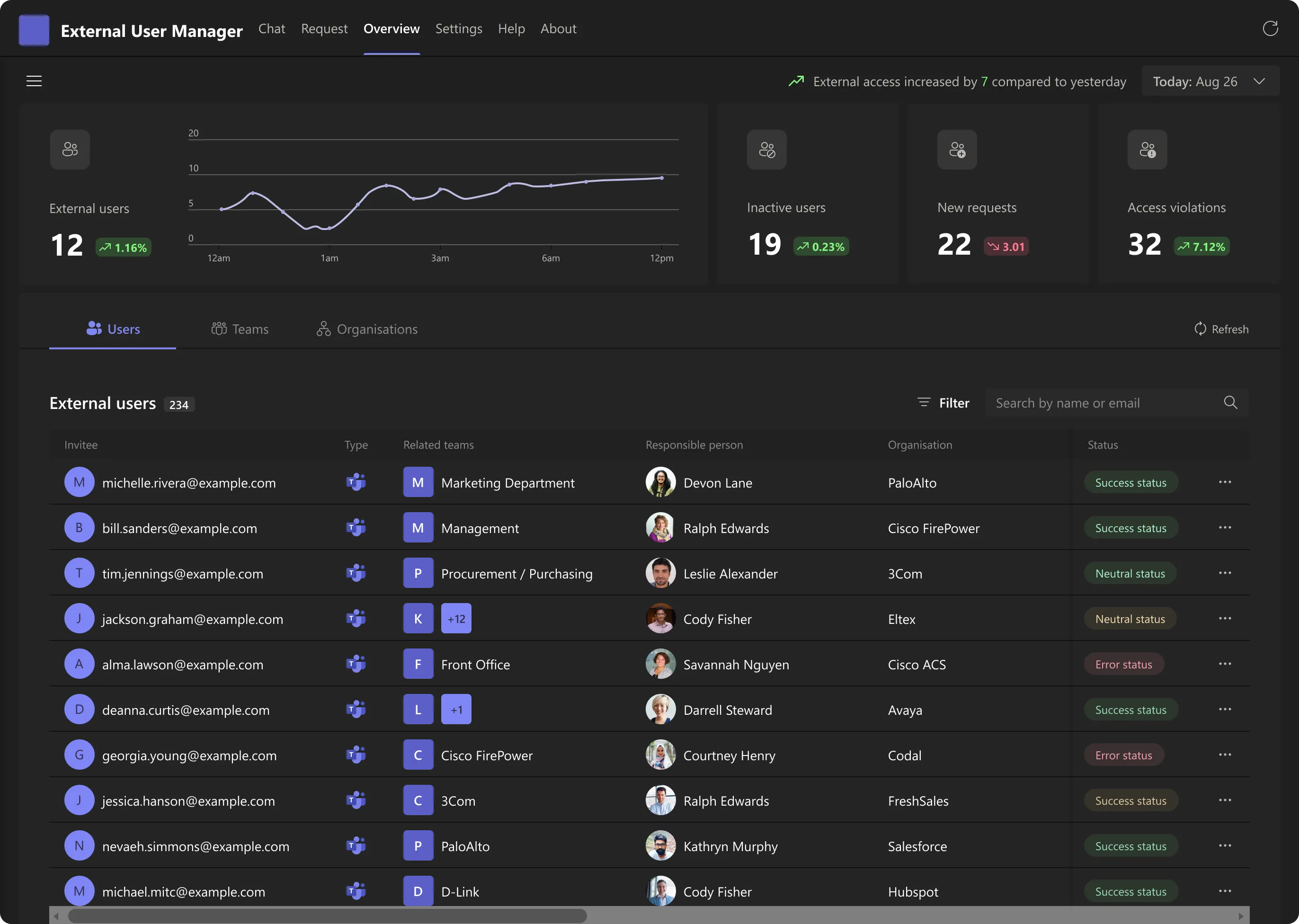
The overview answers three questions before an admin scrolls: how many externals do we have, which way is that going, and what is waiting for me. Everything below the counters is the same population seen through a different lens.
What the first version could not say
It answered “who has access”. It could not answer “what should I do”.
The first release did the hard part: it pulled every external in the tenant into one table with their teams, their organisation and the person responsible for them. That table is still the foundation. What it lacked was anywhere to act.
V1 — an inventory
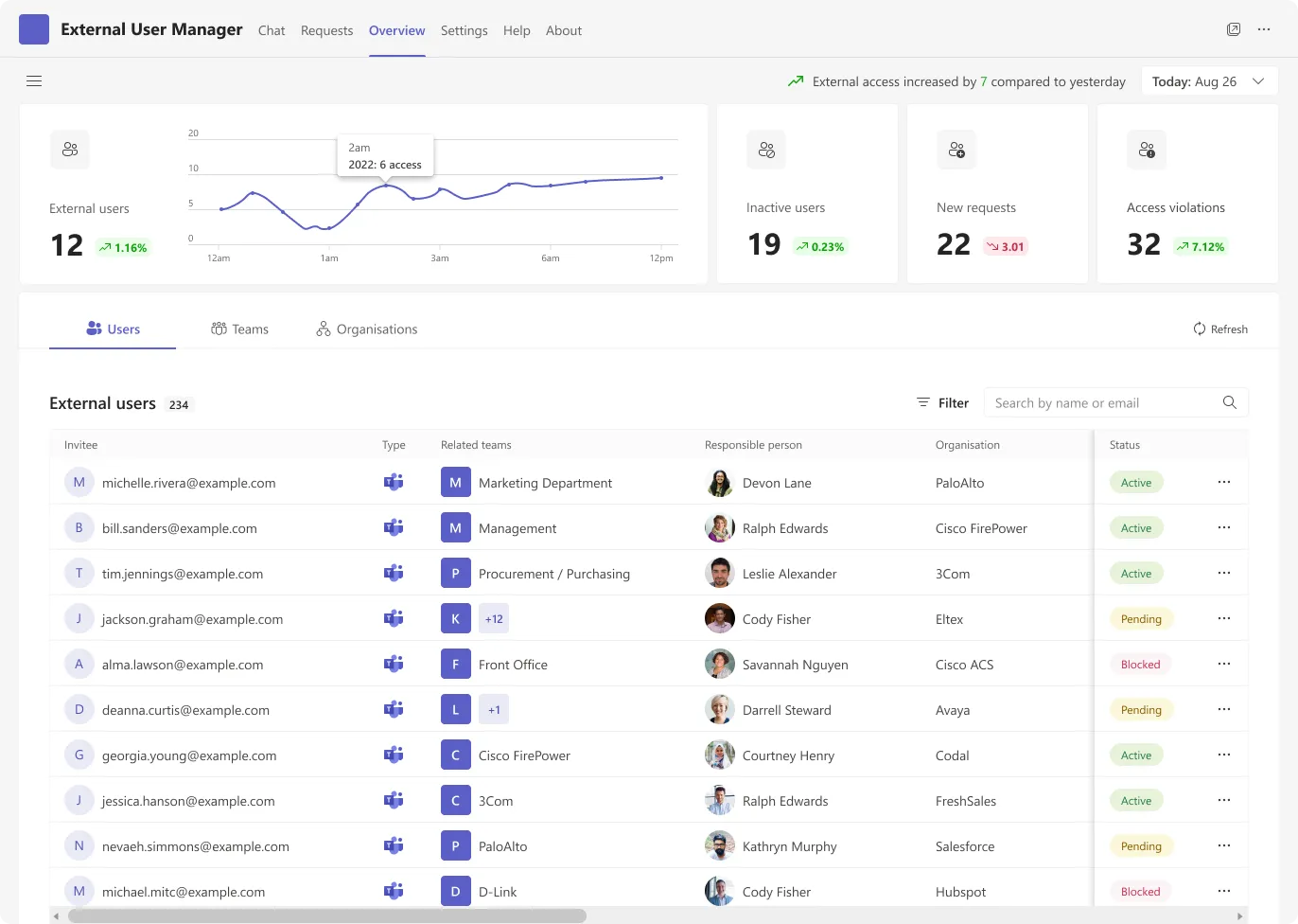
- Users, Teams, Organisations — three ways to browse, none to act
- Requests existed as a counter, never as a queue
- A status chip described the present and hid the future
V2 — a queue
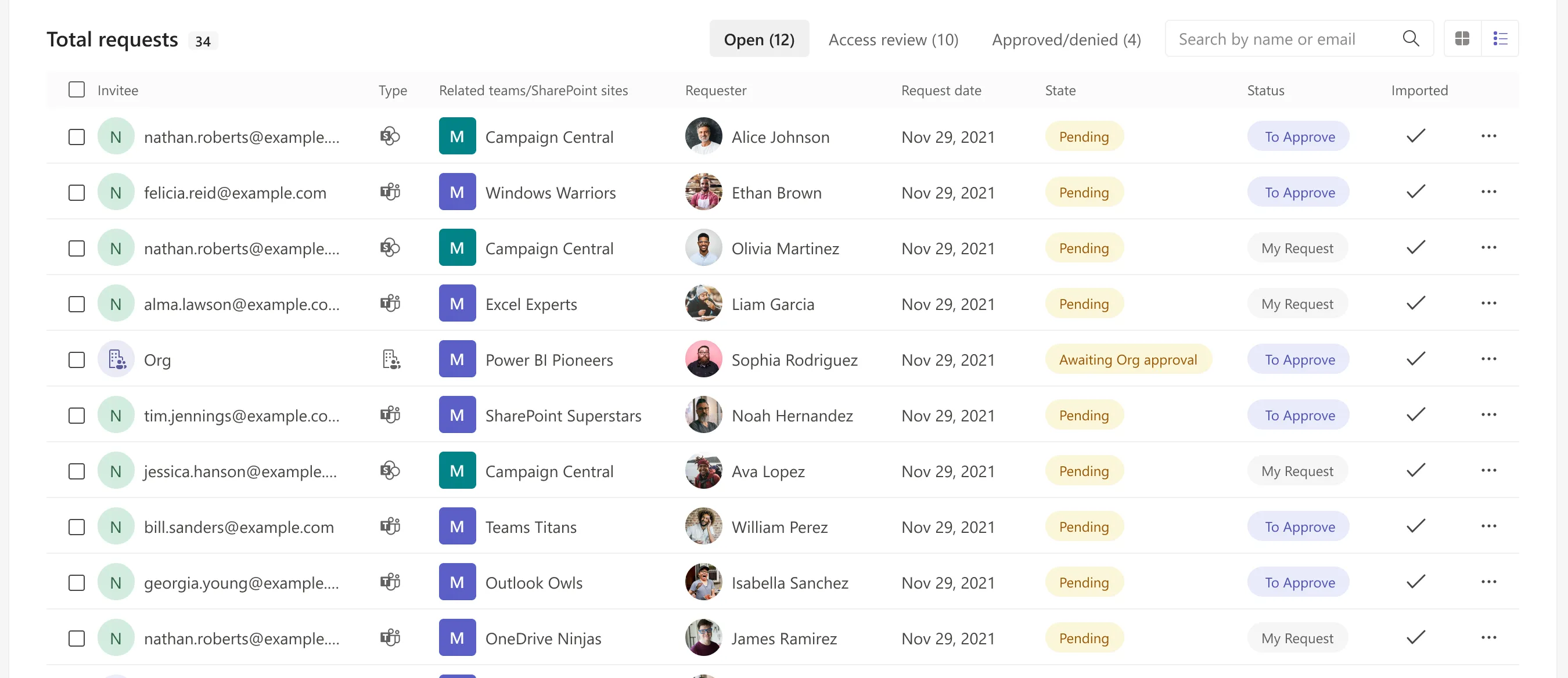
- Requests became a tab carrying its own live count
- Open / Access review / Approved-denied splits the queue by decision, not by date
- Every row carries the action, and says whose request it is
In V1 an admin who spotted a problem had to leave the product to fix it — approvals happened
in email, removals happened in the Teams admin centre, and the audit trail happened in
somebody’s memory. The counters reported on work that was being done somewhere else.
V2 keeps the same table and adds the two things that were missing: a queue with a decision
state, and a per-guest record where the decision can be justified.
What V1 got right: theme parity
Every surface, chip and chart was specified twice against the Teams palette from the first release, and that carried straight into V2. Status colour keeps the same meaning in both, and contrast was checked on the dark side, where the soft green and red normally collapse into each other.
Information Hierarchy That Scales
Four numbers, five lenses, one queue.
The page is stacked in the order the questions actually arrive. State first, then the choice of lens, then the rows to work through. Each band is legible on its own, which matters because these are the screenshots that end up in a report.
-
The counters carry the whole tenant in four numbers, with the day’s change stated in words above them.
Three of the four are a to-do list rather than a statistic: pending, new, in violation.
-
Five tabs are five lenses on the same population: guests, unmanaged users, teams and SharePoint sites, organisations, and requests.
Only one of them carries a badge, because only one of them is work that will not wait.
-
The queue turns the badge into named rows: who is being invited, to what, by whom, and what state the decision is in.
This is where the overview stops reporting and starts being worked.
Surfacing the Right Signals
Counters that are a to-do list, not a scoreboard.
The number and the direction
External users is the only counter that is genuinely a statistic, so it is the only one given a curve. A tenant sitting flat at twelve guests and a tenant that reached twelve this week are different problems, and the sentence above the band — “external access increased by 7 compared to yesterday” — says which one you are looking at before the chart is read.
Pending users
Guests who were invited but never completed onboarding. They hold access without having accepted the terms that justify it, which makes them the quietest risk in the tenant and the easiest one to clear.
New requests
The queue, surfaced as a number before it is surfaced as a tab. It is the counter most likely to be climbing for a human reason: somebody stopped approving. Clicking it lands on the queue already filtered.
Access violations
Guests who fall outside the policies set in the configuration area. This is the only counter with a correct value, and the value is zero — which is what makes it worth putting beside three counters that are never zero.
Audit export, in the toolbar
Research kept returning to the same point: the deliverable is the report, not the screen. Export sits in the page header rather than at the bottom of a table, because the admin who needs it is usually not looking at a table when they are asked for it.
Four was the ceiling. A fifth counter would have turned the band into a dashboard, and a dashboard is something you look at rather than work from. The test each candidate had to pass was simple: does the number name a piece of work, and can you click it to reach that work? Total teams, total organisations and total invitations all failed it.
One Queue, Two Densities
Judging a request and clearing a backlog are different jobs.
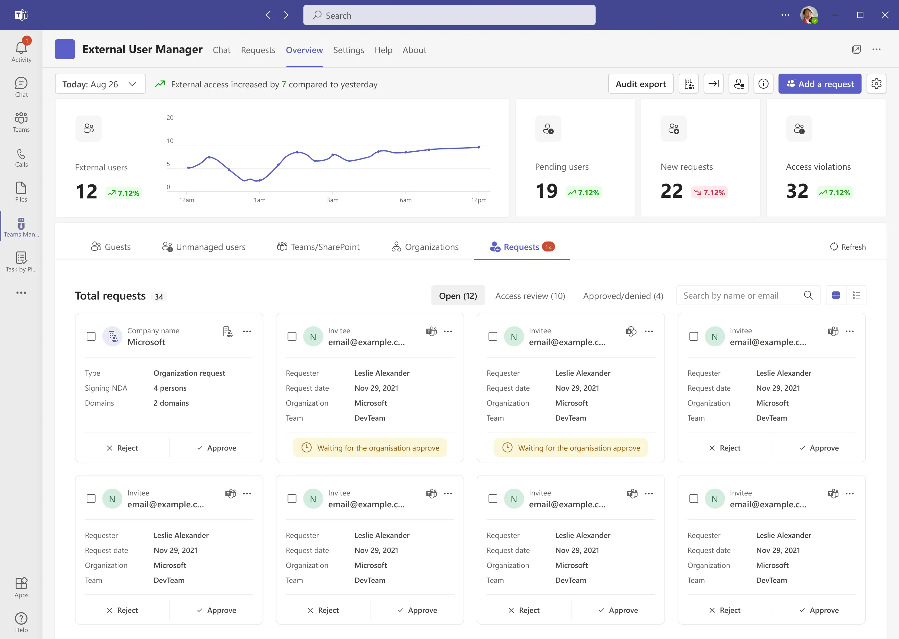
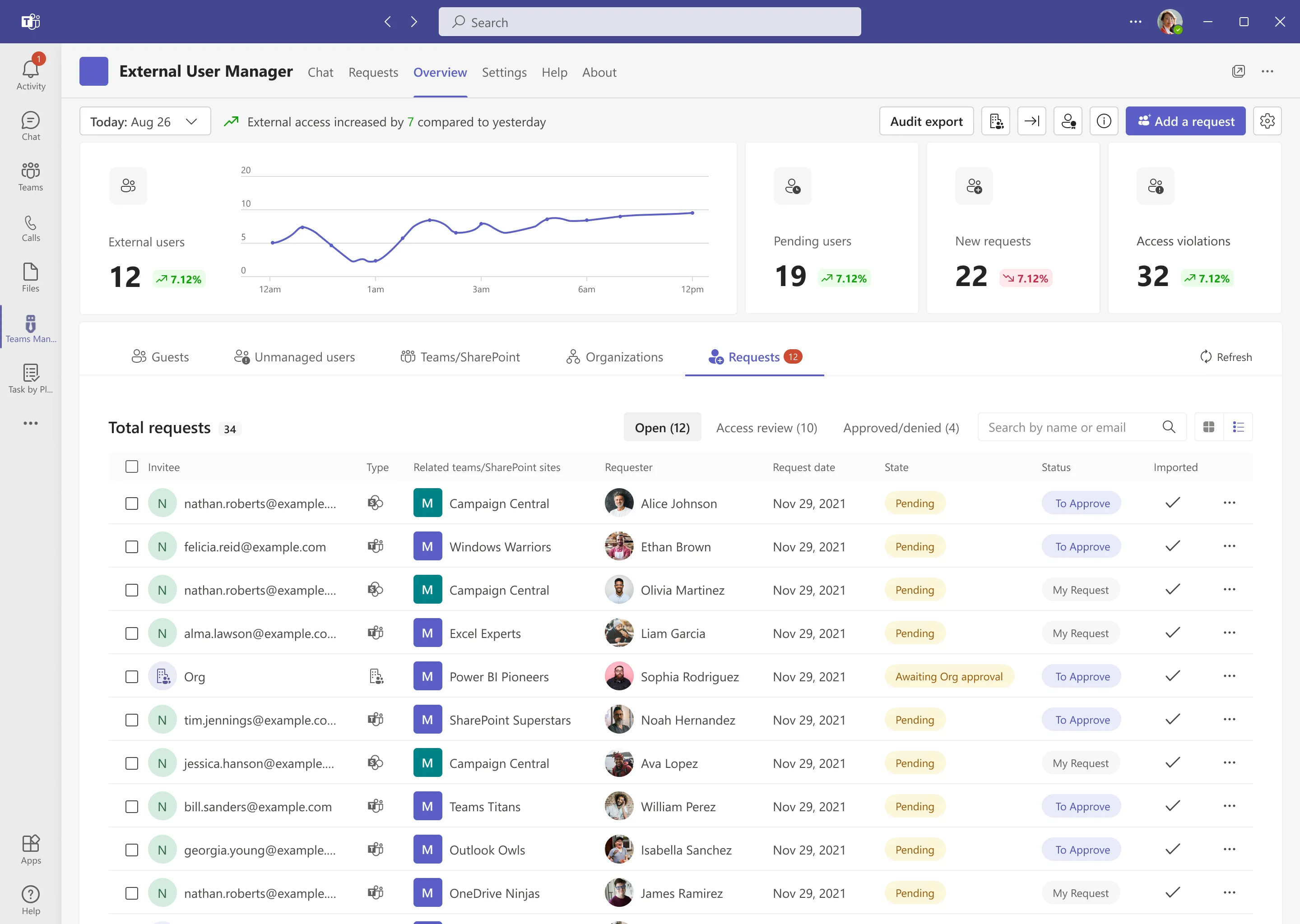
The same twelve open requests read two ways. Cards give one request the whole page, which is what you want when the decision is genuinely a decision. The list gives you a hundred rows and a scroll wheel, which is what you want on the Monday after a two-week holiday.
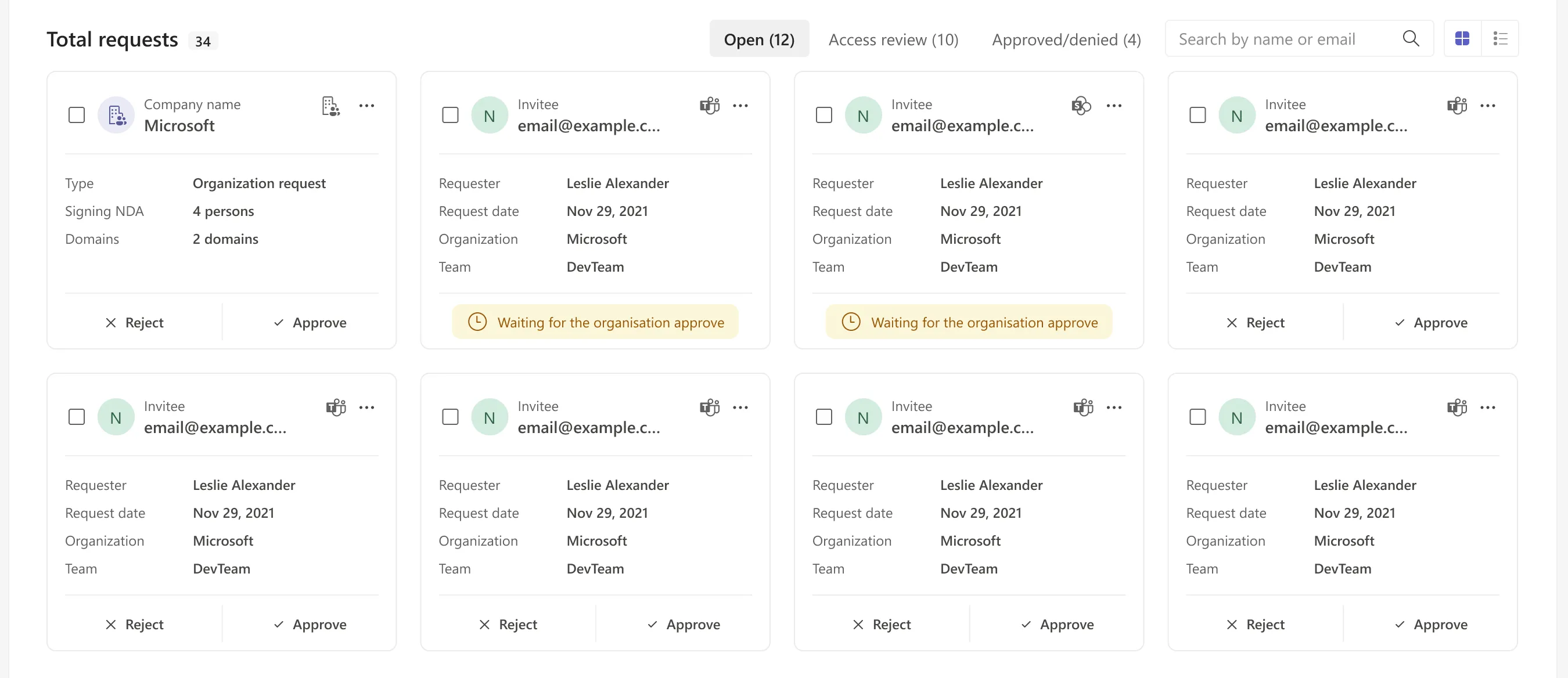
Cards, for judging
Every card states the four facts a decision needs — who asked, when, for which organisation and which team — and puts Reject and Approve at the bottom where they read as the end of a sentence. A card that is waiting on somebody else replaces both buttons with the reason, so an admin never clicks into a decision that is not theirs to make.
List, for clearing
The same records at eight times the density. State says where the request is (pending, awaiting organisation approval); Status says what it wants from you (to approve, or that it is your own request). Splitting those two into separate columns is what lets an admin scan for their own work without reading a single row in full.
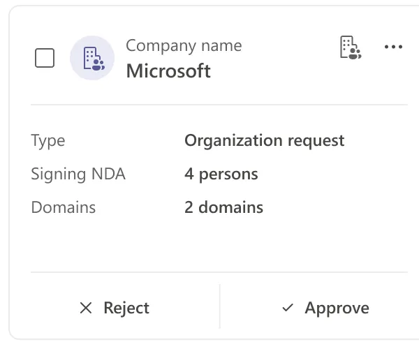
Organisations are requests too
An organisation request is not a bigger user request, it is a different one: it names the number of people signing the NDA and the domains it will cover. Giving it the same card shape with different fields keeps it in the same queue, which is the only place anyone would think to look for it.
Access With an Expiry Date
One record per guest, and the evidence for every decision on it.
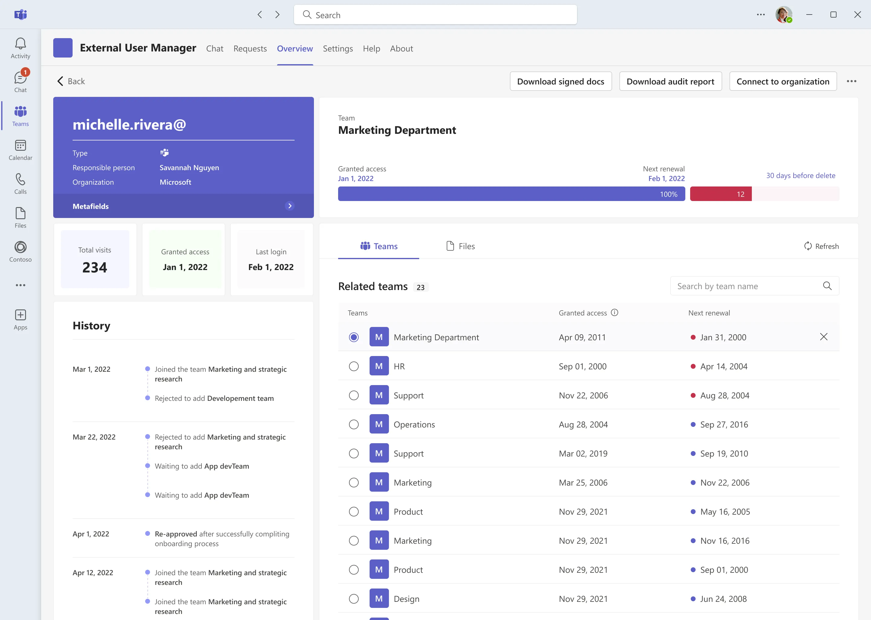
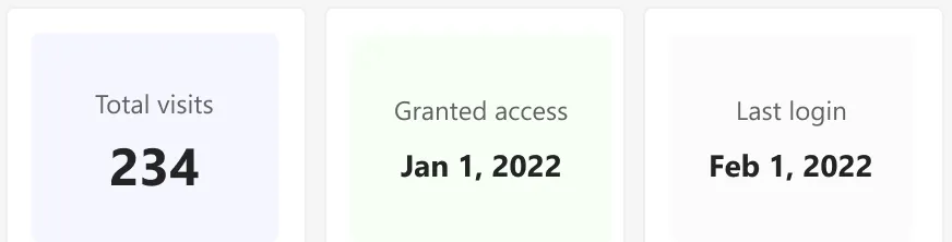
Clicking a guest opens the page the whole product exists to fill in: who they are, who is responsible for them, how much they actually use the tenant, every team they can reach, and the running history of how they got there.
The responsible person, above the fold
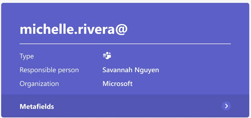
Type, responsible person, organisation — in that order, in the strongest colour on the page. Research kept returning to accountability: a removal is only defensible if you can name who vouched for the guest. Metafields sits underneath as a drawer, because every tenant wants to store something different and none of them should push that fact off the top of the card.
One bar, three dates
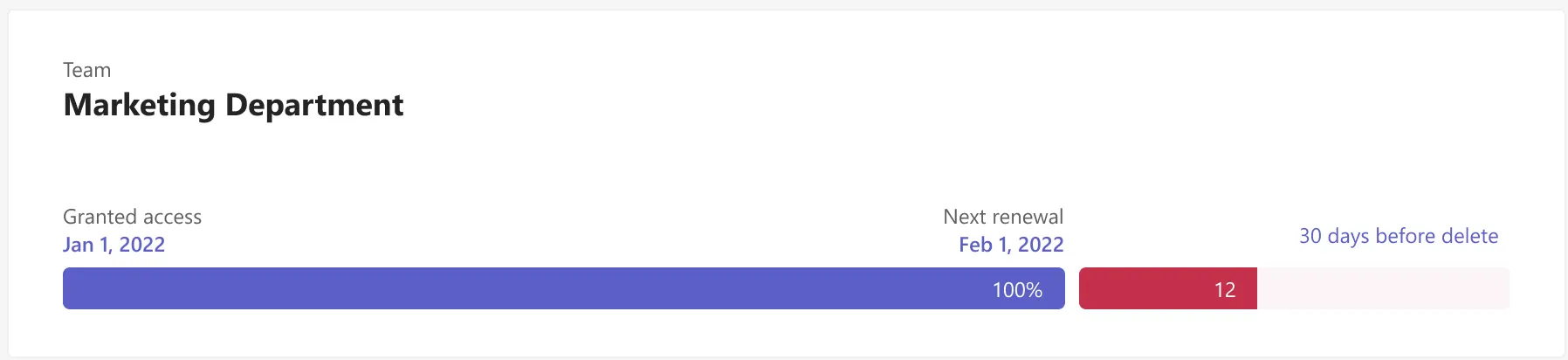
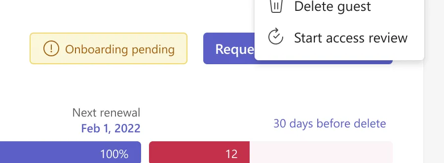
Granted access, next renewal, and the window before deletion, drawn to scale on a single line. The red segment is the thirty days in which the guest can still be saved. Putting the three dates on one bar rather than in three fields is what turns a set of facts into a deadline an admin can read at a glance.
Three onboarding states, three different sentences
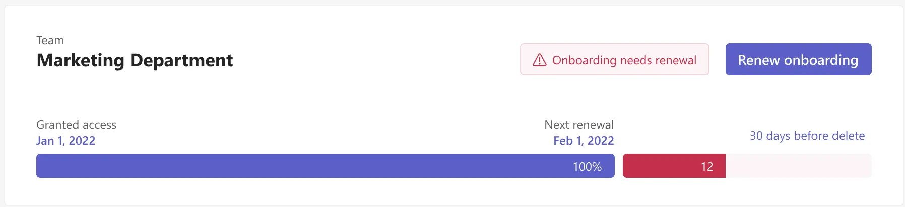
A healthy guest gets no badge at all — silence is the design. Pending gets an amber badge and the request action beside it. Needs renewal gets a red one and the single button that fixes it. The action is never a generic “Action”; it always names what will happen.

History is the audit trail
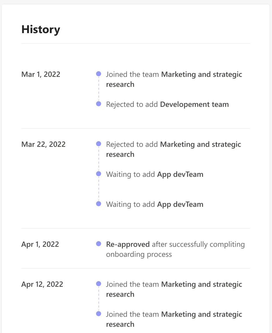
Joined, rejected, waiting, re-approved — grouped by date and written as sentences rather than event codes. This column is why an approval decision never has to depend on somebody remembering a conversation, and it is what the audit report is assembled from.
Access is per team, so renewal is too
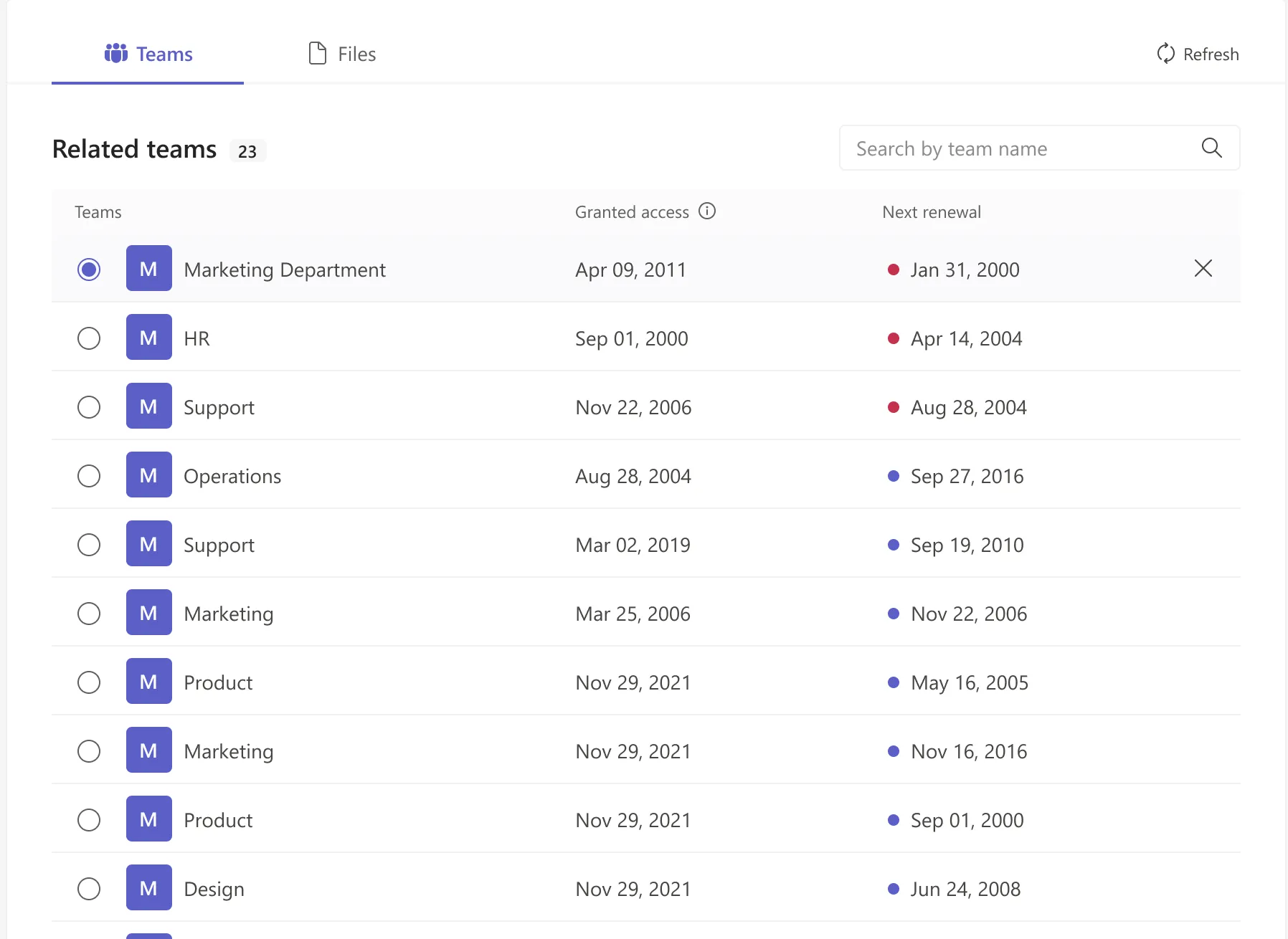
A guest with twenty-three related teams does not have one expiry date, they have twenty-three. Each row carries its own granted-access and next-renewal date with a red or blue dot for whether it is overdue, and removing a single team is one click from here — the narrowest revocation the product offers, and usually the right one.
Governance Is Configuration
Where “violation” gets its definition.
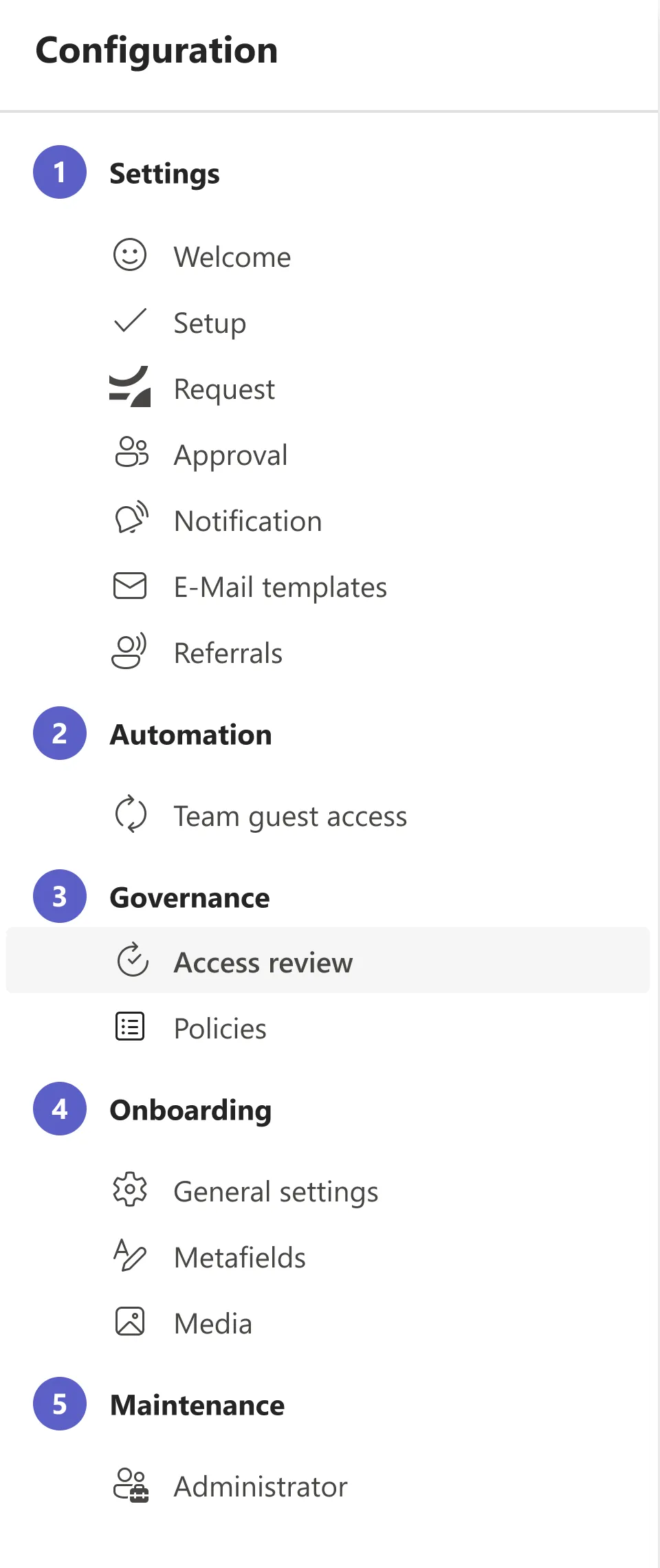
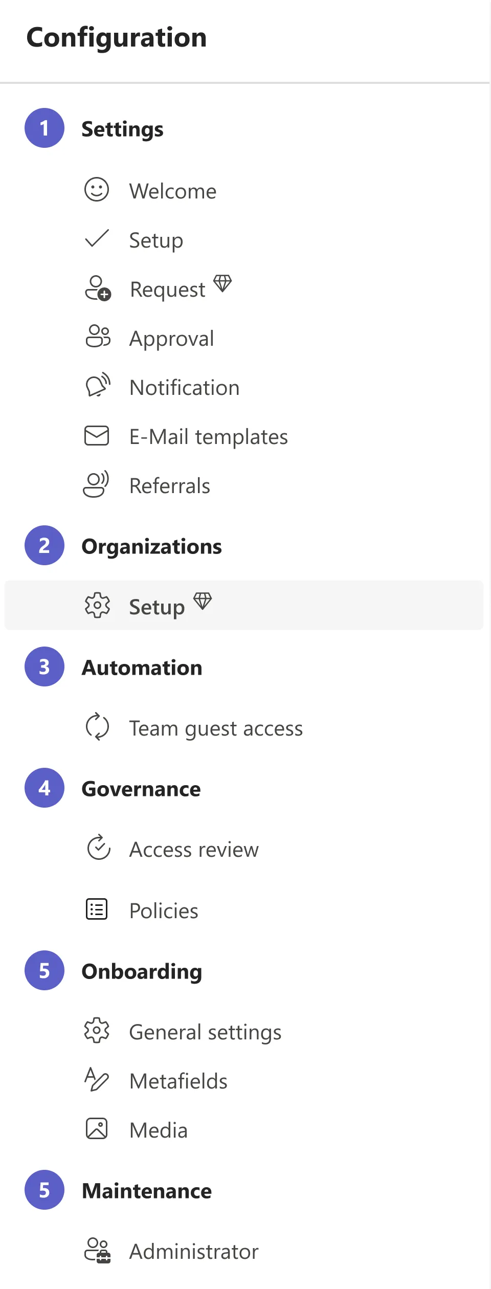
No two tenants govern guest access the same way, so the product could not ship one organisation’s policy as a default and call it governance. The configuration area is organised as a numbered sequence rather than an alphabetical list of switches, because it is read once during setup and then only when something needs to change.
A master switch that changes the map
Turning on organisation requests does not reveal a panel — it inserts a whole group into the configuration rail. Features that change what the product is get to change its navigation; features that change how it behaves stay inside a card.
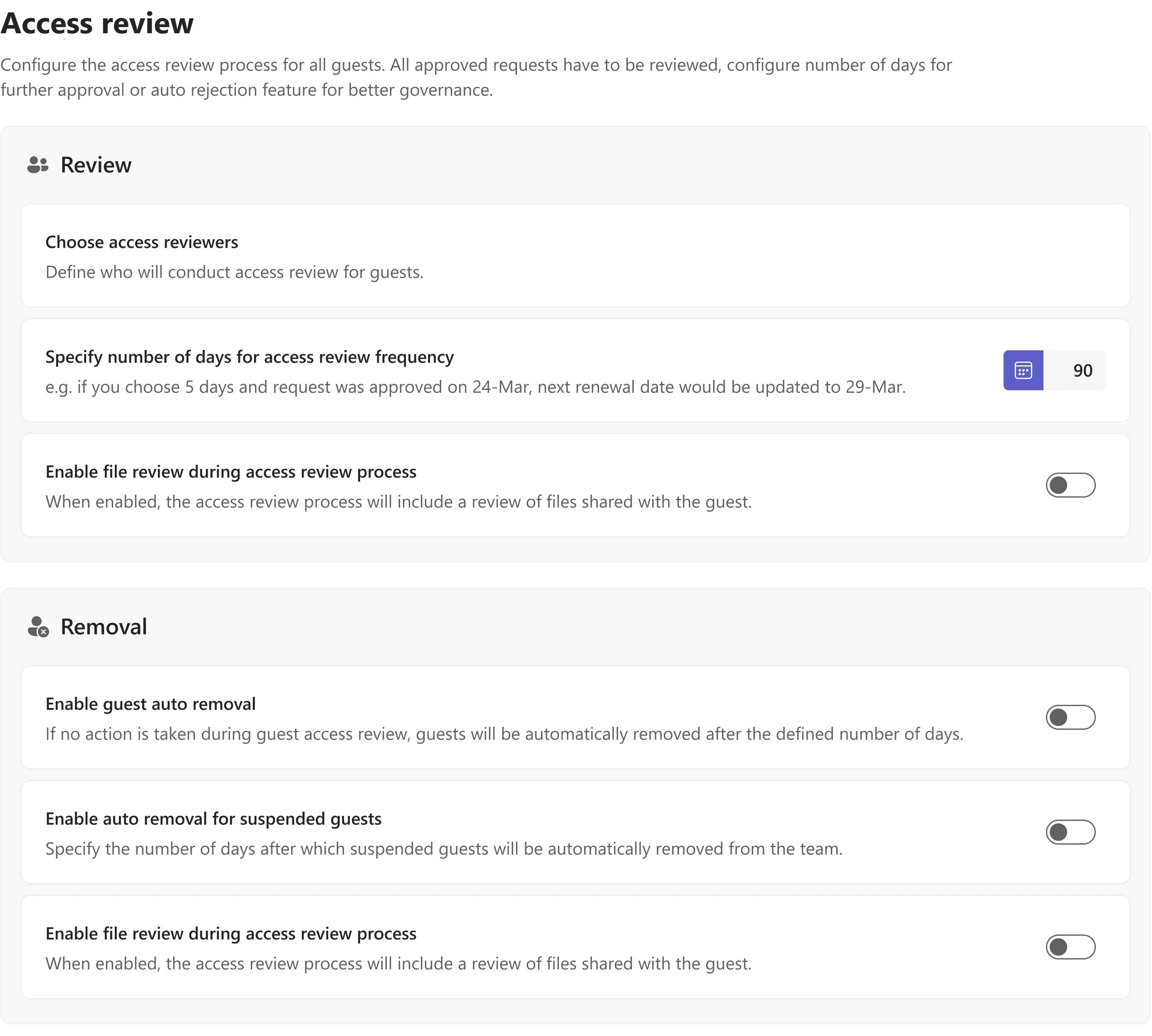
Access review
Review and Removal are deliberately two blocks on one page. Setting a ninety-day review frequency is harmless on its own; combining it with auto-removal is the setting that quietly deletes people. Keeping them adjacent means the consequence is visible at the moment the first switch is flipped.
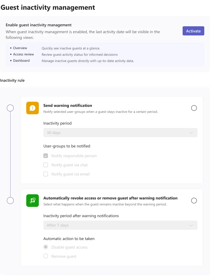
A rule, drawn as a sequence
Inactivity is not a toggle, it is a sentence with two clauses: warn after thirty days, then disable or remove seven days later. Drawing it as two connected steps — greyed out until the feature is activated — means an admin reads the whole rule before switching it on, rather than discovering the second half after it has fired.
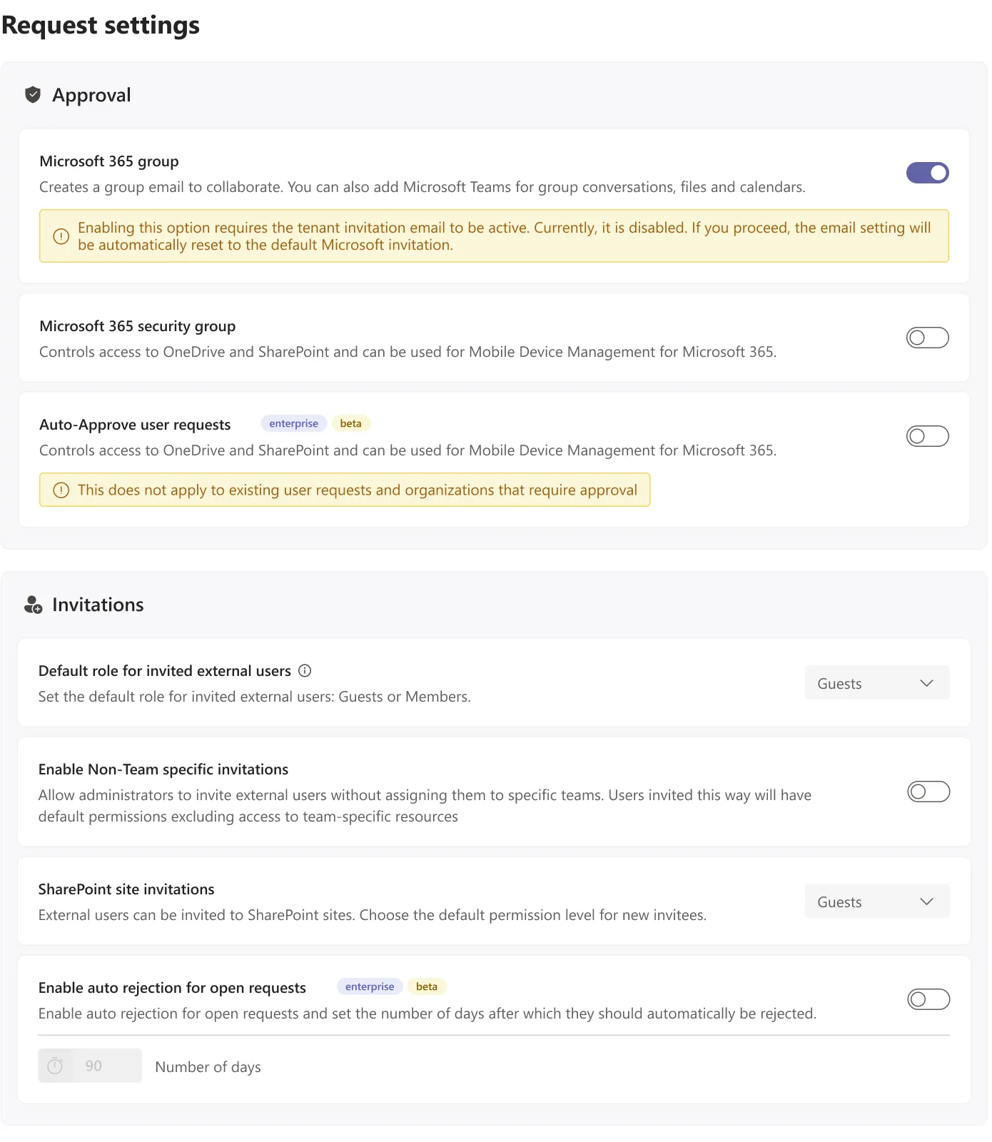
Warnings written where the damage would happen
Enabling Microsoft 365 groups silently resets the tenant invitation email; auto-approval does not apply to organisations that require approval. Both facts live in an amber note attached to the switch itself rather than in documentation, because a setting whose side effect is documented elsewhere is a setting that will be flipped by accident.
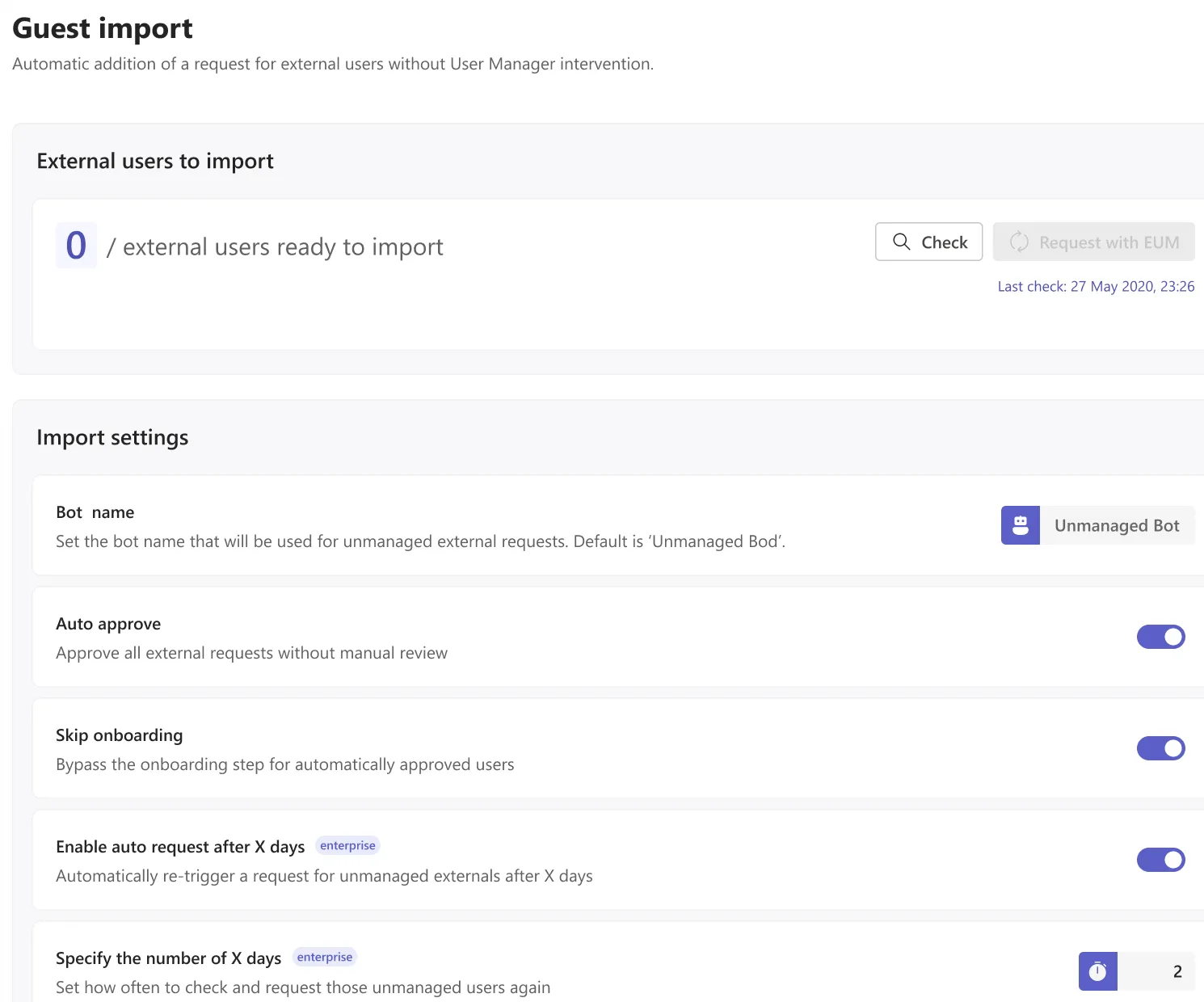
Bringing in the guests who were already there
Every tenant that installs this already has externals in it, invited before the product existed. Guest import finds them, and the number of them sits at the top with a Check button beside it. Auto-approve and skip-onboarding are offered because a mass import of existing colleagues should not create four hundred approvals; the import history underneath is what makes that safe to trust.
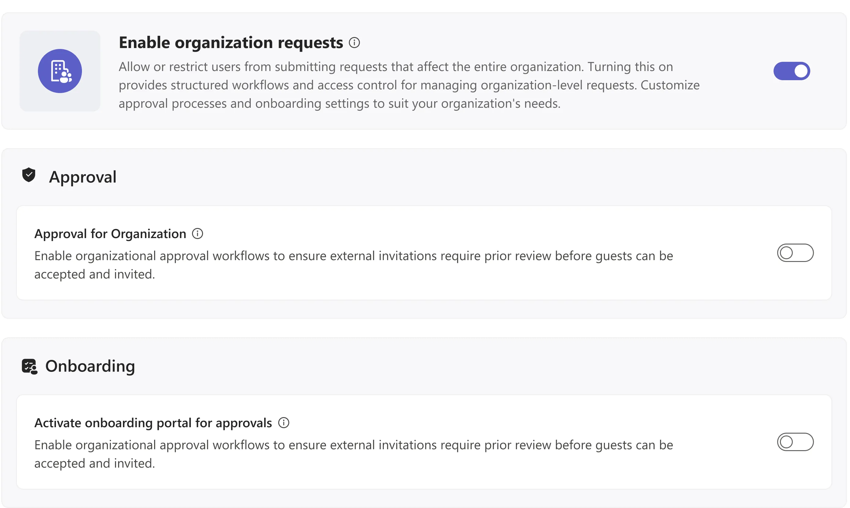
Organisations, once the switch is on
With organisation requests enabled, the settings arrive grouped by the stage they affect — approval, onboarding, invitations, extended and linked permissions. The enterprise and beta badges are on the settings themselves rather than in a pricing page, so an admin planning a rollout learns what they do and do not have while they are configuring it.
Conclusion
Achievements / insights
The useful lesson from this project was that the inventory was never the product. Pulling every external in a tenant into one table was the hard engineering problem and the easy design one; the design problem was everything that happens after an admin finds the row. Adding a queue, a lifecycle with real dates, and a configuration surface turned a report into something an admin opens on a Monday rather than at audit time.
What the design review showed
The redesign added one tab, one page and one settings area, and that was enough to move three jobs — approving, renewing and revoking — out of email and into the product. The measure I trusted most was smaller than any dashboard number: an admin could point at a single guest and say, out loud and without opening anything else, who vouched for them and when their access ends.
What I would design next
The obvious next surface is the team owner’s. Everything here is built for a tenant administrator, but the person who actually knows whether a contractor still needs access is the owner of the team they sit in. Delegating a renewal decision to them — with a deadline, a default, and an escalation back to the admin — is the piece that would stop the queue growing in the first place.