Meetings that leave a record.
A Microsoft Teams add-on for meeting management: build the agenda before the call, capture notes, tasks and decisions during it, and get a protocol out of it automatically afterwards.

Context & Problems
Context
Microsoft Teams made starting a meeting trivial and left everything around it
untouched.
The invitation carries a title and a time. The agenda lives in an email, or a chat
message, or nowhere.
A meeting produces three things worth keeping — notes, decisions and tasks — and Teams stores none of them where the meeting was. So they end up in whoever’s memory happened to be paying attention, and the people who could not attend get nothing at all.
The interviews came back blunt about it:
- • “It’s impossible to create decisions”
- • “Can’t download meeting decisions”
- • “No time tracking, cos we need to know how long it takes the decision-making process”
- • “They are using several alternative platforms for meeting organization”
The Core Problem
Everything that makes a meeting worth having happens outside the tool the meeting happens in:
- The agenda arrives as an attachment nobody re-opens
- Decisions are spoken, then written down by whoever remembers
- There is no record to hand the people who were not there
- Nothing connects what was planned to what was decided
The meeting happened. The record did not.
My Role & Constraints
 Me
Me I led the design of:
- • The calendar and how meetings are scoped to a team
- • The agenda structure, its items and their timing
- • Decisions, including voting, and where they are collected
- • The notification flow that tells attendees an agenda exists
- • The extensible chip system, including custom types
Responsibilities:
- • Interviews with meeting organisers and participants
- • Affinity synthesis across needs, pains and visual feedback
- • Competitive review of the meeting add-ons already in use
- • Interaction and visual design inside the Teams shell
- • Prototype testing and iteration on the agenda band
Scope & Constraints
- Lives inside Microsoft Teams and its colour palette
- Has to work before, during and after a meeting without a mode switch
- No two companies structure a meeting the same way
- Participants asked explicitly for larger type and softer colour
- The output is a protocol somebody outside the meeting will read
Needs, Pains, Visual
Four columns, and the fourth one is the honest one.
The affinity board came out of interviews with people who run meetings for a living. Three columns are theirs — what they need, what hurts, and what they think of how these tools look. The fourth is mine, written separately so my reading of the room could be argued with rather than smuggled into theirs.
The visual column was the surprise. Feedback on aesthetics is usually vague; here it was unanimous and specific — bigger type, softer and more natural colour, and stay inside the Teams palette because that is where this lives.
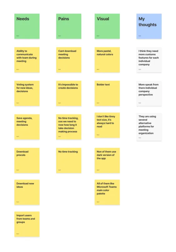
What they asked for, in their words
A voting system for decisions. Time tracking, “cos we need to know how long it takes the decision-making process”. Download protocols. Import users from teams and groups. Almost every note in the needs column names an artefact the meeting should leave behind, and almost every note in the pains column says that artefact does not currently exist.

Reframing the Problem
They did not want a better agenda. They wanted the meeting to leave something behind.
Read as a list, the pains look like agenda-editor complaints. Read as a group, they all sit after the meeting ends: no decisions, no download, no way to know how long anything took. The agenda was never the deliverable — it was the scaffolding for one.
Finding 1
Every pain in the board was about the after, not the during.
Finding 2
A decision is an object, not a sentence in a note. It needs an owner, a count and somewhere to live.
Finding 3
Time is the only currency in a meeting, so it belongs on the item and not just on the invitation.
Finding 4
No two companies structure a meeting the same way, so the structure itself has to be extensible.
Finding 5
The visual feedback was unusually specific: bigger type, softer colour, and stay inside the Teams palette.
From Insights to Product Direction
One page for planning, running and recording.
Strategic DecisionsOne page, three phases
Plan it, run it and record it without ever changing screen or entering a mode.
Make every artefact countable
Minutes, notes, decisions and tasks each get a chip with a number on it.
Let companies add their own
A custom chip with its own name, colour and type, for the structure we did not anticipate.
Put the time on the item
Minutes per agenda item, totalled at the top, so overrunning is visible while it happens.
Notify, never assume
An agenda nobody has seen is not an agenda, so the app says so until it has been sent.
Visual design
Final designs
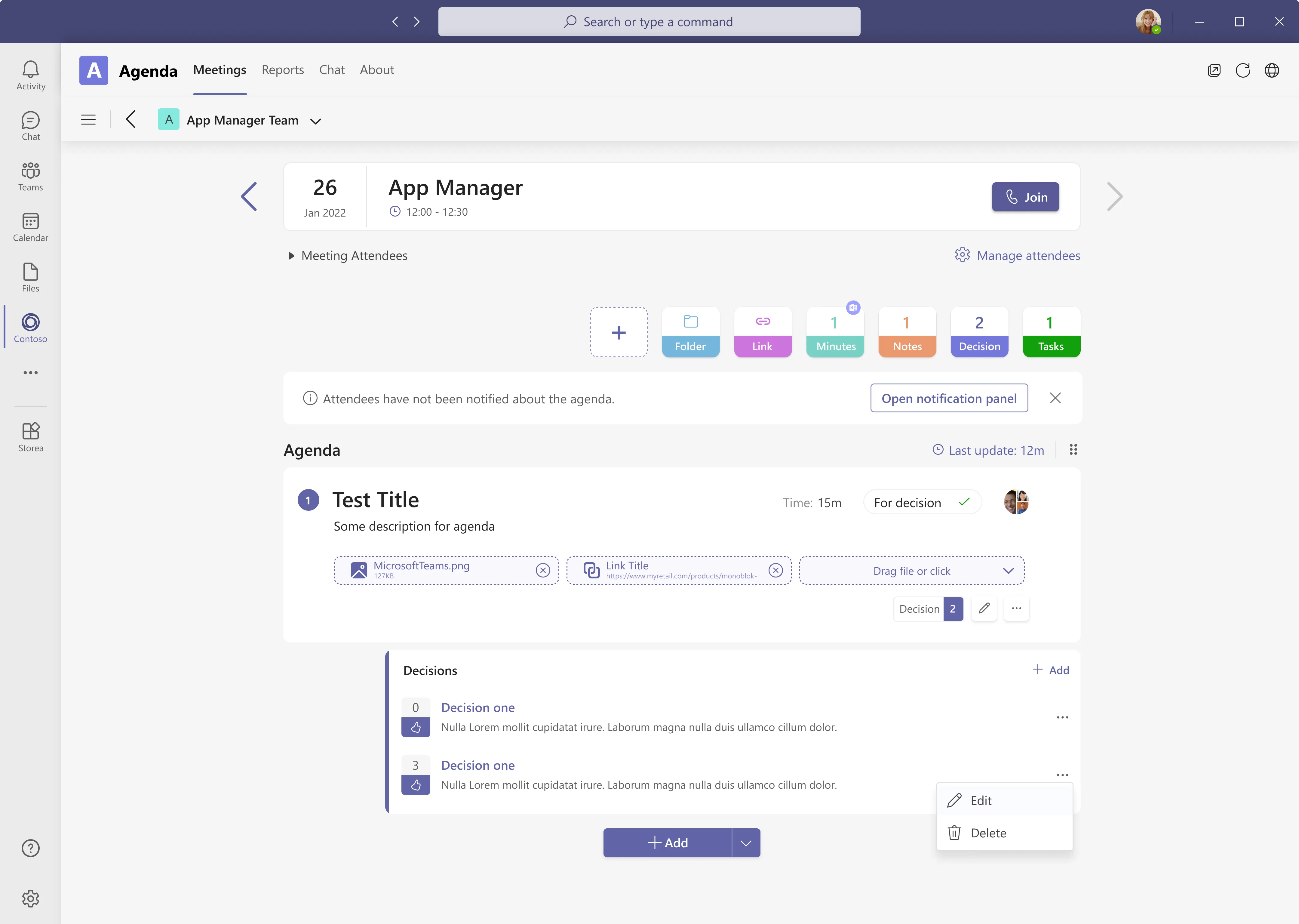
One scroll holds the whole meeting: when it is and how to join, what it has produced so far, whether anyone has been told, and the items themselves with their attachments and decisions hanging off them.
From a Label to a Control
The counters were the first thing we drew and the last thing we got right.
The band above the agenda started as a summary: four labels reporting how much the meeting had produced. In testing it was read as decoration. People saw four zeroes, understood that nothing had happened yet, and scrolled past — which is exactly the moment the product had to make itself useful.
Before — four labels reporting zero

- Four fixed types, decided by us, for everyone
- A count with nothing to click: reporting, not doing
- “Documents” quietly collapsed files and links into one number
After — six chips and an empty slot

- Each chip adds its own artefact, so the count is also the button
- Folder and Link split what “Documents” was hiding
- The empty tile invites a type we never shipped
Colour did the work the labels could not. Each artefact type carries the same hue everywhere
it appears — in the chip, on the item, in the report — which is what let the band shrink to
a row of tiles and still be read at a glance. The palette stayed inside Teams’ own, and
softer than our first pass, because the interviews had been explicit about both.
The empty tile on the left is the part I am most pleased with: it is the only place in the
product that admits we do not know how your company runs a meeting.
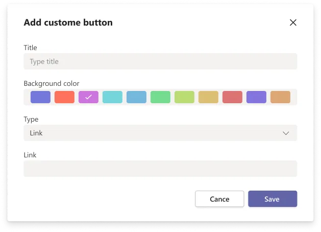
The chip a company adds itself
Title, colour, type, and — for a link type — a destination. Eleven swatches rather than a colour picker, because the point is that a new chip sits beside the shipped ones without breaking the row. One interview note asked for “more custom features for each individual company”; this dialog is the whole of our answer to it.
Information Hierarchy That Scales
When, what, and then the work.
The page answers the questions in the order a participant asks them on the way into a call. Each band is complete on its own, which matters because the middle one is the part that gets screenshotted into a chat.
-
The meeting card holds the date, the title, the window and the one button that matters in the ninety seconds before it starts.
Arrows either side page through the team’s meetings, so preparing for three in a row never returns to a list.
-
Below it, a banner states the one fact that invalidates everything else on the page: attendees have not been notified.
It is dismissible, because an organiser who is still drafting does not need to be told twice.
-
Then the items themselves — numbered, timed, typed, owned, with their attachments inline rather than behind a paperclip.
This is the band that has to survive being read five minutes before the meeting by somebody who has not opened the app before.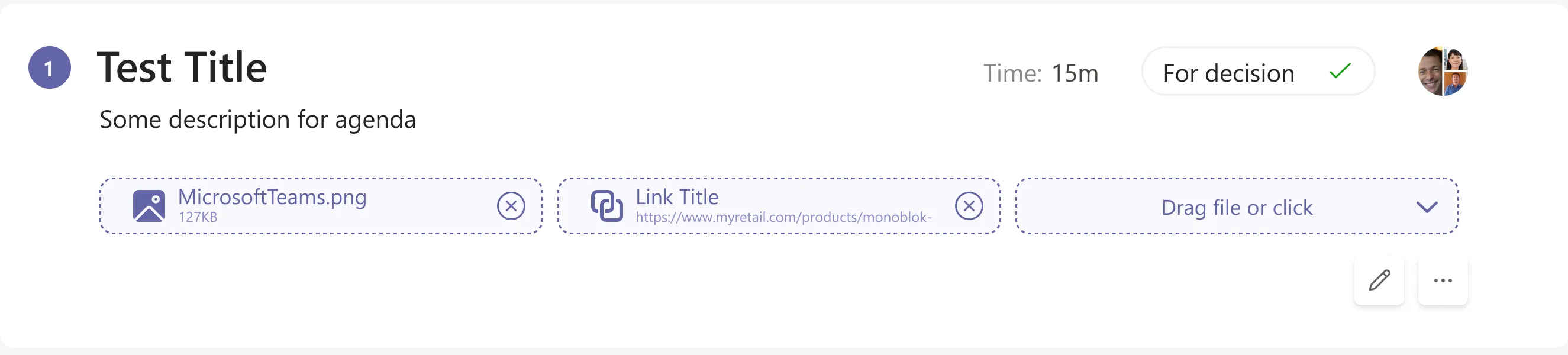
Surfacing the Right Signals
Five facts on one row, and each one prevents a specific argument.
Position, as a number
Items are numbered rather than bulleted because the order is a commitment, not a formatting choice. The drag handle at the top of the list reorders them, and the number is what makes the consequence of that visible — moving item four to the top is the whole negotiation about what this meeting is for.
Time, per item
Fifteen minutes, stated on the item and totalled above the agenda. The interviews were blunt about this: without per-item time nobody can tell whether the decision-making is what overruns, and a meeting-level duration answers a question nobody was asking.
Type, as a promise
“For decision” tells everyone reading the agenda what is expected of them before they arrive. It is also what routes the item: an item marked for decision is the one that can carry a vote, and the one that will appear in the decisions view afterwards.
A presenter, not a room
One face on the item, assigned from the meeting attendees. Naming who leads an item is the cheapest way to stop the silence at the start of it, and it gives the generated protocol something to attribute the outcome to.
Attachments in the open
A file and a link, shown as named chips with the size and the URL rather than a paperclip icon. Preparation only happens if the thing to prepare is visible from the agenda, so the drop target stays on the item permanently instead of appearing on hover.
Before the Meeting
Find it, scope it, fill it, send it.
Everything up to the call happens in four moves, and none of them leaves the app. The calendar is the entry point rather than a feature: an agenda that has to be looked for is an agenda that gets written in the meeting itself.

A week, with the agendas marked
The week view exists to answer one question — which of these already has an agenda. Meetings that do carry the badge and the team name underneath; the rest are just blocks of time. Making that difference visible at the week level is what turns writing an agenda from an intention into a gap you can see.
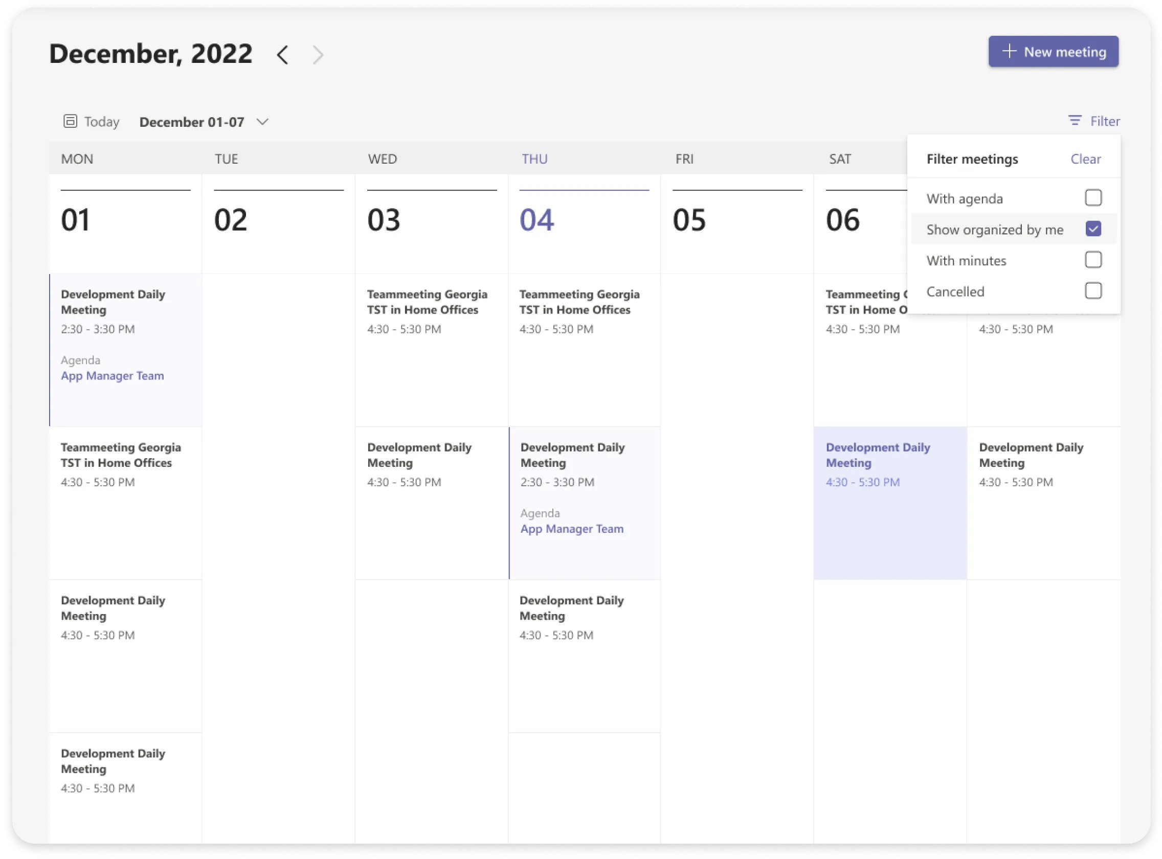
Four filters, all of them about state
With agenda, organised by me, with minutes, cancelled. Every filter is a state rather than a category, because the organiser’s question is never “show me marketing meetings” — it is “show me the ones I still owe something to”.
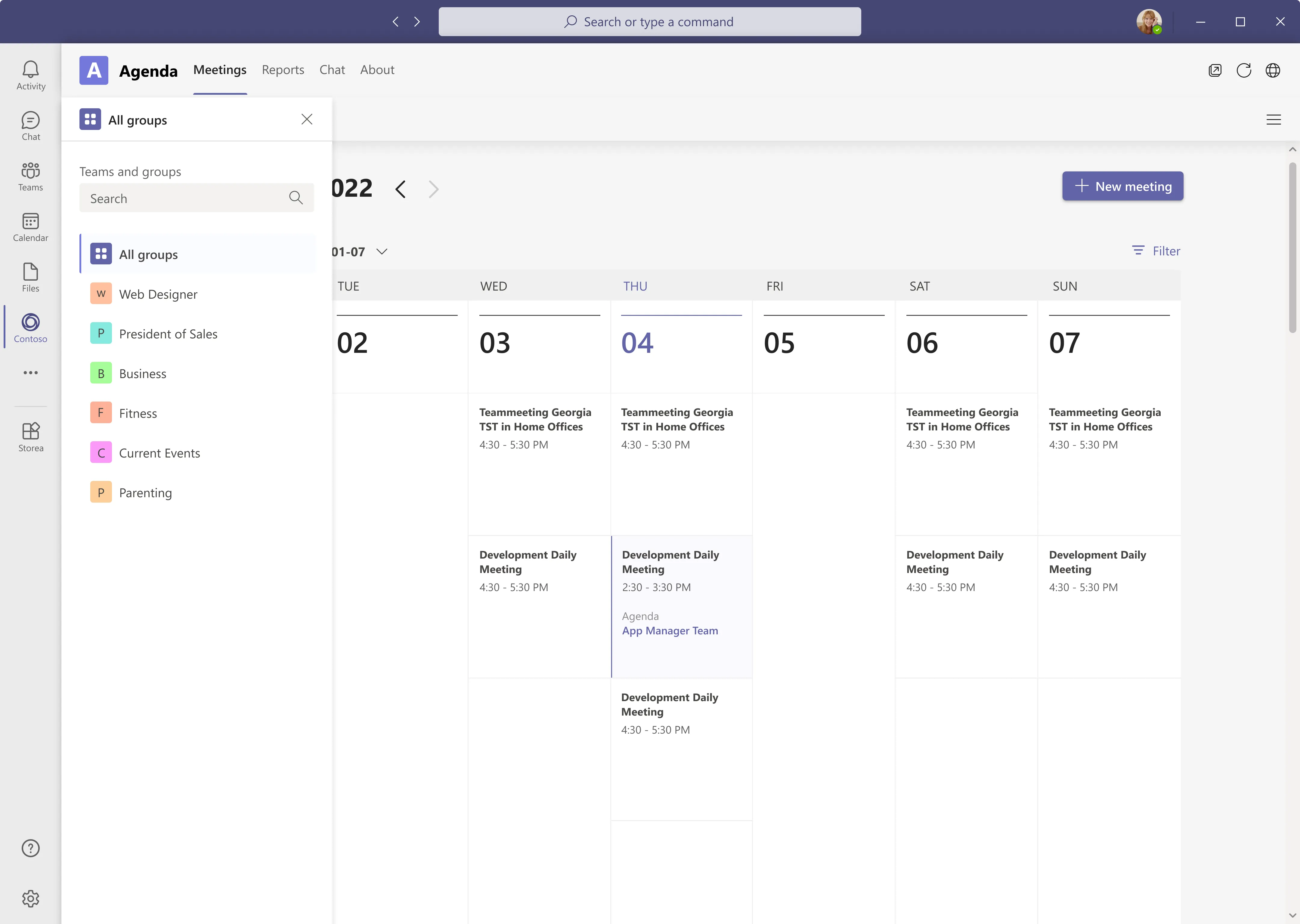
Scope is a panel, not a dropdown
One person sits in eight teams and cares about two of them this week. A searchable panel with coloured initials handles that better than a select, and “All groups” stays pinned at the top so the way back is never more than one click. This is also the answer to an interview note asking to import users from teams and groups rather than retype them.
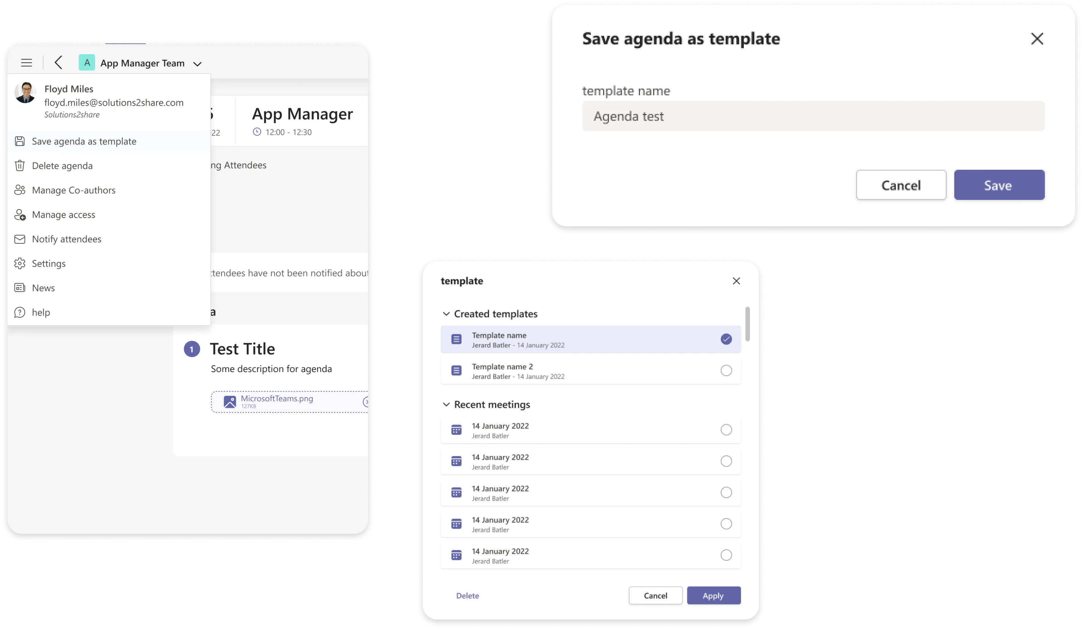
Most agendas are last month’s agenda
A recurring meeting has the same shape every time, so the product lets an agenda be saved as a template and re-applied. The picker offers created templates and recent meetings side by side, because the fastest template is usually the last one you actually ran rather than the one you remembered to save.

An empty agenda offers both routes
Add agenda is the primary button and Add by template sits underneath it as a link. The ordering is deliberate: a first-time organiser has no templates, and putting the shortcut first would advertise a feature they cannot use yet.
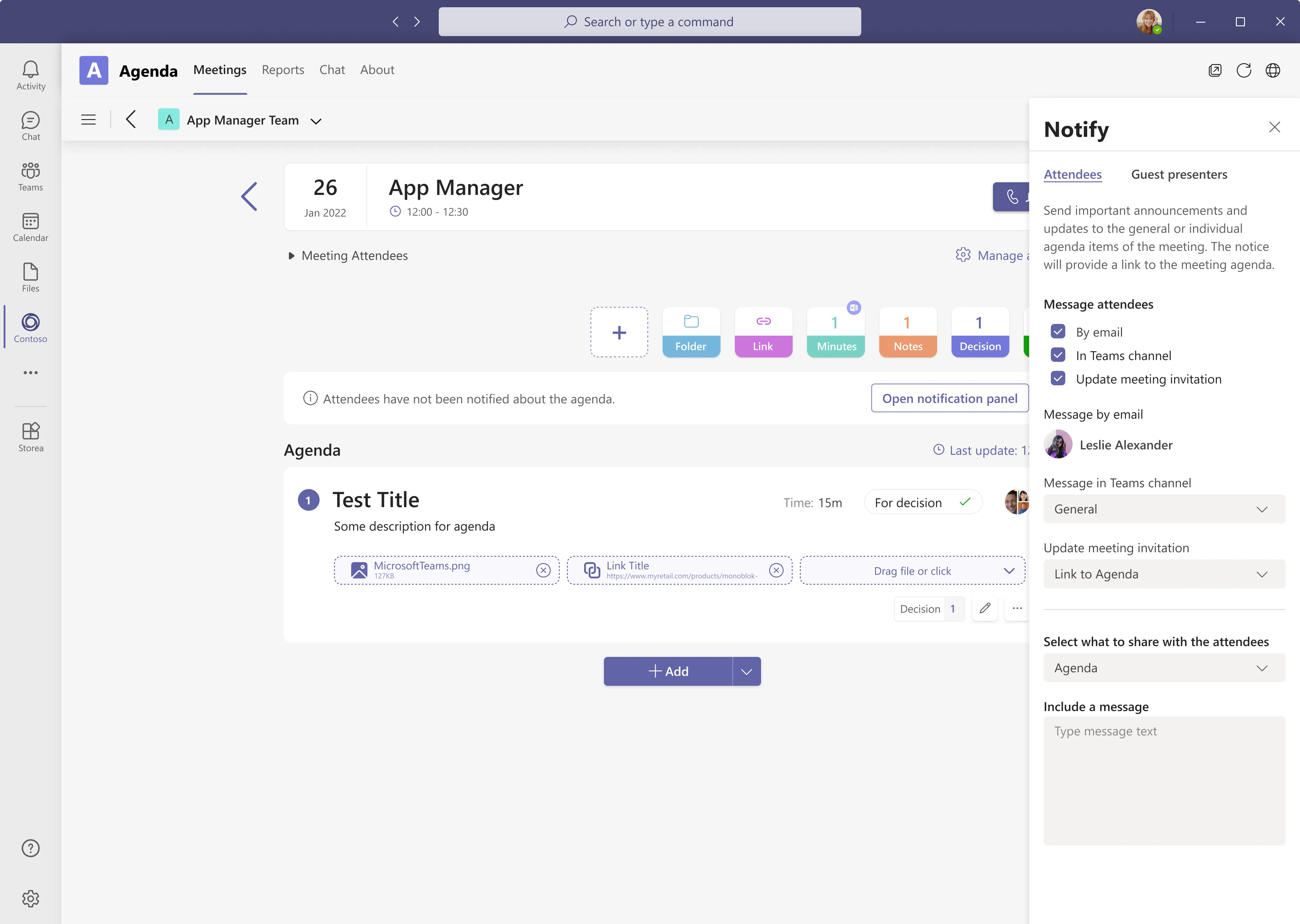
Sending is the last step, and it is explicit
Email, the Teams channel, and the meeting invitation itself — three checkboxes rather than one send button, because the right combination differs per organisation. Choosing what to share separately from how to share it means the agenda can go out while the decisions stay internal, which is the distinction that made this panel necessary at all.
During the Meeting
Capture has to be faster than remembering.
Anything typed during a call competes with the call. The editing surfaces are therefore inline, keep the rest of the agenda visible, and never open a modal that hides what is being discussed.
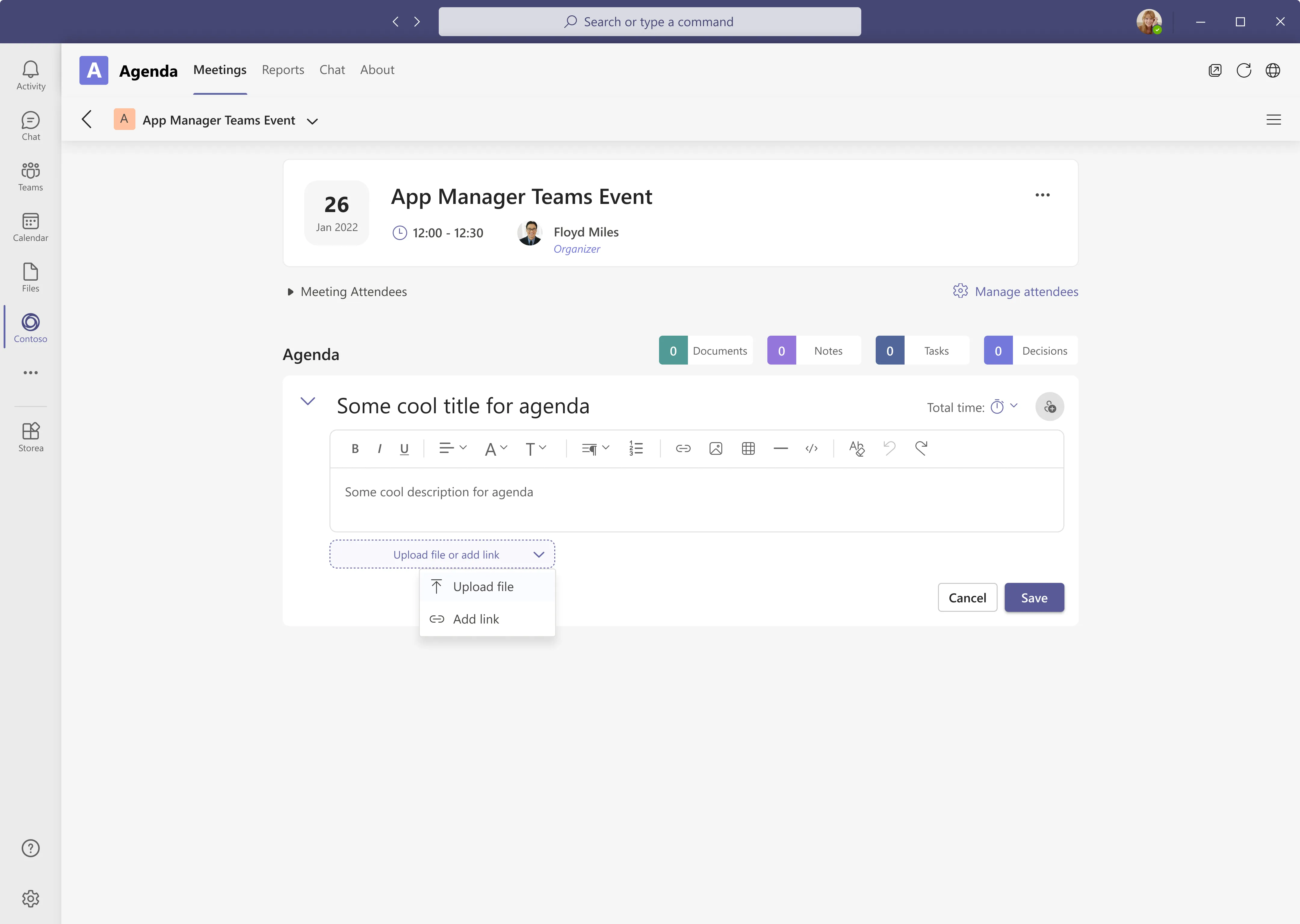
A full editor, not a text field
Formatting, lists, tables, links and images — the same toolbar people already have in every other Microsoft surface. Attaching is one control with two answers, upload or link, because in practice the thing being attached is as often a SharePoint URL as it is a file on a desk.
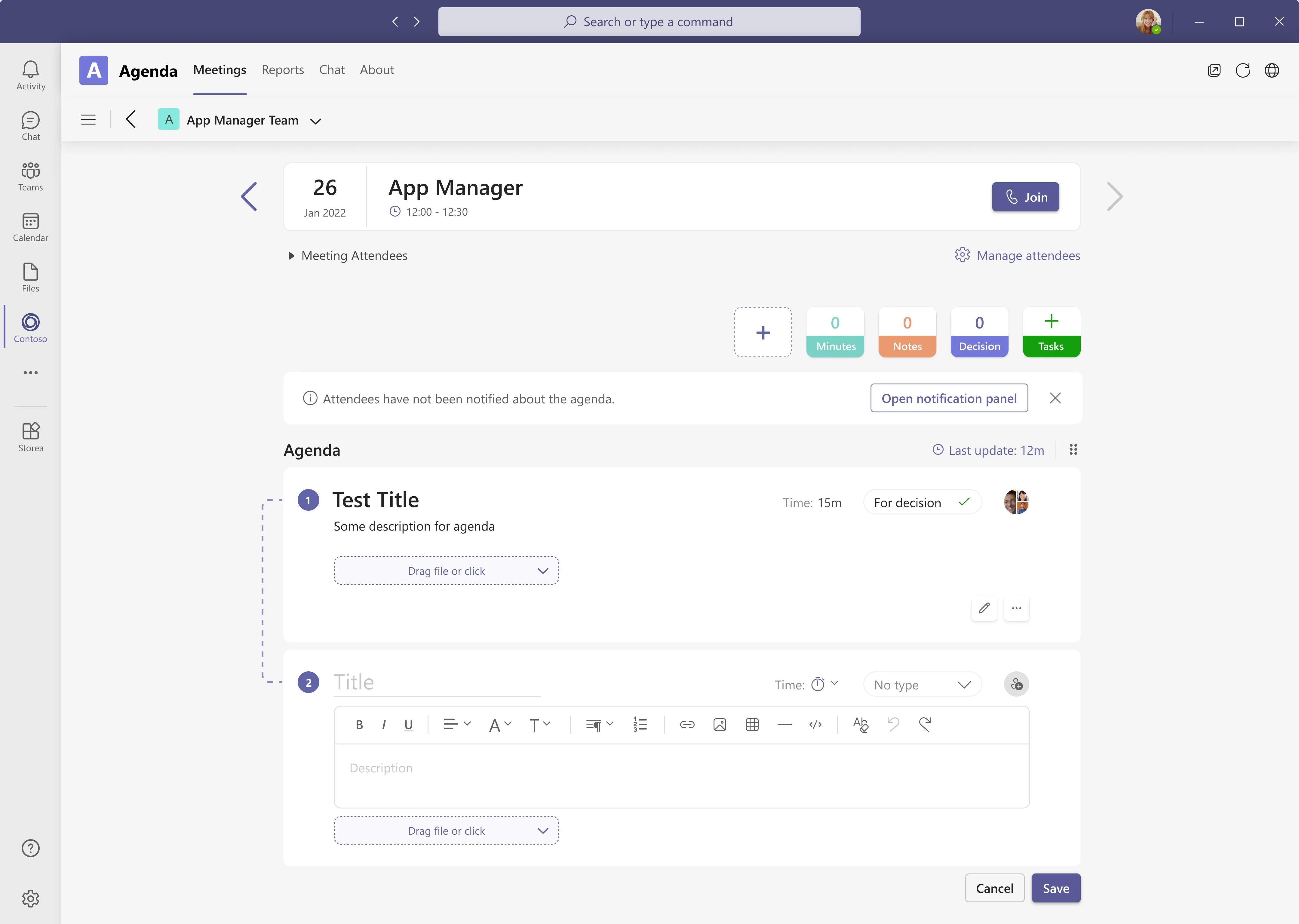
The new item appears where it will live
Adding an item expands it in place, in position two, with the first still readable above. The connector down the left is there to say this belongs to the list rather than floating over it — the alternative, a dialog, hides the agenda you are trying to extend at the exact moment you need to see it.
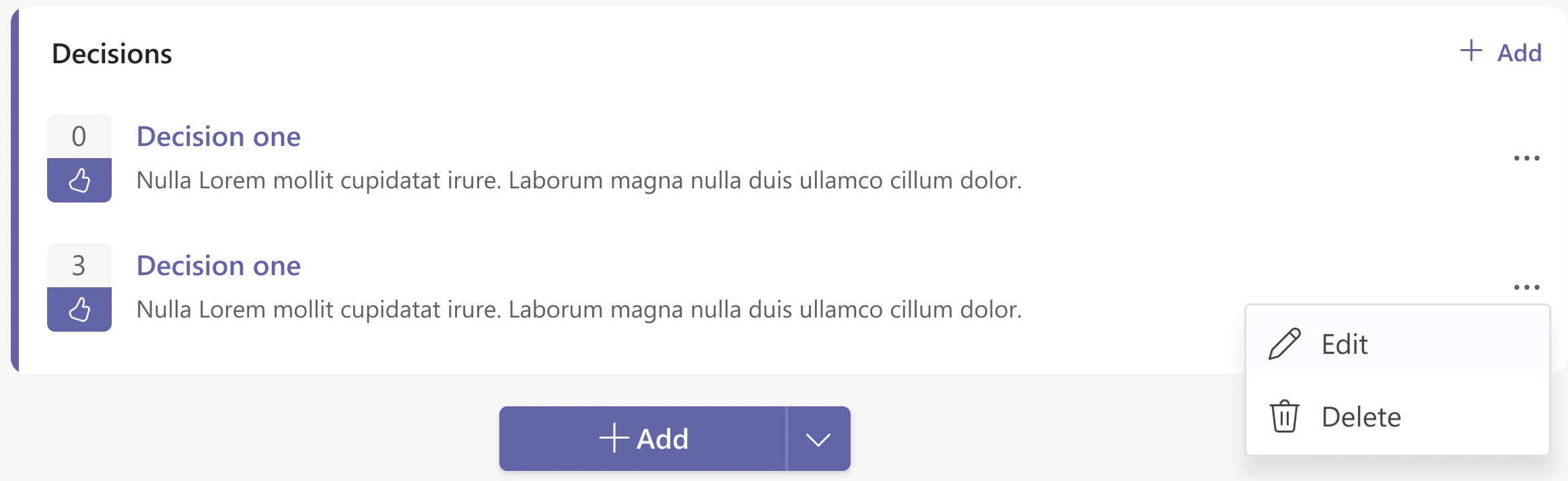
Decisions carry a count
Every decision is its own record with a vote beside it, which is the feature the interviews asked for most directly — “a voting system for new ideas, decisions”. The count is small and the thumb is not celebratory: this is a show of hands captured in passing, not a poll that stops the meeting.
After the Meeting
The part the whole product exists for.
The record is the deliverable. It has to be readable by somebody who was not there, and it has to leave the app, because half the people who need it do not have Teams open.
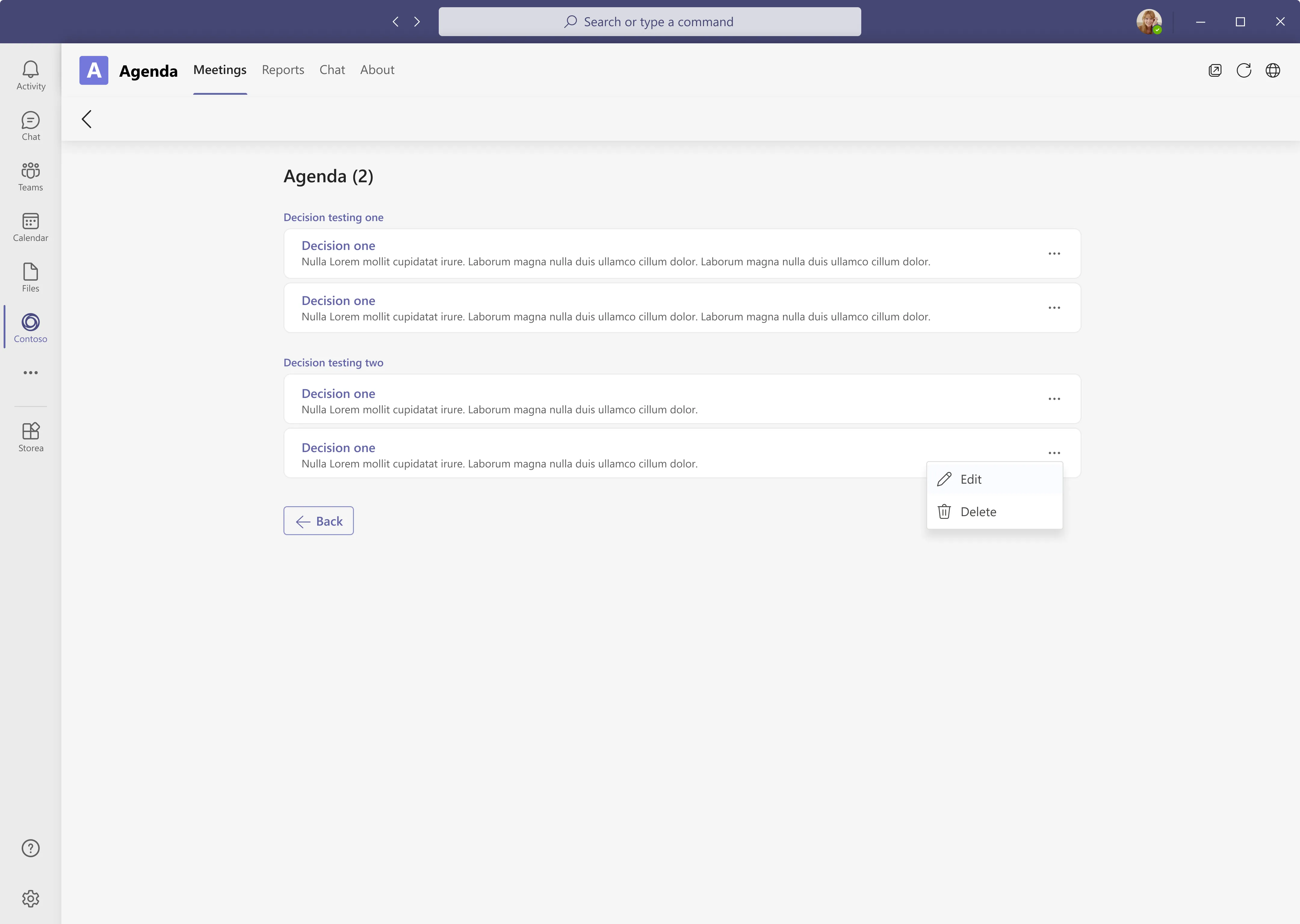
Every decision, under the item that produced it
Pulled out of the agenda and grouped by the item they came from, so the context survives the extraction. This is the view somebody opens a week later to answer “what did we agree”, and the grouping is what stops that answer being a list of sentences with no idea why any of them were said.
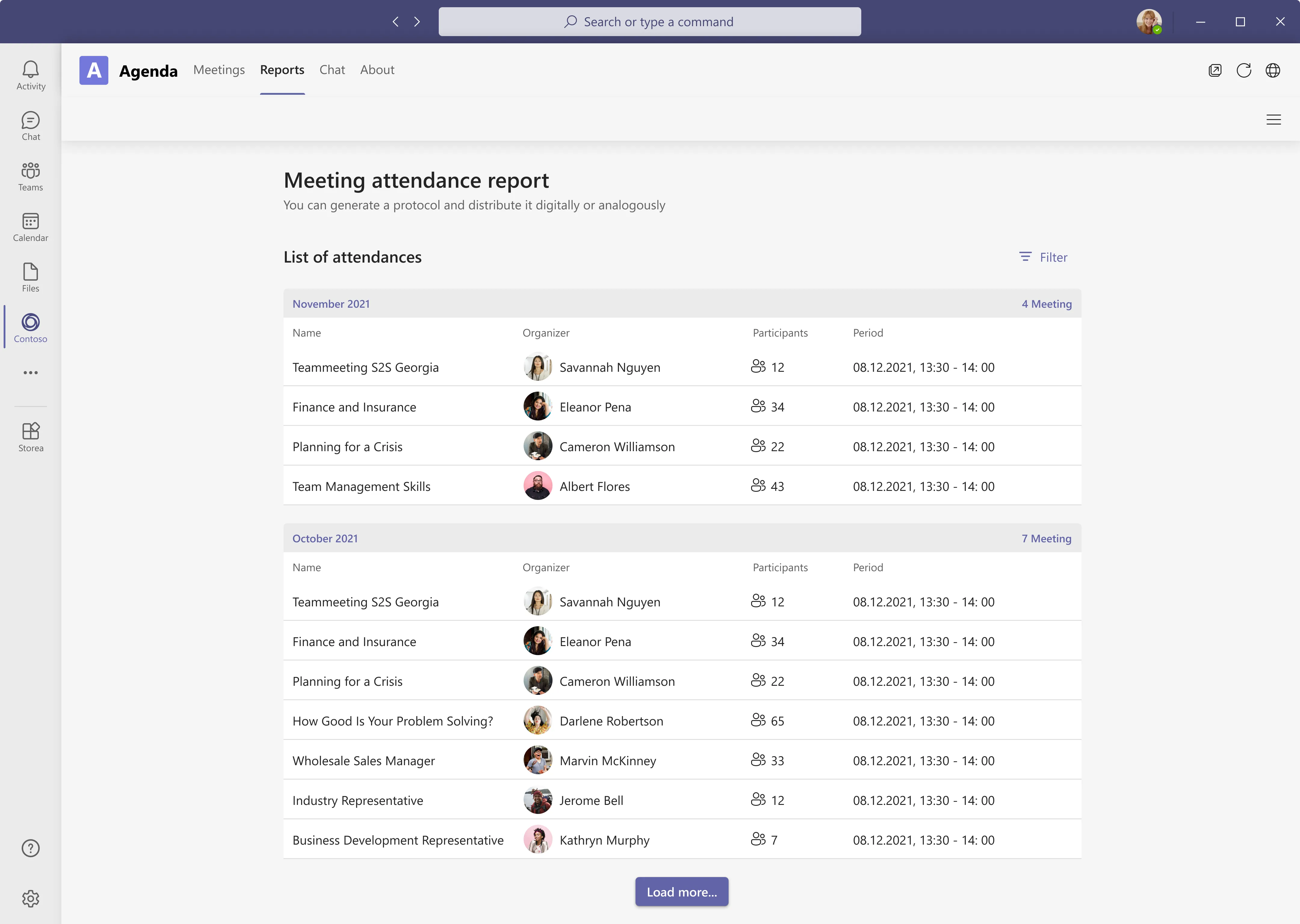
A protocol you can hand over
Grouped by month, with the organiser, the headcount and the window. The subtitle says it plainly — generate a protocol and distribute it digitally or analogously — which came straight out of an interview note asking to download protocols. Load more rather than pagination, because this is read by scrolling backwards until you find the meeting you half-remember.
Conclusion
Achievements / insights
The affinity board turned out to be the specification. Almost every feature that shipped can be traced back to one note on it — the voting system, the per-item timing, the downloadable protocol, importing people from teams and groups, and the custom chip that answers “more custom features for each individual company”. Doing the synthesis properly meant the arguments later were about execution rather than about what to build.
What the design review showed
The change that mattered was the smallest one on the page. Turning four passive counters into six chips you can add from — with an empty slot for a type we did not ship — moved the band from something people scrolled past to the place they started. It is the clearest example I have of a component that failed not because it was badly drawn but because it was not a control.
What I would design next
Tasks are the weakest link in the chain. A decision that produces a task currently ends where the meeting ends, and the honest next step is carrying that task into Planner or To Do with the decision attached to it — so the record does not just describe what was agreed but follows whoever agreed to it.