IBS Management App
Overview
IBS Management App is a mobile application designed to support people living with Irritable Bowel Syndrome (IBS) by helping them manage the FODMAP diet with confidence. The app combines a structured food database, clear categorization, a symptom tracker, and a practical guide — making daily food decisions simpler and less stressful.
As the Lead UX/UI Designer, I was responsible for:
- Conducting user research and identifying key needs,
- Designing the information architecture and user flows,
- Creating wireframes and high-fidelity designs,
- Building a visual system that communicates trust and simplicity.
This case study walks through my end-to-end design process — from research insights to final solutions — showing how thoughtful design can genuinely improve the daily lives of people with IBS.
Problem & Challenges
Living with IBS (Irritable Bowel Syndrome) is often unpredictable and stressful.
One of the most effective management strategies is following the FODMAP diet, but this comes with challenges:
- Complex information: FODMAP data is often scattered across articles, blogs, or outdated PDFs, making it difficult to quickly find what’s safe to eat.
- Everyday decisions: Users need to know “Can I eat this?” in seconds, not minutes.
- Tracking symptoms: Many existing apps lack intuitive ways to connect food intake with how the body reacts.
- Trust issues: IBS sufferers rely heavily on accuracy; poor UX or unclear labeling can create doubt and stress.
The challenge was to design an app that not only provides reliable information, but also feels simple, fast, and trustworthy — supporting people in moments when they’re making real-life food choices.
Goals & Objectives
The main goal was to create a user-friendly and trustworthy mobile app that simplifies the FODMAP journey for people with IBS.
Specific objectives included:
- Quick access to food data: Enable users to instantly check whether a food is low, medium, or high FODMAP.
- Organized structure: Present foods in clear categories (fruits, vegetables, dairy, sweeteners, etc.) for easy navigation.
- Symptom tracking: Allow users to log meals and track their body’s responses over time.
- Education: Provide a guide with practical tips for living with IBS and following the FODMAP diet.
- Consistency & trust: Design a clean, calm, and accessible UI that reduces stress instead of adding to it
Research
User Research
To better understand the needs of people living with IBS, I conducted 3 user interviews with individuals who actively manage their condition using the FODMAP diet.
Key insights from the interviews:
- Information overload: Participants often struggled to find reliable and consolidated information about FODMAP levels in foods.
- Decision stress: They needed a quick and clear way to answer the daily question: “Can I eat this without triggering symptoms?”
- Tracking gaps: Most had tried to note symptoms manually but found it inconsistent or too time-consuming.
- Trust & clarity: They valued simplicity in design and accuracy in data more than extra features.
These insights shaped the foundation of the app, focusing on clarity, speed, and trustworthiness as the core design principles.
Desk Research
To understand the current landscape, I reviewed existing mobile apps that support people with IBS and those following the FODMAP diet.


Design
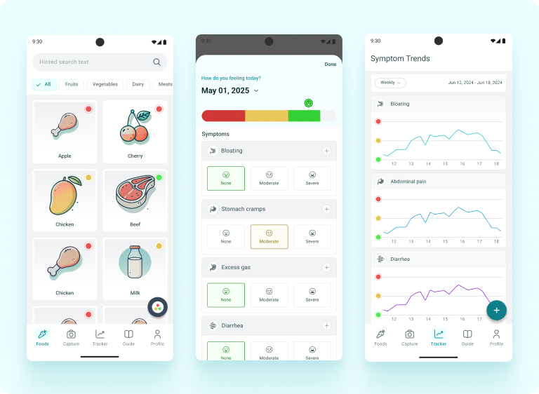
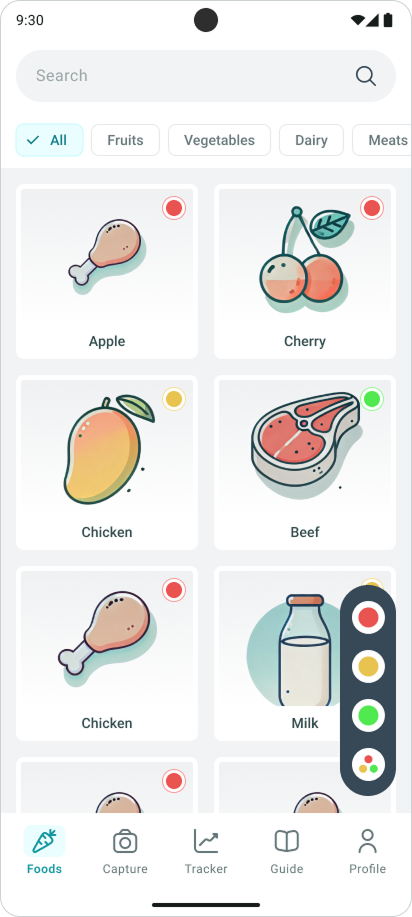
Main Page – Foods Overview
The main page of the app is designed as the starting point for users, since the most frequent task is to check whether a specific food is suitable for the FODMAP diet.
Design decisions:
- Category tabs at the top (All, Fruits, Vegetables, Dairy, etc.) → allow users to filter quickly and reduce cognitive load.
- Search bar with hint text → supports fast lookup when the user already knows what they’re looking for.
- Visual food cards with icons and colors → each food is displayed as a card with a friendly illustration, making the interface approachable.
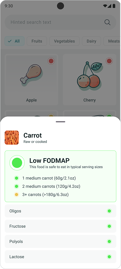
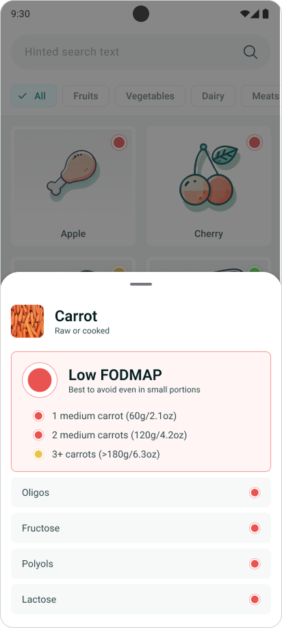
- Traffic light system (green, yellow, red dots) → conveys FODMAP safety at a glance without needing to open the detail view.
- Bottom navigation bar → clear access to the app’s other core functions (Capture, Tracker, Guide, Profile).
Why this design?
Users with IBS often feel stressed when making food choices. The main page was designed to minimize friction and provide instant clarity:
- Green = safe
- Yellow = moderate caution
- Red = avoid
This structure ensures users can answer the key question — “Can I eat this?” — in just 1–2 seconds.
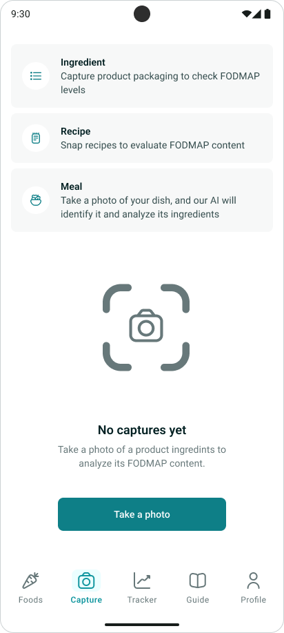
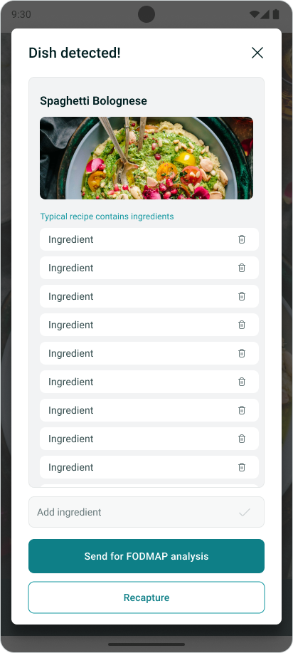
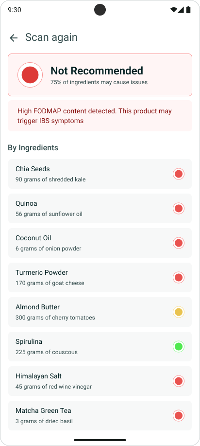
Capture Feature – Food & Ingredient Scanner
How it works:
- Take a photo of an ingredient label, recipe, or meal.
- AI detects the dish and lists ingredients.
- Each ingredient is analyzed with the traffic light system (green = safe, yellow = moderate, red = avoid).
- The app shows an overall result plus a clear ingredient breakdown.
Why it matters:
- Saves time when shopping or eating out.
- Reduces stress by giving instant clarity.
- Builds trust by showing exactly which ingredients cause issues.
Tracker – Symptom Logging & Trends
The Tracker allows users to log their daily symptoms and visualize how they change over time.
Key functions:
- Daily logging → Users record symptoms such as bloating, cramps, gas, diarrhea, etc. (None / Moderate / Severe).
- Trends view → Graphs and calendars help spot patterns across days or weeks.
- Correlation potential → When combined with meal logs, users can connect foods with symptoms.
Why it matters:
- Encourages self-awareness by showing how diet impacts well-being.
- Provides a visual, easy-to-read format (graphs, emoji scales, color coding).
- Helps users discuss patterns with doctors or dietitians.