My Role
As a UX/UI designer, I was the bridge between stakeholders and developers, working closely with both parties to ensure the best user experience. I conducted extensive user research and competitive analysis to understand user needs and preferences. Using this knowledge, I created intuitive user flows and developed wireframes to lay out the app’s structure and key features.
From there, I moved on to high-fidelity design mockups and prototypes, incorporating feedback from stakeholders and users to refine the app’s visual style and functionality. Throughout the process, I collaborated closely with developers to ensure that designs were technically feasible and could be implemented efficiently.
Problem
Managing a large team can be a daunting task, but with the help of modern technology, the process can be simplified. Microsoft Teams is a valuable tool for team governance, but it’s not without its challenges. Users often lack a clear understanding of how well they’re utilizing Teams’ governance features, with no clear indicators to measure their progress. Additionally, important information about the various features, methods, and apps available on Teams can be difficult to navigate and structure. As a UX/UI designer, I worked to address these issues and create a user-friendly interface that streamlines the team governance process.
Solution
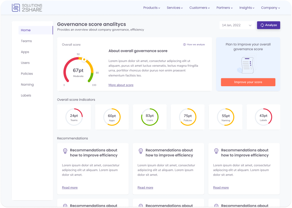
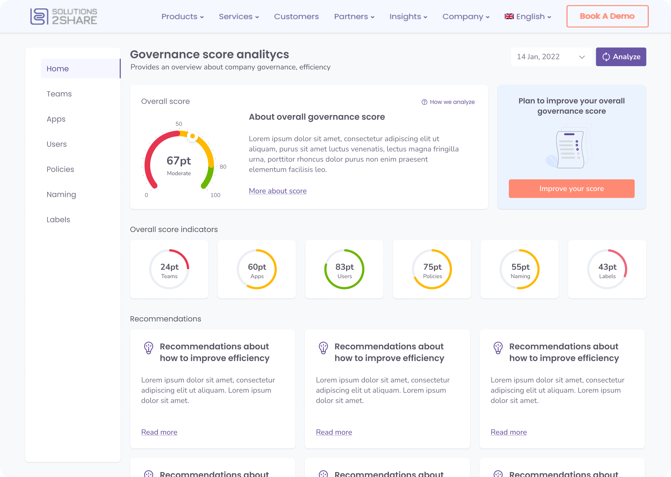
To help users understand their team’s governance process and measure their progress, we created a user-friendly governance score dashboard. The dashboard includes an overall governance score, as well as detailed scores for team and user management. Additionally, the dashboard provides users with tailored suggestions for how they can improve their governance process, including utilizing various features and apps within Microsoft Teams.
With this new dashboard, users now have a clear and easy-to-understand view of their team’s governance process. They can quickly identify areas that need improvement and take specific steps to address them. This ultimately leads to a more efficient and effective team collaboration experience.
Process
Research
Competitors analysis
In this project, my initial step was a focused competitor analysis. Tasked with designing an app in a complex, variable-rich environment, I found clarity by examining the market’s leading player: Rencore. Instead of the usual broad analysis, I concentrated on Rencore’s features, dissecting their strengths and weaknesses. This approach provided vital insights into the market and informed my design strategy.
Competitors

Research
Heuristic evaluation of the competitor’s
Heuristic evaluation of our competitor, Rencore, proved invaluable. By assessing their platform against established usability principles, we identified key usability issues. Our focus extended beyond basic tasks to include navigation, search functionality, error messaging, feedback, and help documentation. This comprehensive analysis offered deep insights into Rencore’s usability strengths and weaknesses, guiding the design strategy for our own platform.
Research
Affinity diagram
The affinity diagram was a key tool in structuring findings and ideas around governance variables. It enabled visual grouping of similar concepts, clarifying the overarching narrative. This method revealed patterns and themes within the data, sparking insights for enhancing the governance process. The result was a clear, concise data summary that directly informed the design process.

Research
Ontology Map
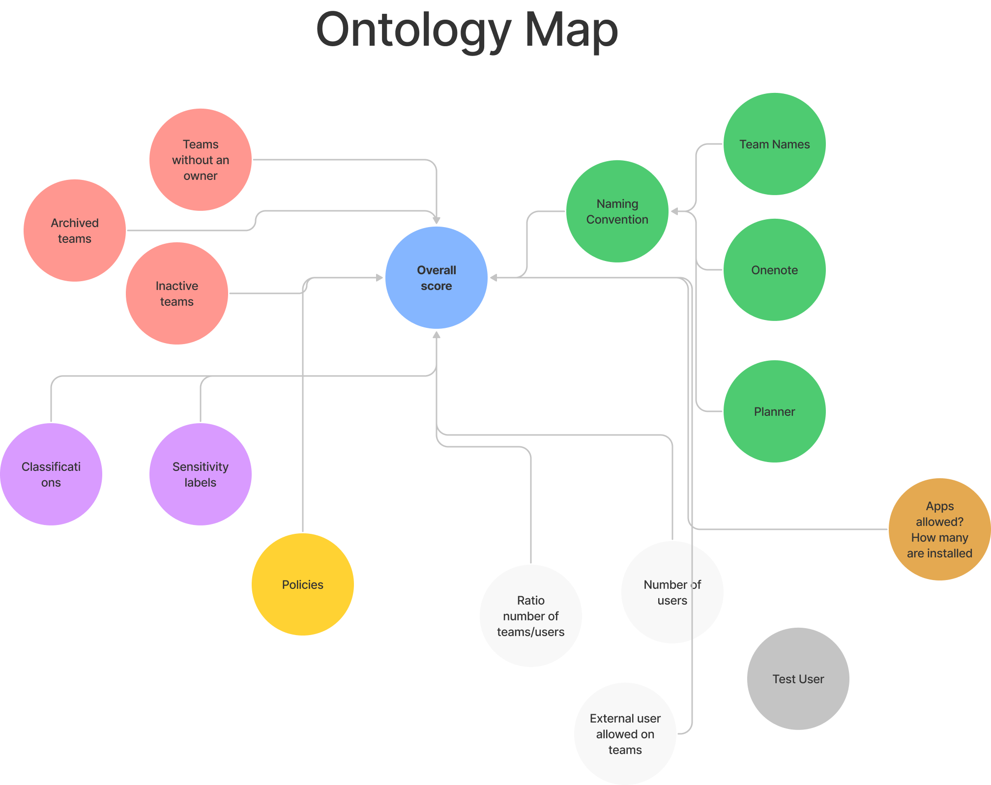
In the case of creating a governance score dashboard, an ontology map would be a valuable tool to help visualize the relationships between different governance variables. This would allow you to better understand how changes in one variable might affect other variables, and help you identify potential areas for improvement.
For example, you could use an ontology map to show how different governance variables, such as user management, team management, and app management, are connected to each other. You could also use the map to highlight areas where improvements could be made, such as by identifying dependencies between different variables or by identifying areas where the current governance process might be inefficient.
Research
Tree Diagram
The Tree Diagram was instrumental in demystifying the system’s hierarchy. It visually mapped the relationships between various elements, offering an intuitive overview of the system’s architecture. This tool greatly simplified navigation and enhanced the user-friendliness of the system.

Implement
How I solved the problem
Recognizing the need for simplicity in understanding governance efficiency, I designed a clear score indicator. This feature, complete with straightforward explanations of the scoring analysis, allows users to easily gauge their performance and identify areas for improvement, eliminating confusion and complexity.
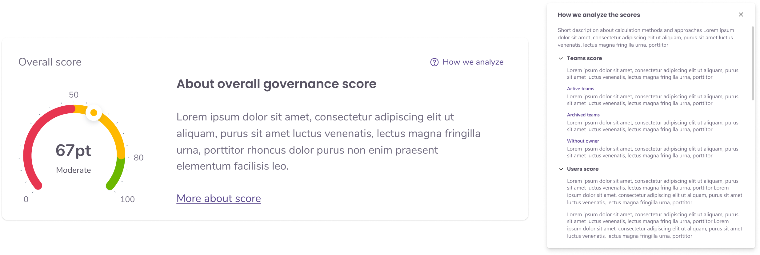
To enhance user understanding of governance variables, I created dedicated pages for each. Selecting a variable leads users to a detailed breakdown, including its definition, calculation method, and relevance to the overall governance score. This design facilitates a deeper comprehension of each variable’s impact on governance efficiency.

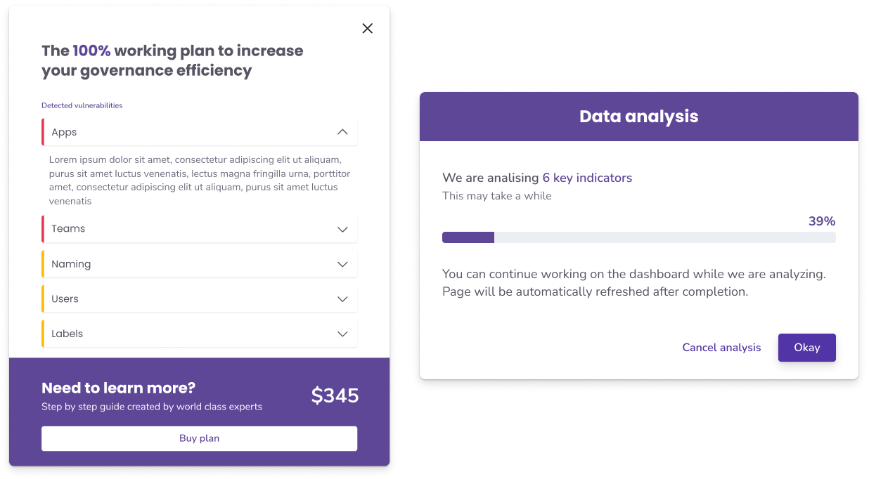
I enhanced the user experience by introducing an “Analyze” button as the primary feature. Recognizing the analysis was time-intensive, I enabled users to continue other tasks while their governance score is being processed, ensuring efficiency and convenience.
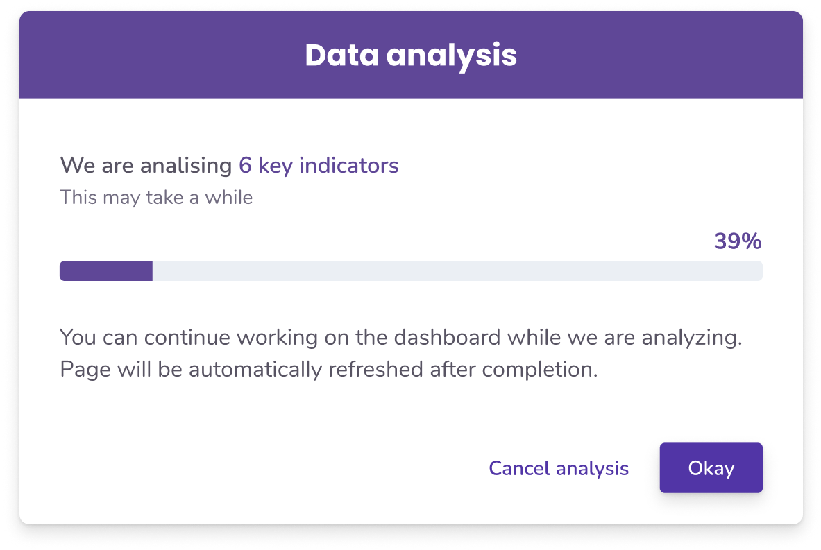
To provide clarity on the governance score, we displayed not just the score itself, but also the contributing variables, offering users a comprehensive understanding of what shapes their score.
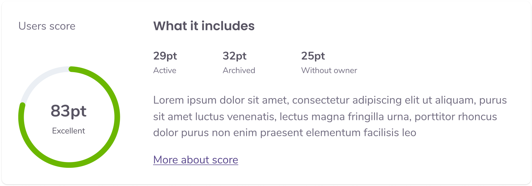
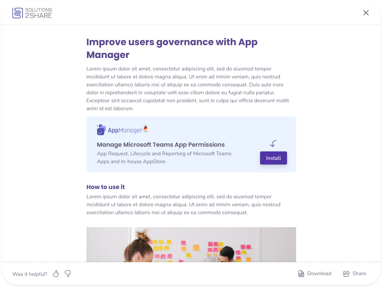
We enhanced user engagement by adding a feedback modal to our recommendations feature. This allows users to share their opinions, enabling us to refine our governance analysis algorithm based on valuable user insights.
Customer feedback revealed a demand for detailed insights into the progress and results of governance analyses. We responded by introducing a history feature for past analyses and a drop-down menu for quick progress checks. These enhancements offer users an efficient way to track their improvement over time.

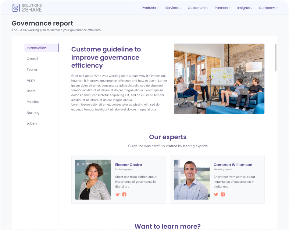
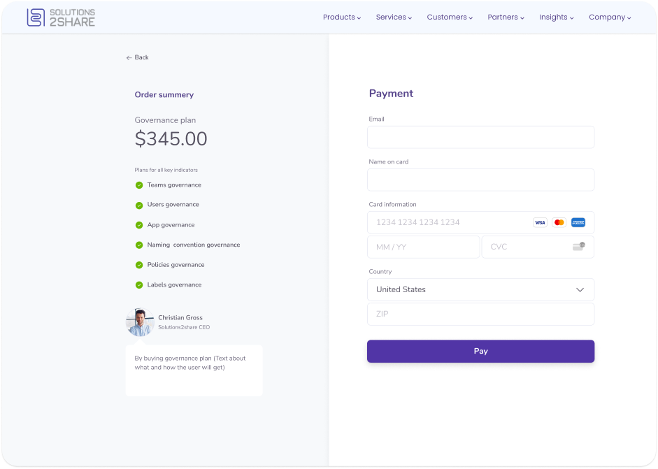
Striking a balance, I integrated our service subtly into the analysis process, presenting it as a beneficial recommendation rather than active advertising. This approach enhances our product’s visibility while adding value to the analysis, aiding users in improving their governance efficiency.


