M365 Cleaner
Overview
M365 Cleaner is a lightweight Microsoft Teams app that analyzes and visualizes digital clutter across Microsoft 365. It identifies outdated Teams, oversized files, inactive SharePoint sites, and messy mailboxes, then highlights actionable cleanup opportunities.
Problem
As organizations adopt Microsoft 365, their storage quickly becomes messy:
- Inactive Teams pile up.
- SharePoint sites remain untouched.
- Mailboxes and OneDrives fill with oversized attachments and duplicate files.
Admins face high storage costs and poor visibility, while team owners and users have no clear way to manage their data. Existing tools felt technical and spreadsheet-heavy, lacking intuitive insights.
The challenge was to simplify this complexity and create a tool that is:
- Visual – insights at a glance.
- Actionable – clear cleanup recommendations.
- Integrated – embedded into Teams, where people already work.
Goals & Objectives
Provide a single source of truth for M365 storage health.
- Visualize clutter in a way that feels familiar yet engaging.
- Enable both admins and everyday users to take action confidently.
- Fit seamlessly into Microsoft Teams as a tab or personal app.
My Role
Research & Discovery
To understand the problem space, I combined qualitative research with structured UX methods.
- Stakeholder Interviews: IT admins, team owners, and everyday users highlighted different priorities — admins wanted cross-tenant visibility, team owners needed clarity on inactive Teams, and users wanted quick insights into their own storage.
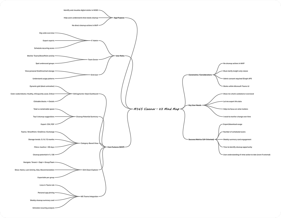
- UX Mind Map: I mapped out all possible clutter touchpoints across Microsoft 365 — Teams, SharePoint, OneDrive, and Exchange — and visualized connections between usage, storage growth, and cleanup opportunities. This helped define the scope of entities and surface dependencies.
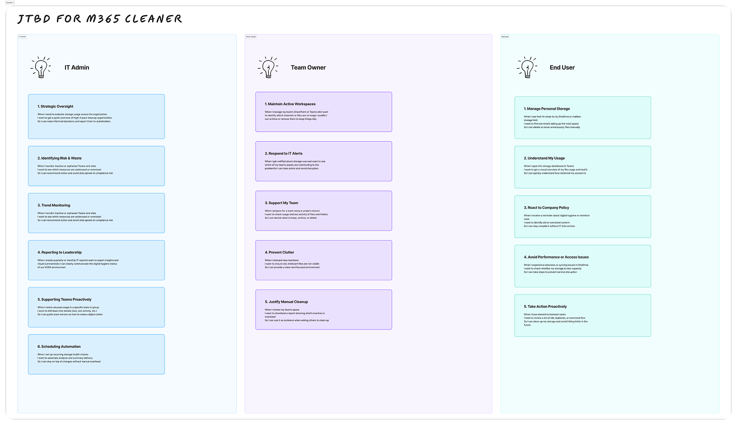
- Jobs To Be Done (JTBD) Framework:
- When I’m managing Teams storage, I want to see which groups are inactive, so I can decide what to archive.
- When my OneDrive is nearly full, I want to quickly spot large files, so I can delete or move them.
- When I’m an IT admin, I want to monitor overall storage trends, so I can reduce unnecessary costs.
Key insight: people don’t want raw storage metrics — they want clear, job-oriented outcomes. These methods helped anchor the design around user intent rather than technical complexity.
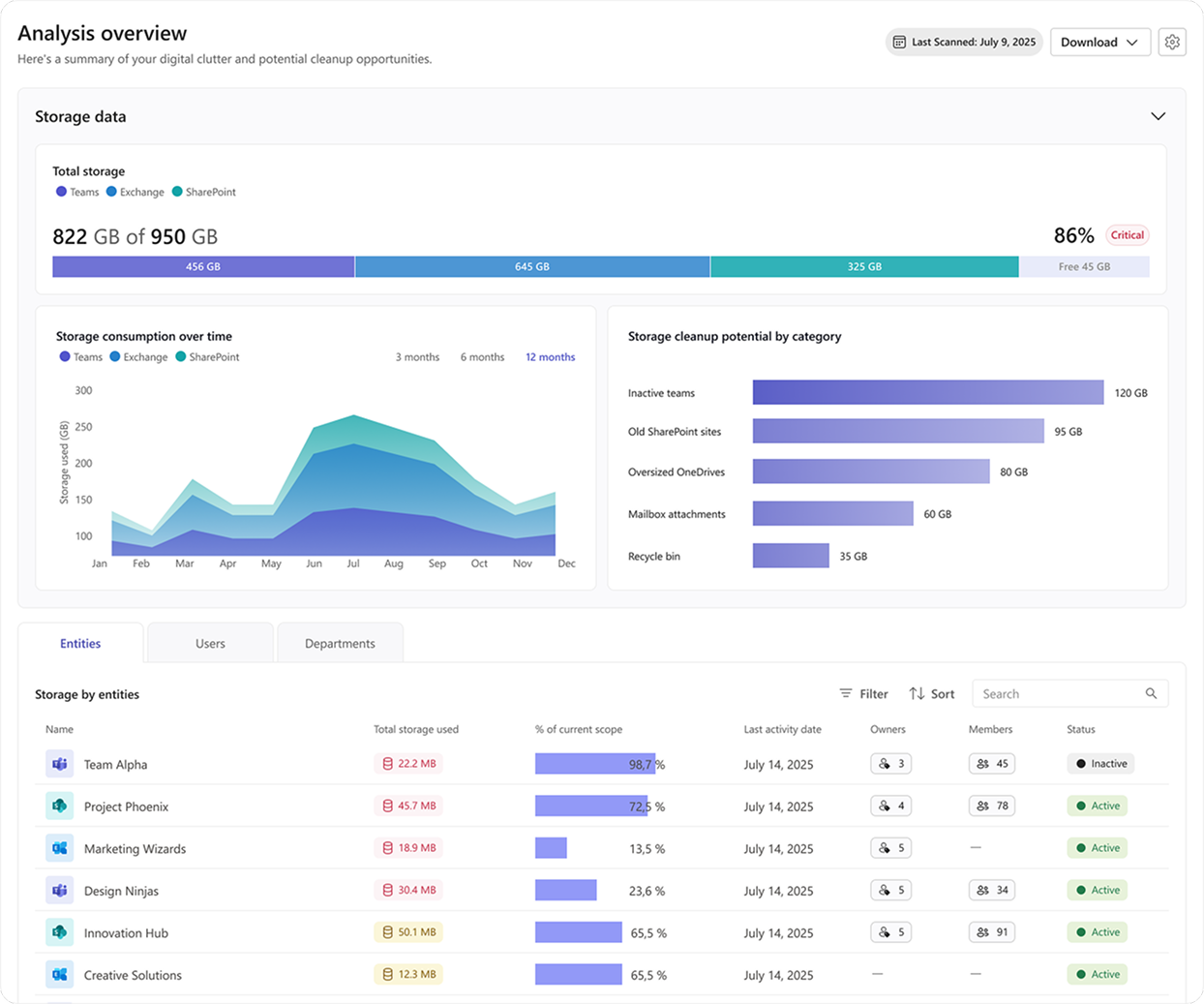
Main Page – Analysis Overview
This screen serves as the entry point, giving admins and users a clear, visual summary of storage health and cleanup opportunities. Each component was designed to balance clarity, hierarchy, and quick decision-making.
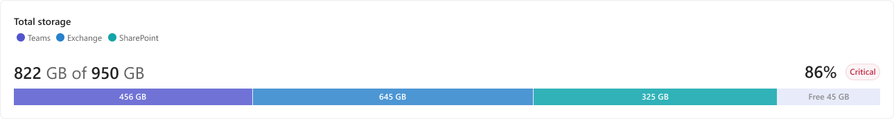
Total Storage Bar
Components: Overall usage vs. free space, color-coded by service.
Why: A single-glance health indicator. The critical alert (86% used) helps users understand urgency without digging deeper.
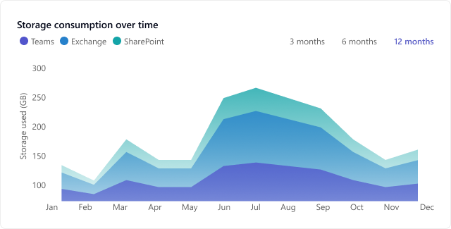
Storage Consumption Over Time
Components: Area chart with 3/6/12 month toggle.
Why: Shows trends, not just static numbers. Helps admins spot growth patterns and forecast when storage will become an issue.
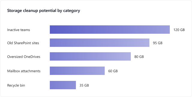
Cleanup Potential by Category
Components: Breakdown of biggest cleanup opportunities (inactive Teams, old SharePoint, oversized OneDrives, etc.).
Why: Directs attention to the highest impact actions. This turns raw storage data into actionable insights.
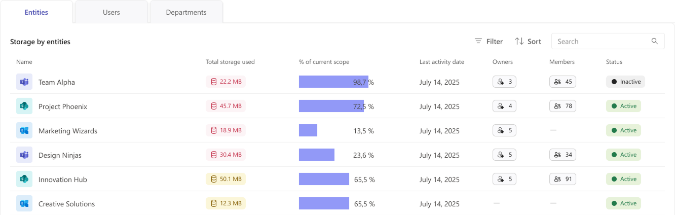
Entities/Users/Departments Tabs
Components: Switchable views; table with entity name, storage used, % of scope, last activity, owners, members, status.
Why: Supports progressive disclosure — from high-level summary to detailed accountability. Owners and status help decide what to clean up, while filters/sort/search aid navigation in large datasets.
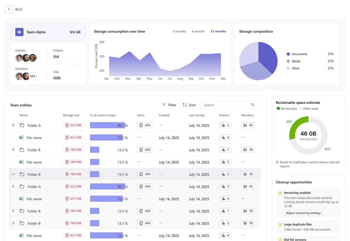
Entity Page (Team View)
This page gives a detailed breakdown of a specific Team’s storage.
- Header card: Quick facts (owners, members, folders, files, total storage).
- Trend + composition: Storage usage over time and distribution by type (documents, media, other).
- Entity table: Folder- and file-level details with activity, owners, and members.
- Sidebar insights: Reclaimable space, cleanup opportunities (e.g., large duplicate files, old versions), and top storage consumers.
Why: Designed to help team owners identify what’s consuming space and where to take action.
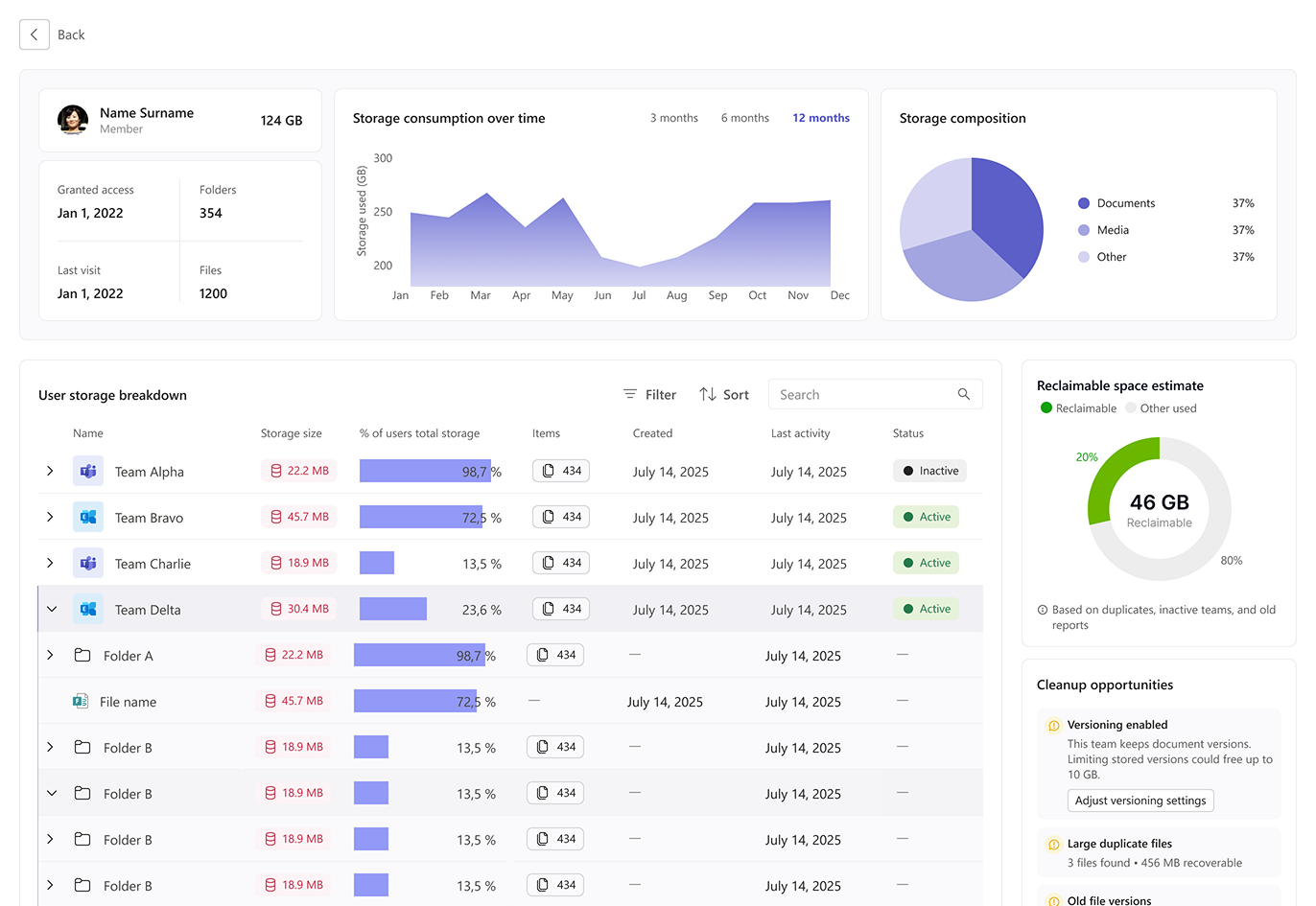
User Page (Individual View)
This view shifts focus from teams to a single user’s storage footprint.
- Header card: Profile info, access date, last visit.
- Trend + composition: Personal storage over time and file type distribution.
- User storage breakdown: Which Teams and folders the user contributes to most, with activity and status indicators.
- Sidebar insights: Same reclaimable space and cleanup suggestions, tailored to individual usage.
Why: Helps admins or managers spot heavy users, inactive accounts, and reclaimable space at the user level.